2024 – A Review in Charts. It’s that time of the year again, when airborne illness runs roughshod through our immune systems and the Harder children aggressively inquire as to how many sleeps remain before Christmas. It’s also a time for investors to reflect on the past year and strategize for the next. With that in mind, this edition will be a chart-based review of how markets evolved in 2024, whereas next month we’ll outline our views and positioning for the year ahead (spoiler: we’re growing increasingly cautious).
2024 in a sentence: unrestrained fiscal deficits and a surprisingly resilient US economy unleashed animal spirits and pushed stock markets to new highs, but historically expensive valuations will make a repeat performance much more difficult in 2025.
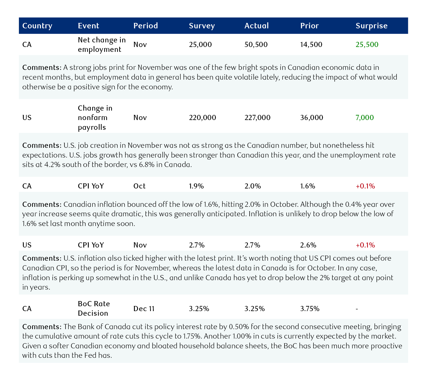
Performance – a standout year: if we start with stock performance, we can see it was an excellent year for equities, particularly U.S. equities. After two years of essentially no gain, North American stocks outperformed European and other international markets significantly in 2024. Note that in each chart, the beginning of the year has been demarcated with a dashed white line.
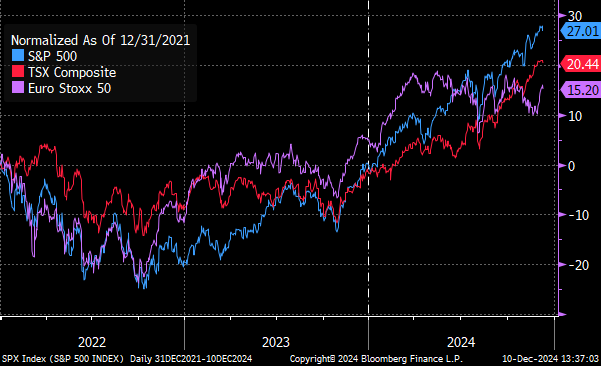
However, that performance was by no means enjoyed equally across the entire market; after pulling back in 2022, the so-called “Magnificent 7” (Amazon, Google, Meta, Apple, Nvidia, Tesla, Microsoft) now make up nearly a third of the entire S&P 500’s market cap. We view this degree of concentration as decidedly unhealthy.
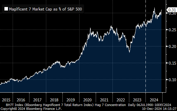
Macro – rising deficits lift all boats: The economy certainly did its part to push markets higher, with employment data softening less than economists expected. It’s true that the unemployment rate ticked higher this year (particularly in Canada) but that figure remains very low relative to historical levels.
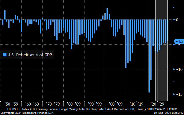
A significant driver of this better-than-expected economic performance was a fiscal deficit of nearly unprecedented proportion. It’s true that the deficit has been higher in relative and absolute terms, but never before has the US government run a deficit of ~7% of GDP outside of crisis or war. While an extra $2 trillion of debt-financed spending is good for near-term growth and revenue, we are concerned about rapidly increasing interest outlays and crowding out of the private sector. The chart below shows how much more the US federal government spends than it receives as a proportion of the overall economy.
The shaded area below are forecasts that project the deficit will decline from ~7% to ~4% by the end of the decade, assuming no new spending or tax cuts. We see this as a highly unlikely outcome, and do not anticipate deficits reducing to this extent. Even if they did, a deficit of 4% of GDP is still very high.
Aside from multi-trillion dollar deficits, there’s something else we don’t typically see when unemployment is low and stocks are hitting record highs: rate cuts. Most rate cutting cycles start as a reaction to a rapidly deteriorating economic picture. This year rate cuts started later than expected, but nonetheless are providing further support to assets and growth. After this week’s Bank of Canada cut, the policy rate has now been reduced by 1.75% cumulatively, with another 1.00% priced in for 2025.
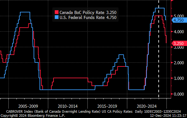
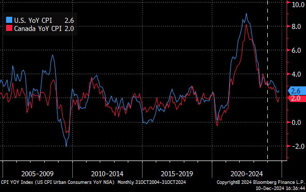
Rather than a series of emergency cuts meant to soothe fearful markets, as we saw in 2020, this cutting cycle has been much more peaceful. A significant drop in inflation facilitated this “victory lap” for central banks. Our view, however, is that sticky services inflation combined with a long-term deficit problem means inflation is still a key risk going forward.
Valuation – the price of good performance: Now comes the bad news. Growth, margin, and economic outlook are only half of the equation for investors – the other half is price, and those prices are high right now. There is no environment or company so strong that it can’t be ruined as an investment by an unreasonably high price, after all.
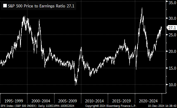
Going into 2025, valuations are indeed very high. Stock markets have priced in plenty of good news this year, and the bar to realize another year of strong performance has been raised even higher. There are many ways to measure how “cheap” or “expensive” stocks are, but the most universal is price-to-earnings. This represents how many dollars you’d need to pay for each dollar of net profit for a given company (or index in this case). Historically the U.S. market has averaged around 18x for P/E, with 13x being seen as quite cheap and 23x as quite expensive.
While P/E was higher in 2020/2021 than it is today, this was due to temporarily low earnings (a lower denominator increases the ratio) and can be ignored here. Outside of that spike, the current S&P 500 P/E ratio of 27x is the most expensive the market has been since the dot-com bust. This means that despite a generally positive environment for stocks, we are growing increasingly cautious.
Conclusion – choosing caution over complacency: It’s been a positive year for markets as a whole – stocks climbed while bonds eked out modest but predictable returns. The economy showed more underlying strength than expected, inflation moderated substantially, and Trump’s election increased the likelihood of a favourable tax regime for corporations. However, massive fiscal deficits combined with rate cuts and new trade barriers lead us to believe that the risk of inflation is being underestimated. Finally, an historically expensive market should temper investors’ enthusiasm, although there are still plenty of attractive individual opportunities to be had.
The ultimate takeaway here is that a strong US economy and stock market have been welcomed by most investors, but we see more reason to be cautious going forward as this rally stretches on. We’ll outline more on our views for 2025 and how we’re positioning client portfolios in next month’s Capital Currents newsletter.
Data digest