
INFLATION!
A good friend that I had not spoken with in a while connected to ask some questions as he was signing up for his company’s retirement benefits package.
After we covered his questions, he asked me something in a way that motivated me to do some extra research.
The question was: How can I create a visual image to see how much inflation will impact our family savings over the period of my retirement? The following are the charts I used to try and put some perspective to the question.
What we need to look at is data that is projecting out 30 years or so.
Conservatively calculated…US long term debt will be $146 trillion!
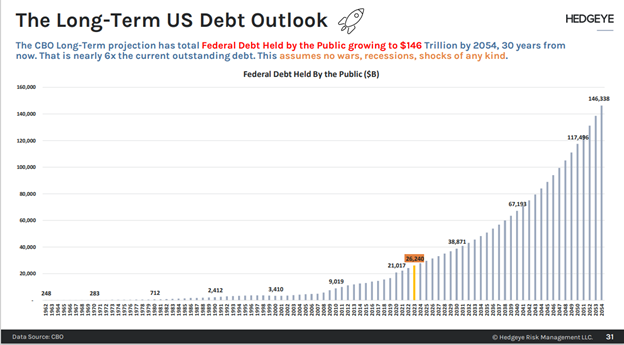
(Note, this chart assumes no recessions, wars or surprises that would require more deficit spending).
The trajectory of the exponential curve represented in the chart above shows one “flat-ish” period where US debt held steady: From 1997 – 2002. Apart from that time frame, US debt has grown at varying rates.
To use a back of the napkin-type calculation this would mean cost of everything will be approximately 5 times more expensive in 30 years. Incomes and social benefits would need to rise 5 times to keep pace.
The debt data requires more context to see what we can expect from inflation in the long term. The next chart is more telling since it links debt to GDP growth.
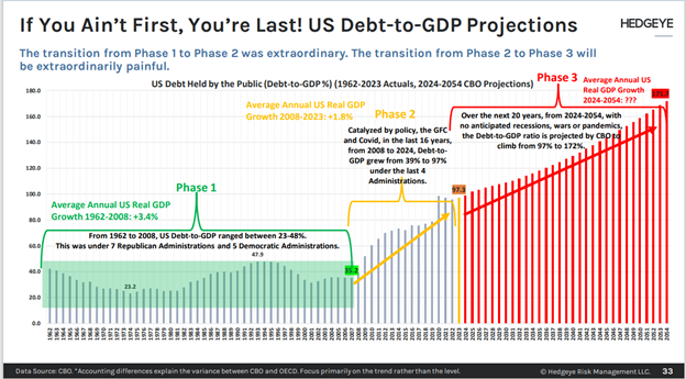
Now, we are getting somewhere. Note how the chart is broken into Phase 1, Phase 2, and Phase 3.
It is important to understand what happened in the chart above. There are two key concepts to understand.
The first concept is that prior to the 2002, debt to GDP was a political issue. Politicians spoke strong words at how they owed it to future generations to get their spending under control. Since it was political, there was more action taken on holding the debt/GDP ratio in check. Since 2002 debt has been struck as an election issue. Ideas like Modern Monetary Theory have replaced the ideas of fiscal prudence.
The second concept is that trending lower interest rates from 1982 to 2008 (where interest rates went to zero) masked some of the rate of increase in actual debt outstanding.
All the years where short-term interest rates were essentially zero (in yellow) allowed for what appeared to be a “painless” accumulation of debt. Reality took hold as inflation shot higher after the financial responses to COVID acclimated in the economy. By 2022, inflation was baked in the cake. (Phases 1,2, and 3 marked with red numbers).
How can governments continue to print more money (which fuels further inflation) and, at the same time, lower interest rates?
In my view, the two actions are incongruent. They can do it for a while, but the higher inflation rates will inevitably force tough choices in the future.
Investors understand this incongruency. Therefore, they flock to investments that they perceive will maintain purchasing power in the face of inflation.
Real estate, stocks, commodities, precious metals, Bitcoin. They are looking for safe harbours in risky assets!
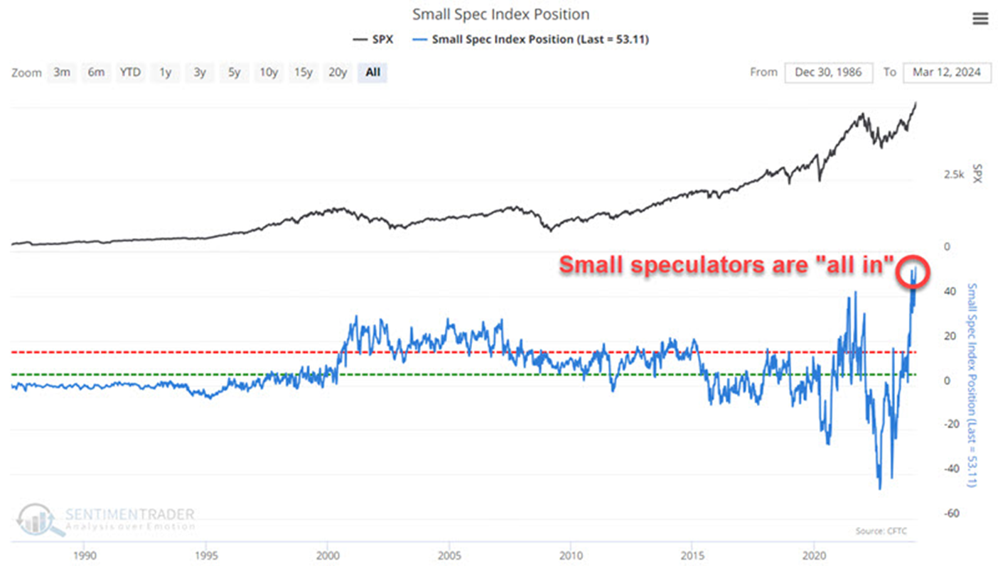
The chart above shows that small speculators (read normal people with trading accounts) are chasing protection. The all-time-high shown in the blue line makes perfect sense given the signaled pathways we have seen from central banks around the world.
It is also important to draw the distinction between Canada and the United States. Canada does not have the privilege of possessing the world’s reserve currency. Therefore, Canada carries a higher set of risks relative to the US in terms of inflation and how it can be managed.
How you respond to the long-term analysis above largely depends upon your age. Someone 52 or 65 years of age is more concerned about inflation than someone in their 80s.
Summary thoughts:
Economic outlooks have shifted a lot in the past 6 months.
What had been yearlong forecast for a mild recession to take hold in the US has morphed into persistent inflation aided, and abetted by global central bank liquidity injections followed by huge government financial stimulus packages to the people.
A lot of asset managers have been advising clients to “extend duration” in their fixed income portfolios. (That means buy longer term bonds). During the month of March, the trend for interest rates across the yield curve has gone from looking for lower interest rates to expecting slightly higher interest rates in coming months.
Why? Because inflation expectations continue to rise.
Oil, gold, stocks, and crypto currencies took notice as well. All these riskier asset classes had excellent months in March.
The reason I wrote this report was to show that, no matter what the next year or two brings economically, inflation is baked in the cake for our future.
Some will say that it always has been. I agree with that statement.
But the debt to GDP chart above shows the way inflation impacts our daily lives has changed.
Inflation as it relates to household budgets has become more embedded and detrimental since 2020.
Those in their employment earning years can hedge inflation by earning more. Our youth and seniors have less flexibility in their earnings.
Please feel free to write back if you have comments about these long term thoughts….thanks for reading.