
Yield curve inversion—when short-term interest rates rise above long-term rates—has occurred before the start of every recession for the past 75 years and has also given advance notice of the serious stock market declines associated with bear markets. On average, an inversion has arrived 11 months before economic contractions and nearly six months before stock market peaks.
Given this track record, it’s perhaps understandable that the financial and popular press have now latched on to the measure and routinely cite relative interest rate levels when predicting an “imminent” and “inevitable” recession. But much of the recent reporting has failed to consider the economic logic behind the indicator’s predictive power, and we believe the result is a flawed interpretation of the current recessionary probability in the U.S.
Not all curves are created equal
None of the recent commentary that we have seen discussing yield curve flattening and inversion has focused on the difference between 10-year Treasury yields and 3-month borrowing rates. On the one hand, that’s not surprising: the 10-year vs. 3-month yield is nowhere near inversion and has been steepening—not flattening—of late. At the same time, this avoidance of the 10-year vs. 3-month difference is surprising: after all, that measure of yield curve steepness forms the basis of most academic research on recession prediction and—not coincidentally—serves as the Fed’s preferred measure of the yield curve.
Although the press has focused on the recent inversion in the 2-year vs. 10-year segment of the yield curve, there is an economic logic behind the Fed’s focus on the 3-month vs. 10-year maturities. Bank loans form a significant part of the capital structure of many corporations and these are typically linked to short-term borrowing rates such as the 3-month yield. The 10-year yield serves as a reasonable proxy for market growth expectations. So, as 3-month rates rise above 10-year yields, we would not be surprised to see corporate executives shelve capital projects until growth expectations recover, and instead use the funds to pay down short-term loans. This would tend to constrain growth in the economy overall, providing much-needed logic to how a flattening yield curve connects to recession probability. This connection is often missing or glossed over when the press discusses flattening between other points on the yield curve.
Incorporating future policy moves
One potential drawback to using the 3-month rate as the basis of curve measurement is that it’s slow to adjust when the Fed signals a major shift in interest rate policy. For this reason, many bond trading desks prefer to look at the 2-year vs. 10-year Treasury yield when discussing inversion, arguing that the 2-year better incorporates market estimates of where short-term interest rates are headed and can give an earlier signal of a potential upcoming recession. One obvious problem with this approach is the difficulty of predicting future Fed policy; after all, few, if any, bond market watchers predicted the last two years of monetary policy.
For our part, we use the difference between 1-year and 10-year government debt as our yield curve measurement. By confining ourselves to the next 12 months, we have better visibility on potential Fed changes, while still generating a signal that has led significant market downturns by nearly six months on average. We then incorporate this yield curve measurement into our U.S. recession scorecard, which includes six other key leading economic indicators. For a full update of our recession scorecard, please see the global equity commentary in this month’s Global Insight.
Yield curve inversion talk looks premature
Our preferred measure is above its historical average
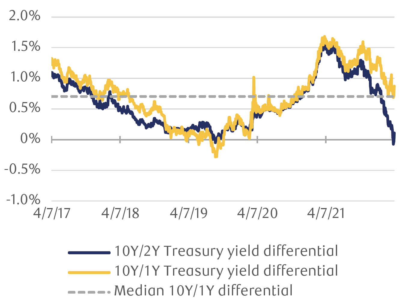
Source - RBC Wealth Management, Bloomberg
As of the morning of April 7, there is a 0.86 percent positive gap in favor of the 10-year Treasury yield over the 1-year, leaving our measure firmly in what we view as benign territory. If that difference were to narrow to something under 0.3 percent, we would likely shift the yield curve signal to a cautionary neutral view, and if it were to flip negative—where the 1-year yield exceeds the 10-year yield—we would move this indicator to red in the scorecard. That looks to us to be a long way off as things currently stand.
The real picture is different
Another factor in yield curve analysis today is inflation. For most of recent U.S. economic history, inflation was largely an afterthought for most investors. That is clearly not the case today, with the Consumer Price Index rising at the fastest pace in 40 years.
One way to incorporate inflation into our yield curve analysis is to focus on Treasury Inflation-Protected Securities (TIPS), which adjust their cash flows based on changes in consumer prices. These bonds provide us with a so-called “real yield,” stripped of inflation’s impact. By this measurement, we are also far from a curve inversion; the difference between the 10-year and 2-year real yield is a very healthy 1.37 percent as of today’s open. Far from signaling recession, the TIPS market is indicating confidence in the Fed’s eventual ability to bring prices under control, a view that is confirmed by other inflation indicators.
Inflation expectations are driving curve inversion
Real yields show very different picture on relative rates
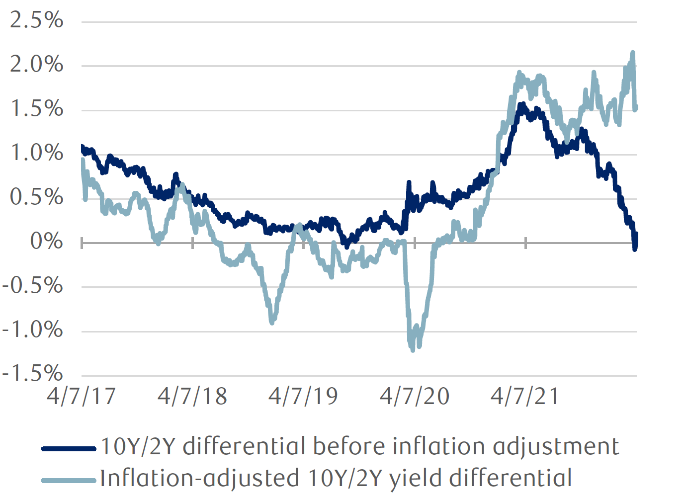
Source - RBC Wealth Management, Bloomberg
Absence of evidence is not evidence of absence
We believe that recent discussions of yield curve inversion as a predictor of recessionary risk have gotten ahead of the data and the economics.
We remain of the view that we will experience positive, but slowing, economic growth in 2022, although we acknowledge higher risks to the expansion particularly in the 2023–2024 time frame.
The main takeaway for most long-term investors, in our opinion, is that there should be a high bar to migrate away from risk assets given the potential harm to long-term portfolio gains. We would consider it unwise for investors to make such a move now, based on the evidence we have seen from recent yield curve moves.