How well do you know your portfolio?
How can we support you with a portfolio risk analyzer tool?
- Re-imagine your current portfolio construction with quantitative analysis and visual tools
- Compare your portfolio with various customized benchmarks
- Understand type of risks your portfolio is exposed to
Below is a sample analysis of a portfolio with Canadian Equities from May 31st 2020 to May 31st 2025.
PART 1. Get a summary of your portfolio overall risk and return quality.
| Portfolio | Annualized Return | Volatility | Sharpe Ratio | Maximum Drawdown |
| Your Portfolio | 23.01% | 12.83% | 1.59 | -7.13% |
| S&P/TSX 60 ETFs | 14.77% | 12.89% | 0.94 | -14.19% |
- Annualized Return: Average yearly gains or losses generated by the portfolio.
- Volatility: The extent to which returns have deviated from the average return.
- Sharpe Ratio: Measures how well an investment has compensated you for the risk taken.
- Maximum Drawdown: The largest loss from the portfolio’s peak to its lowest point.
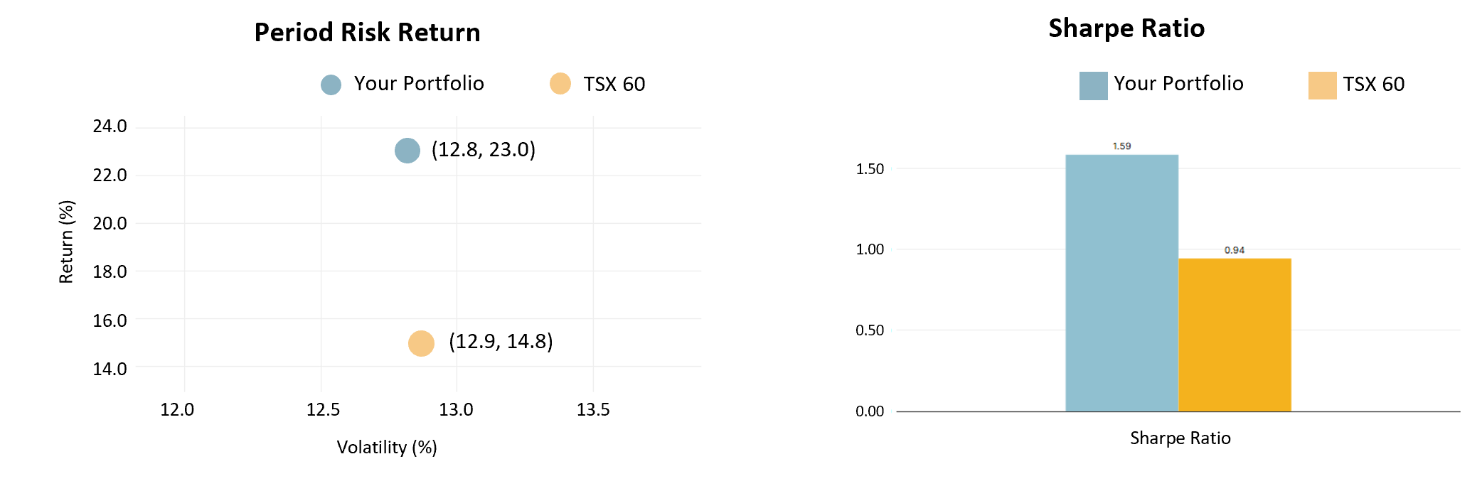
Period Risk-Return Graph: Visualizes the risk and return exposure of your portfolio versus the TSX 60. Your portfolio achieved higher returns with lower volatility.
Sharpe Ratio Graph: The Sharpe Ratio tells you if the money you made on an investment was worth the risk, compared to leaving it somewhere safe like a government bond. A higher score means you received a good return for the risk you took. Your portfolio delivered more efficient returns than the index.
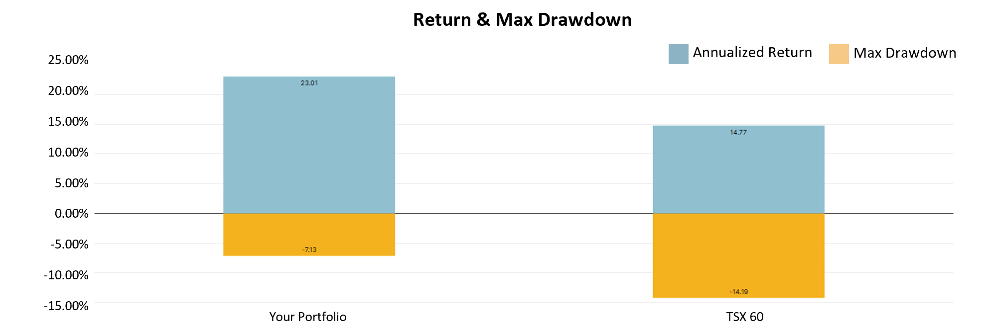
Return & Max Drawdown Graph: Compares your portfolio's annualized return and maximum drawdown against the benchmark. Overall, your portfolio achieved higher returns with a lower maximum drawdown.
PART 2. Compare your portfolio performance with TSX 60 ETF
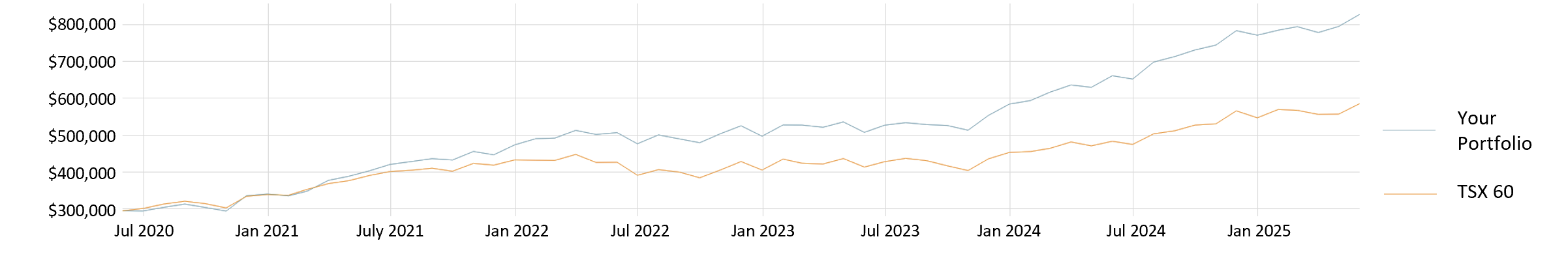
Compares your portfolio to a TSX 60 ETF over the analyzed period. This shows an upward trend for both investments, with your portfolio delivering stronger returns.
PART 3. Identify key risk factors the portfolio is exposed to
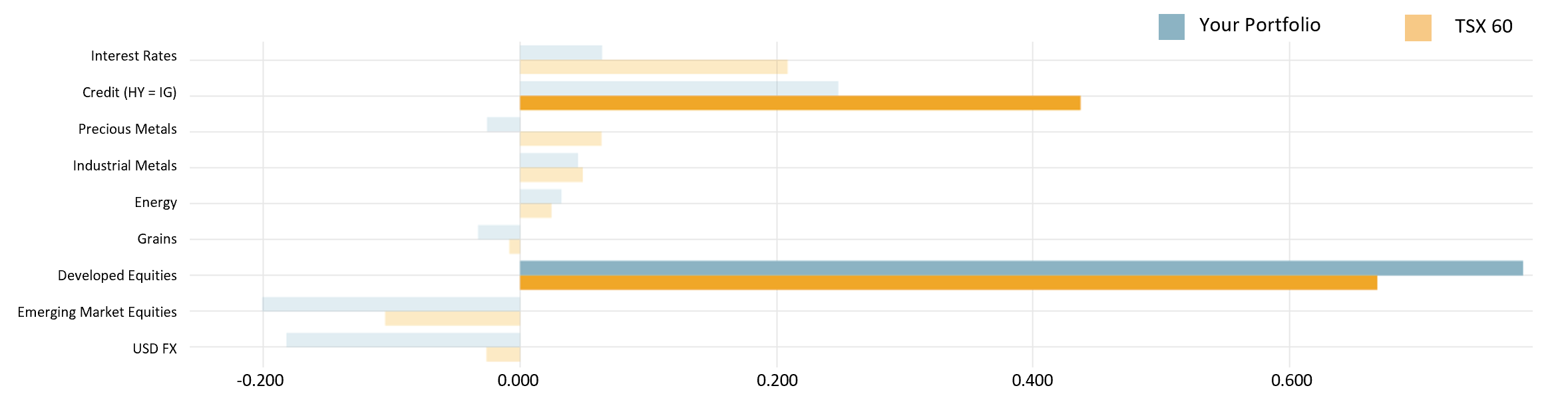
Illustrates how both portfolios are influenced by nine major economic and market variables. This helps you better interpret the risks your portfolio is exposed to.
PART 4. Visualize how your portfolio could be affected by key economic drivers
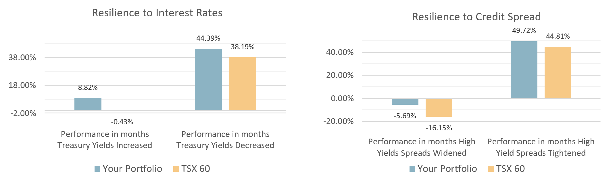
Resilience to Interest Rates: Shows how both portfolios performed when treasury yield increased or decreased. Your portfolio outperformed in both scenarios.
Resilience to Credit Spread: Shows how both portfolios performed to fluctuations in credit quality. Your portfolio outperformed in both scenarios.
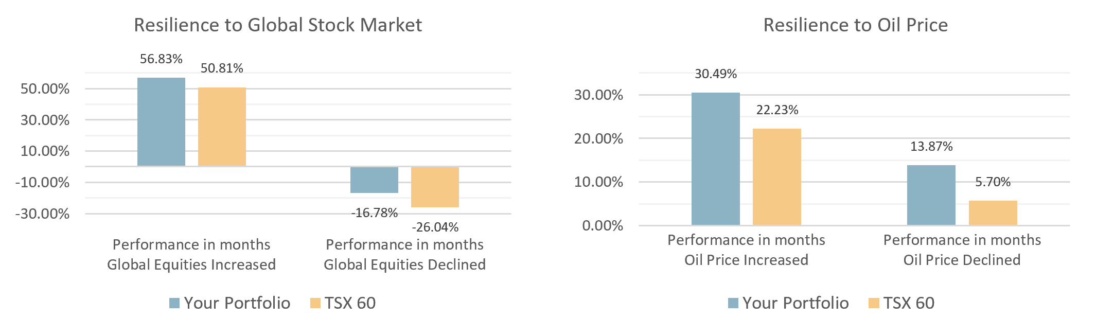
Resilience to Global Stock Market: Shows how both portfolios performed when global equity markets were rising or falling. Your portfolio showed greater resilience, during global market downturns and outperformance during global growth markets.
Resilience to Oil Price: Shows how both portfolios performed when oil price were rising or falling. Your portfolio outperformed TSX 60 ETFs in both rising and falling oil price scenarios.
Note: This is a small subset of insights from the Portfolio Risk Analysis Report.
Click Here To Request A Portfolio Risk Analysis Report
