
Triannual Review
Year End Summary and Look Forward
Right is right even if no one is doing it, wrong is wrong even if everyone is doing it.
– St. Augustine
Never let a good crisis go to waste
– Winston Churchill
Executive Summary:
Preparing a year in review for 2020, is a bit like trying to write the Coles Notes for War and Peace. It was a year history will never forget.
It began on a relatively high note. Then, a global pandemic radically shifted the trajectory of everything.
Massive government, financial and personal choice responses to the pandemic were implemented…some were successful, many turned out to be mistakes. Even with all of our modern day science, the pandemic followed the historical waves of illness and death.
Maybe it shows that technology doesn’t trump our propensity to be human. Through the ages, humans seem to follow the same lines of rationalization and, in turn, make similar threads of decisions.
As we close out 2020, we see hope in a vaccine that will be distributed to all in 2021. Hopefully, it will be as good as advertised.
In March 2020, financial assets (stocks, bonds, and real estate) fell into a catatonic state as the world financially froze up.
With global leverage and debt at never seen before levels, the “great reset” many feared seemed to be at hand.
Real estate transactions stopped, stock markets lost between 25% - 40% in three weeks and interest rates went to near zero. Financial velocity had suddenly ceased and the grotesquely large mountains of debt were crumbling before our eyes.
Central banks stepped in and played the only card they know to play – liquidity – and dumped more than $20 trillion into the financial system.
Liquidity worked the same way it always works.
It fueled speculation, which in turn, ignited a massive rally in asset prices. The result: The rich got richer, the advantaged gained greater advantage, and the entitled became more entitled.
At the same time, the poor were further marginalized and made more dependent upon government “generosity. Our younger demographics were further priced out of their first home purchases with rapidly housing inflation, and our seniors watched the soaring prices of staples erode the purchasing power of their savings.
Understated inflation works like that.
An ever larger segment of society falls into more difficult financial circumstances as the cost of living outstrips pensions and wages.
Those with more assets cope better, but make no mistake about it, understated inflation gnaws away at everybody and changes the very fabric of our society.
Twenty-twenty was the year it all accelerated.
How We Got Here:
The following summary has been included in these outlooks since 2016, adding a little bit each year:
- “Great Mistake” – Central banks letting Quantitative Easing (QE) run for more than a year back in 2010.
- Ten Years Later – The slow pace of raising interest rates continued. Central banks never took back the “great mistake” for fear of stalling asset price increases, but in the final quarter of 2018 stocks declined anyway: real estate stalled too.
- The Panic of 2019 – No it wasn’t investors that panicked…it was the central banks. The Bank of Japan, European Central Bank, and the US Federal Reserve all pivoted from tightening monetary conditions back to loosening them.
- “Hotel California Economy” – The pathways to interest rate normalization are nowhere to be seen. In 2019, investors around the world scrambled to try and lock in yield on investments. As the old Eagles song hauntingly informed us…You can check out anytime you like, but you can never leave…the highly indebted, low interest rate world was baptized into permanence.
- Asset inflation without growth – Resistance is futile, looking into 2020, lower asset prices are not considered an acceptable outcome. Any and all means necessary to inflate asset prices will be employed. If that means printing hundreds of billions of dollars every month to create liquidity…so be it.
- “Bonfire of the Vanities” – the hundreds of billions of dollars printed in the pre-pandemic world became trillions after March 2020. No amount of monetary stimulus is viewed as too much. There are no goal posts measuring whether more is necessary in terms of amounts or results. “More stimulus is necessary” exists as its own reality now.
But, will interest rates co-operate and stay low? Will the inflation wave that is expanding its borders to more and more asset classes keep investors in the frame of mind to hold on to their bond positions? If not, who buys all the bonds and where does the money come from to make the purchases?
I have no idea as to the answers to these questions, but we are going to find out the answers in the next couple of years….in this report we will investigate a couple of potential future pathways.
YEAR IN REVIEW:
Stock Markets:
The graphic below shows the short and longer term rates of return for a large segment of the major global stock indexes. I will tease out a few things that caught my eye below.
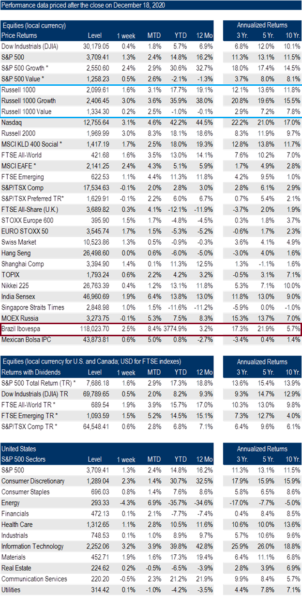
- The long term outperformance of US stocks versus most of the other global markets in both short and long term returns. India is the only other country to have similar long term returns. Even though Japan shows a high 10 year return it is still just over 60% of the valuation it was in 1989.
- How mundane the 10 year return numbers are for virtually all of the non-American stock indexes. Especially given the huge amount of stimulus injected into the monetary system.
- How important dividends are to Canadian rate of returns.
- Russell Growth vs. Russell Value (blue box) – The Russell is an American small company index. It is one of the few indexes that separates it growth and value segments. The vast performance difference is worth noting for it exists within the blended performance numbers of all the other indexes show.
- The crazy year to date data for Brazil (red box) and Venezuela (not shown but highlighted in last week’s publication).
Let’s focus on Canada and the US next.
Looking below, you can see the above data in chart form with the Dow Jones Industrial Average - DJIA – in grey on the top and the TSX darkened below.

A rollercoaster ride for sure, never before in a year did “greed” swing to “fear” and back to “greed” with such a vengeance.
Let’s zoom out to five years and look again.

That is a very stark difference between the US rates of return and Canada. The Canadian TSX is only about 20% higher over the past five years where the DJIA is about 75% higher.
Up until the last two months, the vast outperformance of US stock markets has been driven by the technology sector, but for the first time in a decade, the value names have started to move higher relative to growth names.
The resilience of this shift in investor appetite remains to be seen, but is definitely one of the themes investors would be wise to focus on in 2021.
One final point on the stock markets before we move on.
The divergence of the stock market from profits is remarkable. Never before have stock markets been so detached from their underlying fundamental values.
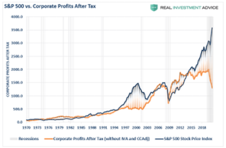
The graphic above demonstrates:
- How large the run up in the S&P 500 has been in non-logarithmic terms relative to the past 50 years.
- That even in the tech bubble of 2000 profits, at least, stayed flat. This time, with profits in a nose dive, stock prices went parabolic up.
Stock markets begin 2021, with lots of things that require investor attention.
Bonds and Fixed Income:
Usually, the annual review spends more time looking at the stock markets. Not this year…it is the bond market that captures my attention.
Before we begin with the 2020 review, I think it is worthwhile to see what the long term performance data shows for bonds relative to US stocks.
Interesting that the rate of return is almost identical since the year 2000. Not what I expected to see.
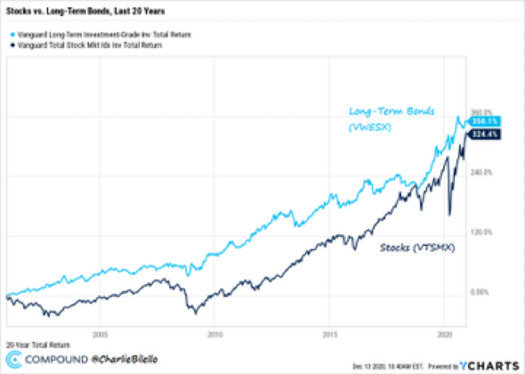
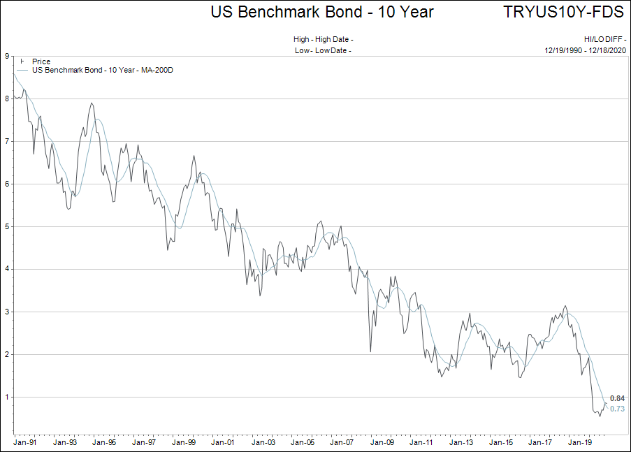
This is the most important part of this entire report to understand: Bonds can mathematically not offer a reasonable rate of return over the next 10 years.
Why? Because interest rates have to have room to fall for bonds to offer returns higher than their yield to maturity.
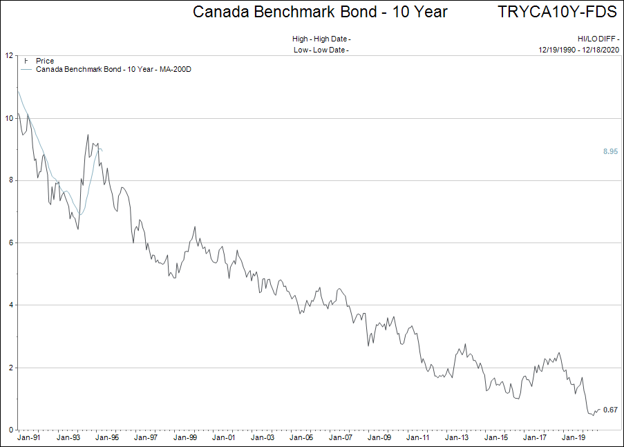
When we view the chart of the 10 year Government of Canada bond below, it is easy to see there is not much room left to the zero bound for interest rates.
This brings me to the number one question I have as an investor looking forward to 2021:
If we are to believe that the inflation pressures are expanding from housing, stock and bond prices to include food, oil, iron-ore, copper, uranium, corn, wheat, etc. who is going to want to hold all of the long bond investments?
Please understand, we are not at the point of saying inflation is out of the gates and running free…but what if?
There a lot of “green shoots” in the inflation story, and if those green shoots keep growing, the asset BULLISH narrative gets more complicated.
The light has been flashing amber for medium/long term bond investments all year. I am holding positions for now, but I do have a stop loss point in mind if the US 10 year Treasury bond goes back above 1% yield.
Bond yields are the key to holding together the entire debt-ridden world. Higher interest rates impact EVERYTHING…so let’s watch closely in the coming year.
Commodity Prices:
The following charts are to give an idea of how inflation is starting to show up in commodity prices. Chart 1 is the combined commodity index followed by a few individual commodity price charts.
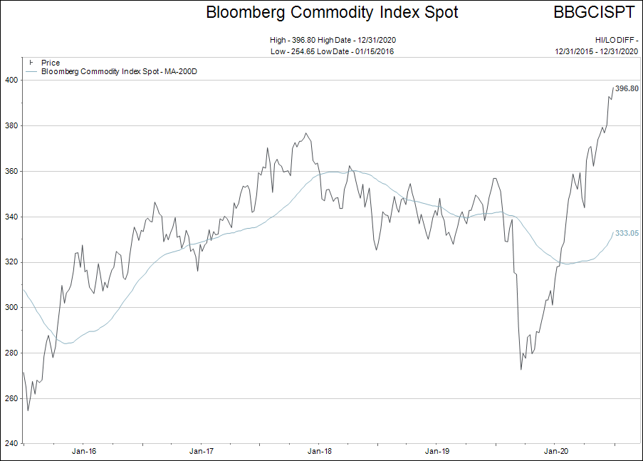

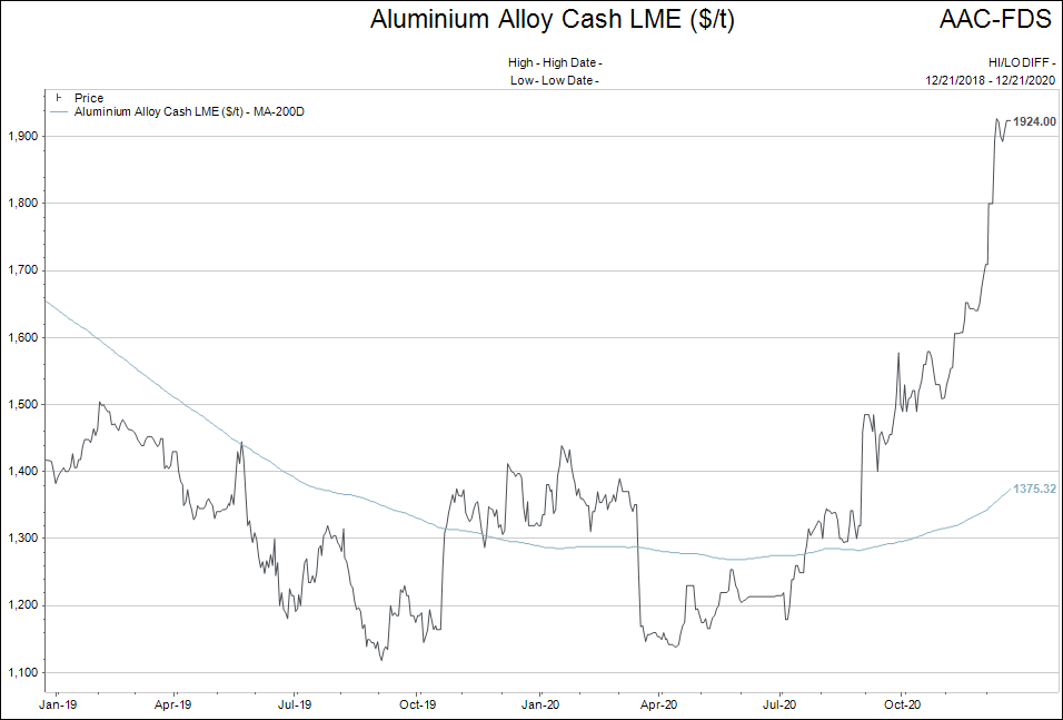
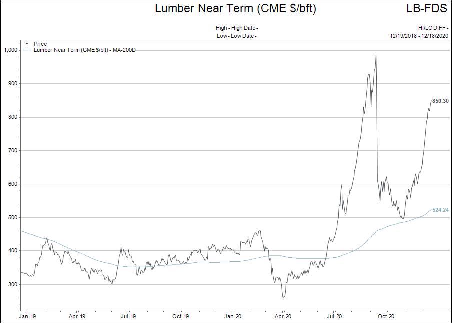
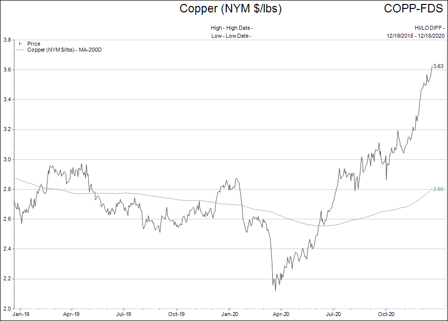
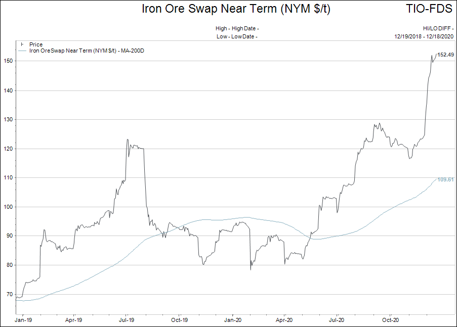
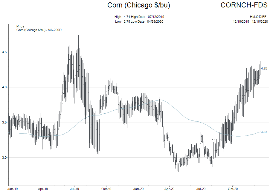
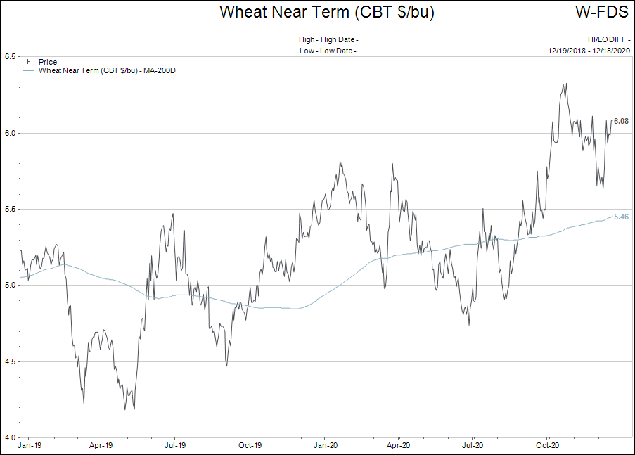
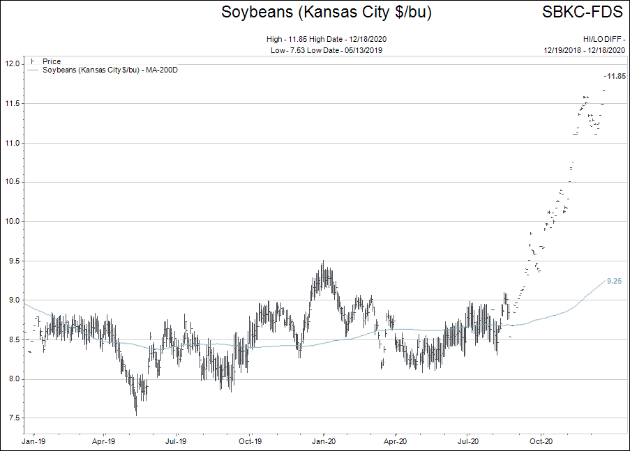
These charts all represent inflationary pressure in a world of near zero percent interest rates. Not exactly what we would expect, is it?
When we add in how much housing prices and building costs have risen; how stock prices have moved; how food prices at the store level have gone higher and how taxes have increased, the inflation theme appears to be broad and strengthening.
This is the second theme I will watch most closely on 2021.
Miscellaneous Topics:
In order to keep this report relatively short in length I am going to link a number of articles to topics you may or may not be interested in. Feel free to email for more information on any of these topics.
- Dividend Paying Stocks: RBC did a nice piece on how Canadians looking to add dividend exposure to their portfolios could wisely make choices. Click here to request this report to be sent to you.
- Global Macro Outlook: Niall Ferguson wrote an even-handed review and forward look entitled After the Pandemic, a Pile of IOUs. A reasonable point of view worth considering.
- Bitcoin, Cryptocurrency and Blockchain:
Bitcoin, do I dare bring it up? Apparently yes…
History possesses only rare examples of “bubbles” that burst and then reform again. The reformation of the bubble is never built on the same “narrative” as the original bubble…that is absolutely correct for the Bitcoin Bubble 2.0.
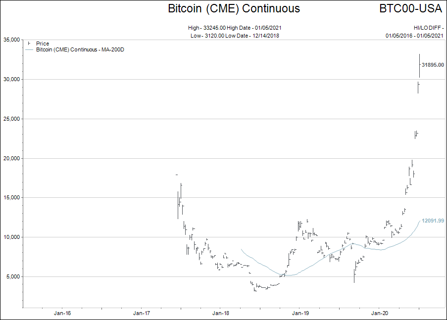
In the Bitcoin Bubble 1.0, which saw the price of Bitcoin go from mere dollars to $20,000 per coin, the driving narrative behind the speculation was the idea of a new currency that existed beyond the confines of the fiat currency world that could not be inflated away because of its fixed number of issuable coins (21,000,000 total coins).
The bubble burst in spectacular fashion, and Bitcoin fell from $20,000 back to the $3,500 range.
As you can see in the chart above, Bitcoin bounced around in a wide range for most of 2019 and 2020, before launching higher.
What changed for Bitcoin to create this new found ramp higher?
The story behind this change is fascinating. If you would like to listen to a Podcast that nails the story, please send me an email and I will send it to you. To keep this short, I’m going to just tell you the punch line.
The Bitcoin narrative shifted from “an alternative currency that cannot be diluted by central bankers and exists outside the confines of central banking” to “Bitcoin is a store of value like gold.”
This is where you really need to put your thinking cap on. A change of narrative might not sound like it is that important, but this is HUGE.
What this change in narrative allows, is Wall Street to bastardize the very thing Bitcoin was supposed to be, into something Wall Street wants it to be.
As an alternative currency, only so many investors cared about Bitcoin.
The majority of the world is happy to live if “fiat currency land” with all of its weaknesses and blemishes. Fiat is skewed to favour the wealth anyway, so as an alternative currency, Bitcoin only had a relatively small group of investors.
But common knowledge (everybody knows that everybody knows), is that fiat currency is being printed like there is no tomorrow. Fiat currency units (dollars, yen, euro etc.) are losing their purchasing power every day. Therefore, a very wide range of wealthy investors are interested in buying “a store of value.”
And here is the kicker…as the wealthy try to buy Bitcoin as a store of value two things happen:
- The dollar denominated (fiat) price of the fixed number of Bitcoins rises.
- Wall Street can now capitalize on the “flow” of Bitcoins by “legitimizing” the exchanges where it trades.
Bitcoin remains a highly volatile asset that is growing into its new “store of value” narrative. As large investors decide to dip their toes in the water with Bitcoin the fiat dollar denominated price will remain supported.
I imagine 2021, will be filled with Bitcoin headlines.
For those who prefer a far less volatile “store of value” hedge for their cash positions, Gold will work just fine for all the same reasons as Bitcoin and you will likely sleep at night easier too.
A note of caution here: At the time of writing this section Bitcoin was priced at $21,000 US. Clearly, the “store of value” narrative has gained traction in the past 10 days. If the Bitcoin “store of value” narrative falls apart, I would expect another collapse in the Bitcoin price to follow.
My understanding of cryptocurrencies is not sufficient to know how much truth underlies the narrative, so proceed by doing your own due diligence and risk weightings.
- Federal Reserve Debt and Balance Sheet Growth:
Here is the image from the January 6th, 2020, Year End Summary of what the US Federal Reserve balance sheet looked like. You can see how the Fed had actually paid down about $1 trillion dollars over two years.
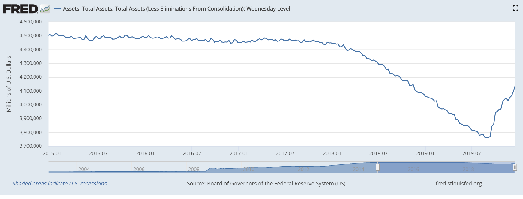
Of course, the stock markets started to sputter in the summer of 2019, as interest rates rose. The US Fed lost its nerve and in September 2019, the monetary printing presses were set back on “brrrr” again.
Below is the updated version of the same chart.
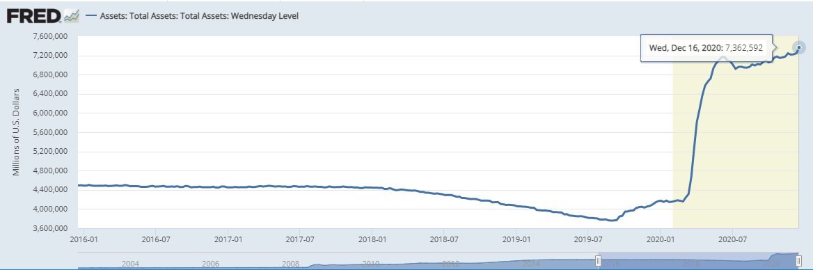
In just a little more than a year, the US Fed added $3.5 trillion, or 90 per cent, to its balance sheet.
Check on the narrow money supply chart in the US. When we are talking about liquidity, we are talking about heroic amounts of money printing; the chart below shows year over year rate of growth.
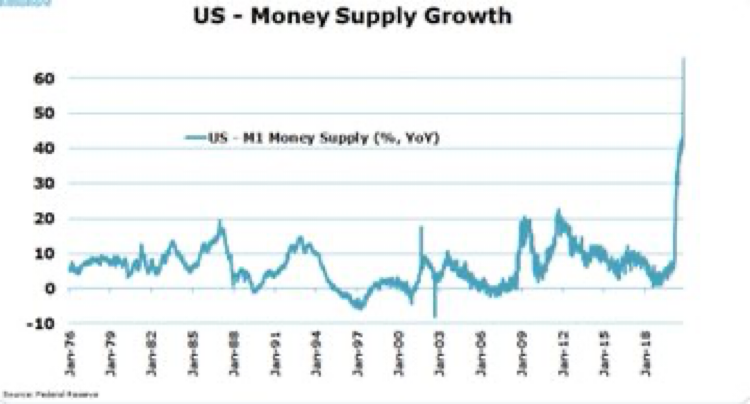
The reason I share these data points in this report is that it is hard for asset markets to correct down in an environment of extreme monetary inflation.
Be careful in your asset mix selection, but don’t bet on the next big decline quite yet.
Summary and a Look Forward:
While preparing for this report I read an editorial written about how easy it is to make money in the stock market. The author used the analogy of a video game.
“Making money by trading stocks is easy. It is like a car racing video game where you drive as hard and fast as you can trying to accumulate as many points as possible. If you crash into a wall, the game resets and you start again trying to make a new high score.”
That is pretty accurate when you think about it.
If every hiccup in the economy is bailed out by more liquidity than could be imagined, it means the time between “resets” is quite short and playing the game to make a new high score returns quickly!
Financially, 2020 was the biggest “game reset button” in history.
Like last year, I want to state there is no point at making a forecast for 2021. There is no way to guess where the path of limitless liquidity leads us.
Strategically, my thought is to continue to watch and respond to what I see happening in financial markets throughout the year.
The areas to watch are clear:
- Liquidity levels in financial markets.
- Interest rates and how they are managed by central banks.
As the world continues to digest the largest liquidity injection in history financial markets remain well supported.
In very general terms I am looking at two pathways to higher inflation in coming years: The first is the “Pedal to the Metal” path. The second is the “Big Liquidity Drop followed by Modern Monetary Theory taken to the Streets.”
“Pedal to the Metal”
This is the more likely of the two outcomes, which is to say the central banks continue to print an oversupply of liquidity and financial assets continue to inflate in price. (More slowly than the recovery in 2020).
The challenge for “Pedal to the Metal” is that interest rates climb higher than expected, and inflation becomes a bigger investment concern.
At some point in this scenario an important event happens. Interest rates climb to a level that they start to stifle debt issuance.
At that time, the US Federal Reserve adopts a framework to control longer term interest rates from going higher. This is known on Wall Street as Yield Curve Control (YCC) measures.
Up until this moment, financial markets will continue to dismiss bad news and surf on the wave of liquidity, but when YCC becomes a thing, investors will have to muster their attention to what happens next…
That could be either a re-acceleration of asset prices more like 2020 after the March 2020 decline, or a sharp decline. There is really no way to guess in advance, so we just have to watch and wait for that to happen…if it happens.
“Big Liquidity Drop followed by Modern Monetary Theory taken to the Streets”
This scenario starts out the same as “Pedal to the Metal,” but something happens to cause a sudden air pocket in liquidity. Asset prices are hit hard, like in March 2020, and the central banks step in to save the day (again).
This would see the S&P500 fall to the bottom end of the “megaphone formations” shown on the chart below.
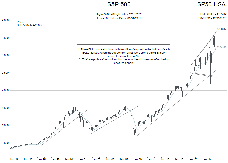
With debt levels as elevated as they are today, the price tag of saving the day, if such an “air pocket” were to form, could possibly reach $100 trillion.
What would happen day-to-day in such a scenario is anybody’s guess, but I can’t imagine that the amounts of liquidity required could just be printed and flowed through the regular financial channels.
The regular channels would be used, but I think two additional channels would be employed:
- Stimulus checks would be sent out directly to individuals. These amounts could be between $10,000 and $25,000.
- Government FISCAL intervention would see direct government ownership and bailout of business and infrastructure mega-projects mainly in the name of saving the environment.
Trying to imagine a dollar denominated price on anything in this scenario is impossible. Financial markets would be chaotic. Hopefully nothing close to this scenario develops in 2021, but it certainly is within the range of “possible.”
If everything turns out to be quiet, and the world returns to relatively normal conditions again after the vaccine is widely distributed, the world will collectively celebrate.
In closing, I begin 2021, with the following general advice for all investors, bulls and bears alike:
Be humble…
For BEARS, it is easy to call a bubble. Anybody can do that. Timing is the hard part.
For BULLS, it is easy to point to the fundamentals and say the present day situation is justified. But history shows that at the end of the last two bubbles, (2000 and 2008) fundamentals were still fine and stocks were down by 30% by the time the fundamentals showed deterioration. The hard part for BULLS is no different than for BEARS, matching fundamentals with price and timing the top of a market cycle. Both are hard to do.
Looking forward to 2021…
Your feedback is welcome.