
Tri-Annual Review
“Committed to Asset Prices”
In terms of market sentiment the contrast to where 2019 and 2020 are starting could not be starker.
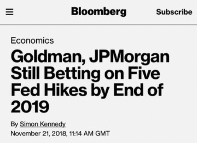
Near the end of 2018, the US Federal Reserve was forecast to stick to slowly raising interest rates and pay down their $4 trillion balance sheet (note the date on the Bloomberg headline below).
Stock prices fell 22% in late December 2018 and the US Fed pivoted away from tightening monetary policy.
Once they had capitulated in fear of what falling stock and real estate prices would mean to an overly indebted world, the markets took off with unprecedented vigor.
Just to show how stark the contrast in sentiment was over the year, below is an interesting graphic depicting sentiment from the day the market bottomed in 2018 to December 2019.
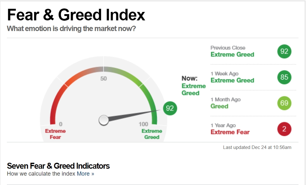
In this image, the CNN Fear/Greed index includes a “one week, one month, and one year ago” section on the right side, which went from late 2018’s extreme fear rating (2) to extreme greed (92) on Dec. 24, 2019.
What changed?
It wasn’t earnings.
The S&P 500 started out 2019 expecting total earnings of about $178. Reality is going to come in around $164, which is on par with the S&P 500 earnings in 2018. Therefore, there was ZERO earnings growth.
In a nutshell, one thing changed…
Monetary policy and the amount of money being printed by central banks.
This is where we begin our look at 2020.
If global central bank policy is driving stock markets, then it is imperative to shift our view of financial markets and monetary conditions, to monetary policy as our major market directional indicator.
The Macro Executive Summary below has been predicated upon the spoken words of global central banks that their long term intention is to normalize their balance sheets and interest rate policy.
As you will see in the body of this report, their words and their associated goals were tossed aside in two phases. First, in the “non-tightening pivot” of December 2018, and second in the “non-QE4 repo program,” which started in September 2019.
Going forward in the weekly comments, I aim to no longer share my view of what should be done (i.e. trimming spending, raising interest rates and balancing the budget), but will report what is being done (i.e. endless money printing).
If the central banks decide to go back to what should be done in the future, I will go back to that worldview for making investment decisions.
For now, with this in mind, let me reiterate and update the narrative as I have seen it since the Great Financial Crisis in 2008.
Macro Executive Summary:
- The “Great Mistake” – Central banks letting Quantitative Easing (QE) run for more than a year back in 2010.
- Ten Years Later – The snail’s pace of raising interest rates continued. Central banks never took back the “great mistake” for fear of stalling asset price increases, but in the final quarter of 2018 stocks declined anyway: real estate stalled too.
- The Panic of 2019 – No it wasn’t investors that panicked…it was the central banks. The Bank of Japan, European Central Bank, and the US Federal Reserve all pivoted from tightening monetary conditions back to loosening them.
- The “Hotel California Economy” – Pathways to interest rate normalization are nowhere to be seen. In 2019, investors around the world scrambled to try and lock in yield on investments. As the old Eagles song hauntingly informed us…You can check out anytime you like, but you can never leave…the highly indebted, low interest rate world was baptized into permanence.
- Asset inflation without growth – Resistance is futile. Looking into 2020, lower asset prices are not considered an acceptable outcome. Any and all means necessary to inflate asset prices will be employed. If that means printing hundreds of billions of dollars every month to create liquidity…so be it. But will interest rates co-operate?
Chart 1 below, is the size of the US Federal Reserve balance sheet. Notice the nearly $400 billion jump that started in September 2019.
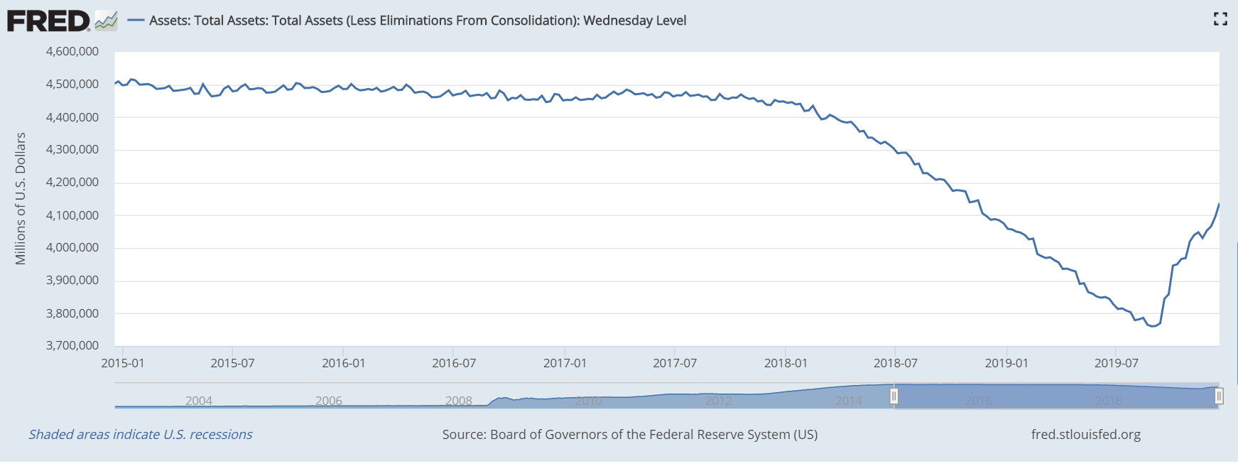
Chart 2 shows the level of overnight repurchase agreements being done by the US Federal Reserve.
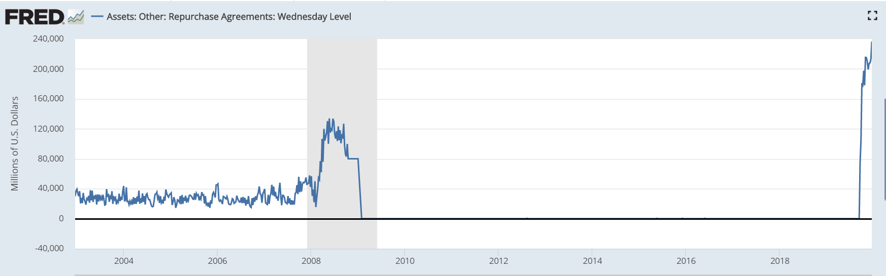
The extreme right side of the chart is actually beyond my ability to fathom in terms of amounts of money.
Finally, I include the US Leading indicator long term chart but to make it a better economic indicator, David Rosenberg, has taken out the stock market component and just left in the economic data.
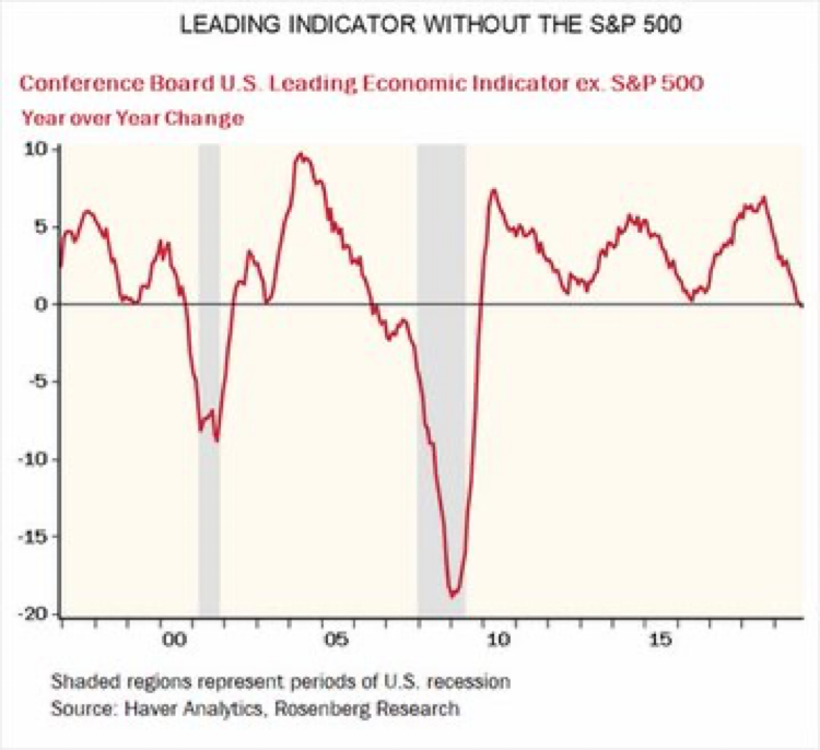
Not exactly the type of robust readings one would expect with a stock market that refuses to take notice of relatively low growth.
Most of the time these weekly comments focus on asset prices and monetary policy, that is what my job is all about, but my last weekly comment of 2019, talked about the long term consequences of financial repression.
The following graphic was first introduced to readers in that post.
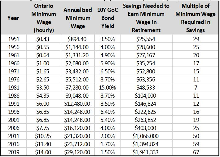
These are the real life results of careless, one-sided monetary policy viewed over a long time period. Savers and people with no assets had no chance to keep up to the costs of the asset based world.
But let’s drill down on the “Multiple of Minimum Wage Required in Savings” column for just a minute. Notice how that multiple stayed quite consistent right up until 2006.
See how the multiple went from 25x minimum wage in 2006, to 50x in 2011, to 59x in 2016 and 67x in 2019.
The huge increase in savings required was not a mistake…it was orchestrated to support the financial system and asset prices.
The book “Credit and State Theories of Money” by Randall Wray is considered one of the founding text books of Modern Monetary Theory and is quoted:
If savers refuse to spend their savings, their savings should be allowed to diminish through inflation. Experience has shown that mild inflation is the least damaging method of curing an excessive buildup of debt.
That is about as callous of a summation of the state of global monetary policy employed during the past 10 years as I have read. Read the emboldened text one more time…let it sink in.
To summarize, in 2020 the financial world is behaving in a manner consistent with expectations of much higher amounts of debt to be created. Fundamental reasons for stock, bond and real estate prices are secondary to the ever increasing demand for more money to be injected into the monetary system.
There is not much I can add to that paragraph to make it easier to understand…that basically sums it up.
It is time to look out into 2020 and make a few of generalizations.
- No central bank intervention…no Bull market
Central banks have boxed themselves into an incredibly difficult position. They have created expectations that they will do “whatever it takes to keep asset prices afloat.” They have also delivered on that expectation during the final quarter of 2019.
If they get nervous about how quickly stocks are going up and begin to talk again about how they might raise interest rates, or stop injecting liquidity into the overnight repurchase agreement markets asset prices will correct lower.
- Stagflation becomes a real possibility
For those old enough to remember the mid- to late-1970s and the lack of growth relative to inflation that took place at that time, well, you might be in for a repeat of that scenario. The difference will be that, in the 2020s, 4% and 5% will become the new 10% to 15% from that era.
I would argue this is a reasonably important idea to consider.
If something like the 1970s stagflation develops then I would further argue that commodity investing will be a much more profitable area to be exposed to than interest sensitive.
A little early to tell, but something to watch for.
- Corrections in markets will be nasty
Why do I say this?
Because there is so much passive investment money in the markets today.
Remember our graphic with the minimum wage comparison to savings a little earlier in the editorial? Most people don’t have enough capital to sit in safe investments, so they went out and took on risk by purchasing stocks and real estate. The process became a self-fulfilling prophecy and investors are pretty confident in their “buy and hold” portfolios.
If anything financial or geopolitical shakes that confidence, there is a lot of money that might decide to retreat to the sidelines in a fairly short period of time.
- The US election campaign is going to be nasty too
Whether that causes asset price volatility remains to be seen, it certainly has the potential too.
Something to think about as we begin 2020.
Some Specific Technical Yardsticks for the Start of 2020
This is not a forecast.
There is no way to forecast what central banks might do or when they will decide to about-face again as they did at the beginning of 2019.
What we can do though, is look at how markets might trade and decide that IF certain things happen, THEN we will make portfolio changes.
We start the year BULLISH on stocks and fully invested in our Tactical Models. The chart below defines where our models start to get defensive for US stock markets.

The 3060 stop loss is derived by estimating where the S&P 500 closing price would intersect the top trend line drawn on the chart. Of course, as time goes on and the S&P 500 keeps rising, the point of intersection keeps rising too.
The fully invested US Tactical Models are a poster-child for why I love using technical overlays for investing in irrational markets.
What if the world really has changed and stock prices are going to rise by another 25% in 2020?
Human nature of investors is going to want to take a profit for fear of a correction in prices that inevitably will come, but by remaining tactical, our models will keep us invested during an irrational move higher in asset prices.
The following charts I want to look at are the 10 year bond yields for Canadian and US government bonds.
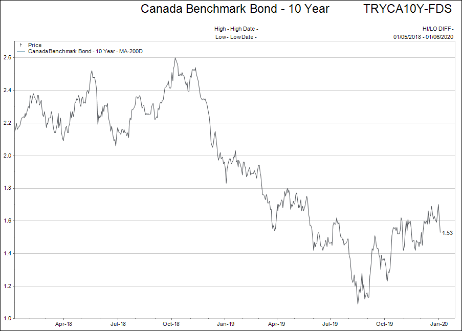
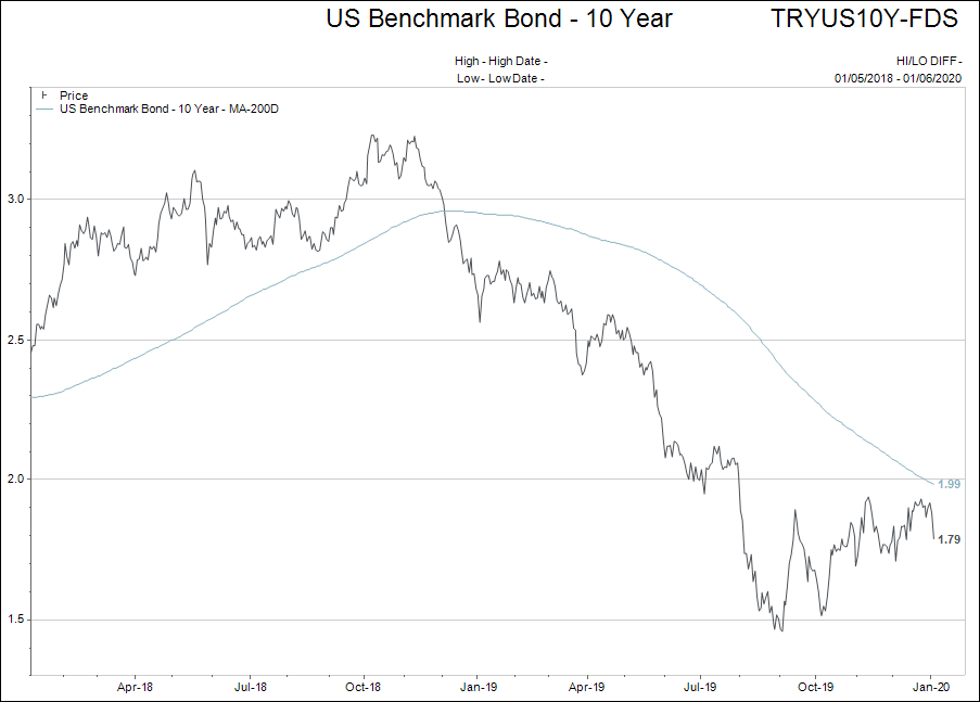
If the central banks are successful in turning back the global economic slowdown, then interest rates will likely continue to track higher.
The 200-day moving averages will be a “stop loss” level for investments in bonds and other fixed income holdings. So far, both of these bond yield charts are yielding a “no decision” type outcome.
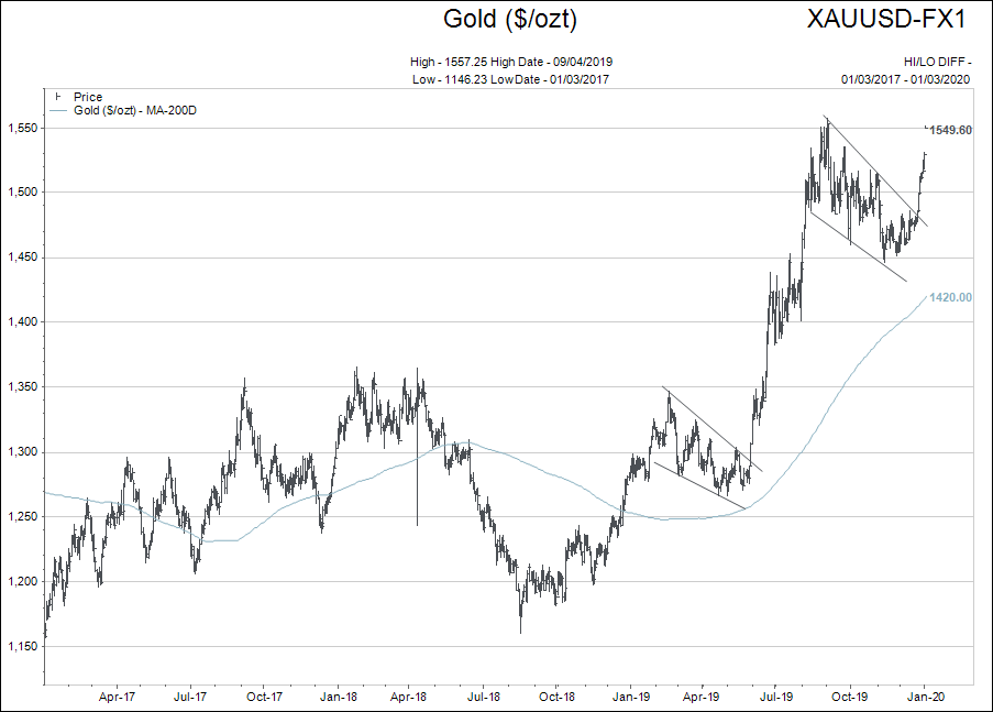
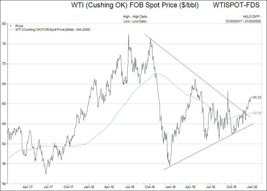
Finally, gold and oil.
With all the talk about bank/utility technology stocks and the S&P 500, investors lose sight of the fact that the Canadian gold stock index (XGD-T) went from $11.62 on Jan. 2, 2019 to a year end close $16.29 for a 40.19% rate of return. Gold bullion in US dollars rose 21% for the year.
The Canadian oil stock index was virtually unchanged over 2019, but the US dollar price of West Texas crude went up just under 28%.
It will likely pay for investors to broaden their sights past the market capitalization weighted stock market indexes at some point in 2020; these indexes are just so expensive on a historical scale.
Coming off excellent years in 2019, gold stocks are not cheap either, but they are under-appreciated by hedge funds, pension funds and mainstream investors.
If these types of portfolios decide to make an asset shift to gold or oil exposure, it could be likened to an elephant trying to fit through a key hole and prices could move up sharply for both.
With those thoughts, I humbly enter the investment year of 2020.
There truly are no historical comparable years to try and gauge our investment actions by and the entire world simply has to watch and wait.
Please standby.