
The U.S. Recession Scorecard created and maintained by our investment committee at RBC has historically been a very useful tool in its ability to decipher the state of the U.S. Economy.
There could not be a more timely moment to revisit this.
For those who have not seen the scorecard previously, it works follows:
Green is Expansionary
Yellow is Neutral
Red is Recessionary
The scorecard indicators remain mixed, including a shift in the yield curve indicator.
The government shutdown has limited employment data, confirming a cautious investment approach is needed, as ongoing policy and trade shifts affect the economy
RBC U.S. Recession Scorecard continues on at an indecisive setting…..however, there is one change of note: the yield curve indicator has shifted back to neutral Yellow from recessionary Red.
Meanwhile, the government shutdown has already removed current employment data— unemployment claims and the unemployment rate—from view, and that potentially means there won’t be a “clean” read from any of our indicators perhaps into next year.
The mixed state of the scorecard indicators argues for a watchful portfolio investment approach, particularly in a world where policy is in flux and the effects of ongoing trade shifts are still not yet visible.
Yield Curve Shifting - Neutral.
Short-term Treasury yields—in this case, the market yield on the 1-year T-bill—fell below the 10-year yield back in December 2024, reverting the yield curve to its normal shape in the process.
Despite that, we left this indicator in the recessionary Red column for the past nine months because typically in past cycles, when such a crossing point has occurred—usually in response to the start of Fed rate cutting—the recession arrives anyway.
However, in this instance, the Fed cut three times in Q4 of last year.
Changes in monetary policy are thought to act with a lag of 6 to 12 months. As such, we are now in the window when the effect of those rate cuts should be showing up as some visible improvement in the economic backdrop.
Consumer Spending – Yellow
Better-than-expected consumer spending in the summer and strengthening new orders for capital goods by business suggest that may be happening. This indicator shifts into the neutral Yellow column.
Fed Funds Rate vs. Nominal GDP - Red.
Before every recession, the federal funds rate has managed to climb higher than the annualized run rate of nominal GDP (ex- inflation). That occurred briefly in the summer of last year, just before the Fed began cutting rates.
Flagging GDP growth has once again put that condition in place, reaffirming its reading at recessionary Red.
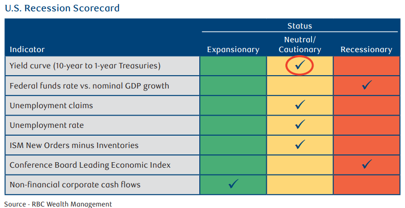
Unemployment rate - Yellow.
It was quiet before the shutdown, as it has been for quite some time.
ISM New Orders minus Inventories – Yellow
Tariff distortion clouds the picture. This is another indicator that should not be directly affected by the shutdown. However, it currently remains trendless. We’ve also left this at Yellow.
Conference Board Leading Economic Index – Red
The long slide continues. The LEI has now declined in 40 of the past 44 months. It has never reached these levels in the past without a recession arriving. It remains firmly in the Red column.
Free Cash Flow Of Non-Financial Businesses - Green
This measure of the capability of non-financial businesses in aggregate to self-fund capital expansion has always declined as a percentage of GDP before or just after a recession got underway. While it has not done so yet after the Q2 data release in September, this data is reported with a long, three-month lag. The next release, hopefully, is in December
As always, please let me know if you have any questions or comments.