

The title of the post is a bit of a play on the famous saying attributed, possibly erroneously, to Benjamin Disraeli. Mark Twain quoted Disraeli as saying, “There are three kinds of lies. Lies, damn lies and statistics.”
In Mark Twain’s time, statistics mostly appeared in written form. Today we have graduated to a more visual and sophisticated way to use statistics - the chart. Because we are visual learners, charts and graphs can help turn a complicated statistic into a simple to understand concept. Of course, they can also be used to muddle the picture. To be one of the three kinds of lies.
In finance, we love to use charts. How much would your $1,000 be worth in 30 years if it compounded by 7% annually? I could write the answer (it’s $7,612) or I could show you this chart, which has an incredible effect on your brain because it takes a difficult concept (how did you get to $7,612?) and breaks it into an easy to understand visual (ah, those yellow dots are how you got there).
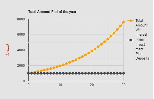
That chart took me 12 seconds to make online and it’s fairly simple and has a positive emotional response for anyone that sees it. What about negative charts? Well, they do exist and it is very important to understand how to spot them so you can learn to ignore them.
This chart is a real doozy.

This chart crime was posted recently by finance person in the United States. They were trying to scare show people that this year is looking exactly like last year, reminding you of your painful memories of your portfolio’s drop from October to December. Remember, we feel loss twice as much as we feel gain so a chart like this is designed to make you afraid, which is then designed to make you do something to avoid the pain you felt last year.
This would be fine if the message it was trying to convey was true, but it isn't. There is absolutely NO correlation between 2019 and 2018. Zip, zilch, nada. I take the train to work every day. That doesn’t mean the delayed trains I dealt with in December of last year are going to happen again this December. The stock market COULD go down this year again, but it has nothing to do with them going down in the same period of 2018. Conveniently left off this chart was 2017, when the S&P 500 went straight up the entire year. 2018 wasn’t impacted by 2017’s results and neither will 2019 be impacted by 2018's results.
This next chart depicts one of my favourite tropes of the investing world. To catch you up on things, 1987 stands out in stock market history because of the Black Monday crash on October 19th when the Dow Jones fell 22% in a day. It stands atop the memories of any stock market participant over the age of 55. But be careful when someone trots out the 1987 comparison chart, like this.
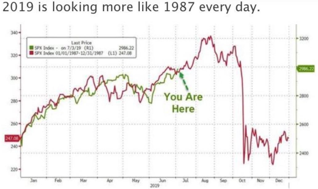
This is using weapons grade charting to create a negative emotional response to one of the worst stock market events in history. Of course you don’t want to wake up on a Monday and see your stocks are down 22%. No one wants that. But what is missing from this chart is everything that lead up to October of 1987. The economic environment. The previous stock market performance. It definitely ignores things like monetary conditions and the general mood of investors. All of these and a hundred other inputs are what makes any market.
This is a really important point to remember whenever anyone tries to compare current times to the past. Nothing is the same as it was back then. Not even last year. We live in a world of constantly changing variables and each of them interacts with the others in new ways. In Physics, there is the Three Body Problem which essentially deals with the trouble of calculating the trajectory of three celestial bodies that interact with each other. Finance and investing has a thousand body problem, which makes any chart trying to compare two different time periods especially pointless.
Look at charts for what they are. Simple visuals that help make a statistical point. Just remember that much of what you are seeing in a chart could fall into the category of lies, damn lies and statistics.