
A Historic Week
- US inflation = +8.6% (Highest since 1981)
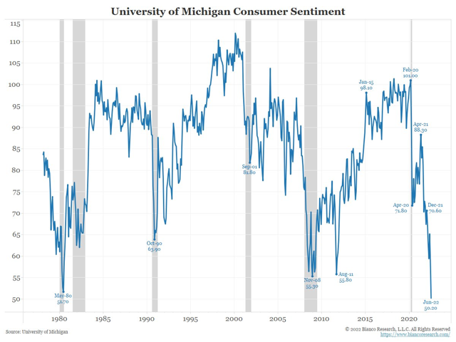
- Consumer Confidence U. of Michigan = 50 (Worst reading EVER)
- US credit card debt – Fastest increase EVER
- Grocery prices - +11.9% (fastest since 1979)
- Chicken prices - +17.4% (fastest EVER)
- Restaurants - +9% (fastest EVER)
- Fuel oil +107% (fastest EVER)
- Electricity +12% (fastest since 2006)
- Rental prices +5.2% (fastest since 1987)
- Airfares +38% (fastest since 1980)
- Services +5.7% (fastest since 1990)
Where all this data leads is to a difficult decision for our politicians and our central bankers.
Do they keep pushing interest rates higher to rein in inflation but push down real estate and stock prices?
Or do they capitulate, once again, and save real estate and stock markets but watch inflation continue to rip higher like the opening statistics show?
I have no idea what happens next. Neither does anybody else…to be honest, I don’t think our leaders know what they are going to do.
Let me add one more chart to show you why this time is different for our leaders.
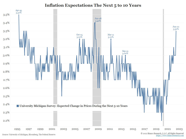
This chart shows inflation EXPECTATIONS for the next 5-10 years. The trend on the chart is growing higher exponentially. Inflation expectations are a self-fulfilling prophecy to the future. If someone believes the prices of things are going higher, they will buy more now to lock in their price.
To see actual inflation move lower again, we need to see inflation expectations make a peak first.
Last week I chatted about consumers and how inflation is impacting their lives.
Let’s take a look at sovereign governments around the world and see what their debt to GDP ratios look like.
The following chart was presented at John Mauldin’s Strategic Investment Conference a month ago by GavKal research.
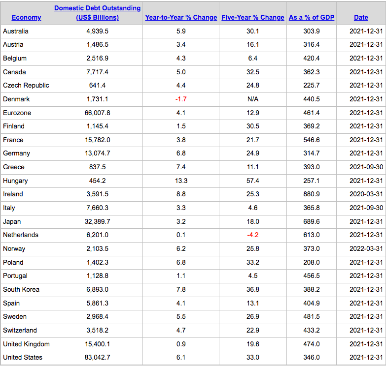
The key column is the second to last where it shows the debt to GDP ratio of the nation. Twenty years ago, these ratios would have mostly been around 100% - 150% with the exception of Japan.
Now at levels averaging closer to 400% debt to GDP ratios, governments are struggling to cope with the higher interest rates too.
To conclude this weekly comment let’s look at a couple of my favourite charts that I use to see the bigger picture.
Chart 1 shows the S&P 500.
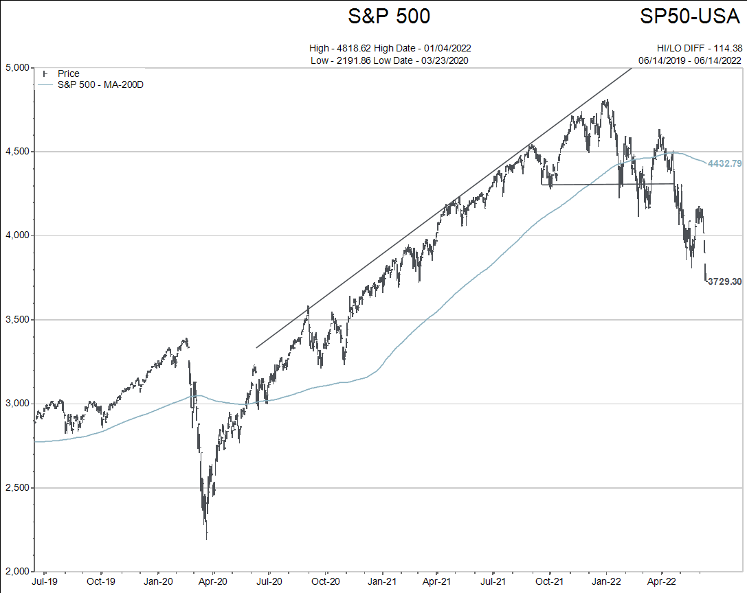
Another lower low price made since the release of the economic data referenced at the beginning of the comment. US stocks see further upside in inflation and interest rates in coming months.
The next charts show Canadian 10 year bond interest rates. (The first is a 3 year time frame and the second is a 15 year time frame).
The jump in yield you see on the chart happened in less than 4 days, again tied to the economic data released last Friday referenced at the top of the editorial.
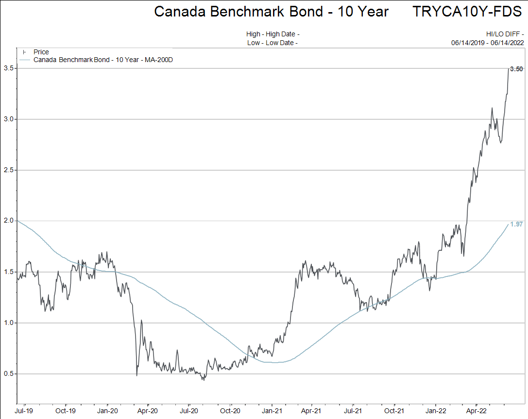
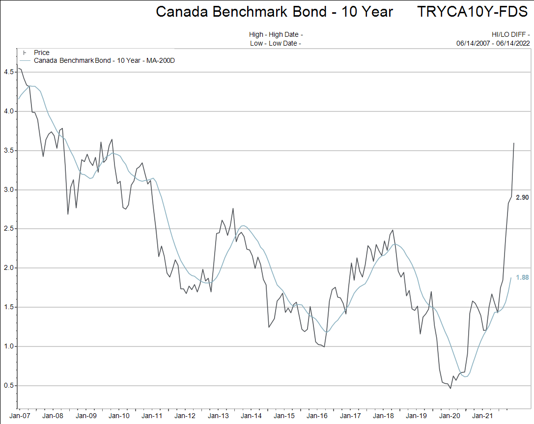
What is happening right now is historic in nature.
As I have said before, my perspective is that all of your portfolios have reduced stock market exposure to a comfortable level that you are able to hang on through “the BEAR market” with.
If you don’t feel that way, please email me back and I will call you.