
Fundamental and Technical View
For US/Canadian Stock Markets
It was a rather nasty week for markets. Quality portfolios have held up much better than speculative which bodes well for most long term investors.
Thursday, I sent out a short note issuing a SELL signal. It was the first such signal since March 2020.
Before I begin, a couple of caveats and assumptions:
- The TSX Comp and S&P500 are dominated by a select few large capitalized companies. Therefore, index performance will likely diverge from portfolio performance that is not index invested.
- Earnings projections up to now are based on people feeling the positive side of the wealth effect. That means that people are still feeling “rich” with their fat portfolios and bloated home values. IF assets prices fall, the economic demand curve will shift…maybe a lot. Treat earnings projections for non-regulated companies with some skepticism at this point in time.
- As asset prices weaken, the thought process is that the yield curve will flatten and there will be fewer interest rate increases than feared. This may prove to be a poorly rationalized thesis.
Point number 3 is where we begin our fundamental view of the coming year or so.
The problem with hoping for fewer interest rate increases is that the global central banks waited WAAAAAY too long to start raising interest rates. Relative to inflation, central banks have a lot of ground to make up.
Even the four interest rate increases anticipated at this point in time, with inflation subsiding to the 5% range, would leave REAL interest rates very negative still.
We need to reinvestigate the chart from last week’s comment to properly drive this point home.
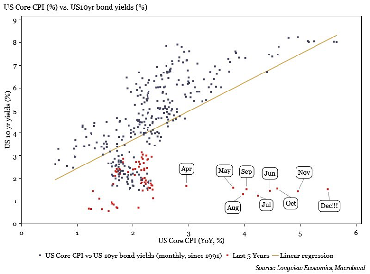
This chart graphs the US inflation rate on the x-axis and the 10 year bond yield on the y-axis. To combat inflation the dots on the graph must find a pathway to get closer to the regression line that slants from bottom left to top right on the chart.
There are only two ways to shift the line:
- Higher interest rates
- Lower inflation
(**There is the third option of an asset value crash but that is what we as investors are trying to avoid so it does not factor into my thesis of preparation. In other words, if assets crash in value and we as investors did nothing, our original investment process was flawed).
The conundrum for central banks is, without higher interest rates, inflation will not naturally decline. It will moderate, but not back to a level commensurate with near zero interest rates.
Let’s apply the basic principles above to the real world financial markets.
From managing money for the past 34 years and understanding that the driver of asset prices is LIQUIDITY the real question I am asking myself is how long will it take for the central banking community to stop fighting inflation by pushing higher interest rates and reducing quantitative easing?
Well, I guess we will all find out the answer to that question at the same time. By my estimation, the problem with hoping the central banks lose their nerve in terms of tightening liquidity sooner rather than later resides in the earlier chart.
The central banks let the dots on the chart stray too far away from the regression line. They must close the gap by at least one of three things happening; (1) lower inflation, (2) higher interest rates or (3) asset price declines changing human behavior.
Failure on the part of the central banks to have the courage to close the gap on the chart will revert the financial markets back to all of their old ways. Stocks will go up, bonds yields will go down, real estate prices will keep rising and inflation/wealth inequality will continue to grow.
Remember, the difference this time, in my humble opinion, is that the politicians are wanting a rebalancing of wealth inequality. Consumers are concerned with inflation…everyone is now talking about it…something needs to change…and either politicians start to “fight” inflation or they get voted out.
The technical view of the stock markets in Canada and the US is where we look next.
Chart 1 is a clean look at the last two years for the Canadian TSX index. I have only included one technical line – 200 day moving average. As most of you know who have worked with me over the years, I have used the 200 day moving average as the most basic of my technical behavior indicators since 1998.
The simple rule is – if the index is above the 200 day moving average then proceed with you long term investments and short term speculations as you see fit. If the index is below the 200 day moving average line, proceed with caution.
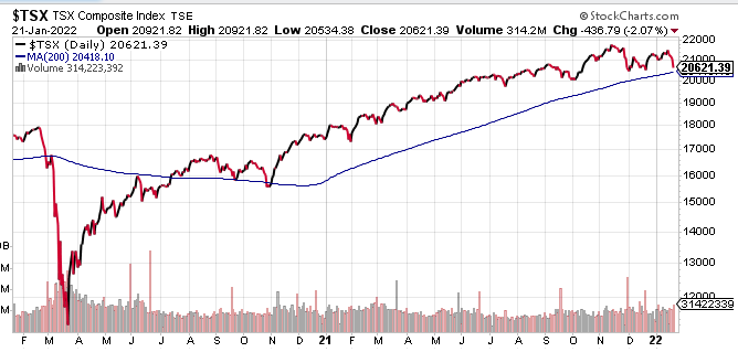
The TSX Comp has been above the 200 day moving average almost entirely since July 2020. (A quick dip below in late October 2020 did take place). The TSX is still above the moving average as I write this commentary on January 22nd.
Therefore, this note is a “shot across the bow” for your Canadian investment holdings. I have started to take some preemptive defensive action in portfolios based upon the fundamental conundrum written about in part 1 of this commentary, but technically there is no warning sign yet.
As for the broad index of US stocks (S&P500) you can see by the chart below that the 200 day moving average has been breached.
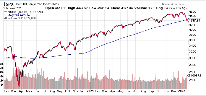
The close below the blue 200 day moving average line is the first such close in over 400 days dating back to May 2020. Here, defensive measures are warranted as per the SELL signal issued on last Thursday.
Summary and Call to Action:
The most important point I can stress with investors at this stage of financial history is that you must know what you own. If you do not know, then either find out or get rid of it.
Let me give you an example. If you own shares in Fortis Inc. you know that the company has a stable earnings stream of $2.63 per share and a dividend per share of $2.14 per year. This give you a yield on your investment of 3.63% per year without factoring any capital gain or loss.
Because the business is stable and utility-like the risk of a massive fluctuation in the company fundamentals are relatively low.
Therefore, if the price of Fortis Inc. shares decline you can add money to the investment and earn a higher yield on the new money added because the dividend does not change. In other words, if the price of Fortis Inc. declines, the value of the company’s shares IMPROVES and the risk of owning the shares declines.
A second example is Bitcoin. Bitcoin has no economic or enterprise value, pays no dividend, and has no earnings. So here is the ironic twist of fate that happens to Bitcoin. (Rather than writing my opinion I will use a direct quote from Nassim Nicholas Taleb).
For a contagion driven asset with no economic anchor such as Bitcoin, a falling price does not make it cheaper and more attractive. A falling price makes it less desirable and, paradoxically, more expensive because it is only information.
Can you see the difference?
You can argue that the future of finance is crypto currency and you may be completely correct. But that is a story/narrative based upon belief and information and is grounded in nothing tangible at this point in time.
As for a quality, dividend paying, profit driven business that is in a stable industry, there are tangible measuring sticks we can use to compare the present price of the company to its own past and the past relative the other investment choices.
The first step in your analysis of your investment holdings is to decide which of these categories each of your investments falls into.
The second step is to make sure you are comfortable holding your portfolio through an entire business cycle.
The financial news is filled with opinions about how the newly initiated monetary tightening cycle will play out. Everyone has their own opinion and, truth is, nobody knows.
My opinion is that the central banks will continue longer than expected to tighten conditions while ignoring the drop in asset prices (stocks and real estate) to try and make up lost ground on real interest rates. (Try to move the red dot up closer to the regression line on the chart shown in section 1).
But that is only my opinion.
Maybe the central banks panic next week and walks back all their hawkish comments about interest rates and the financial markets jump back into party mode again? Who knows?
You have to be able to live with both outcomes and you should not be “betting” on one outcome over the other. That is called speculation, not investing.
I have no problem with speculating…let’s just make sure we are never calling our holdings by the wrong names. It is up to you to decide which of your holdings falls under which category.
That really all you have to do. Be honest with yourself. Look with clear eyes and non-biased objectivity at your holdings. If you are holding too many risky assets; fix the problem.
If you have too much outright stock market exposure to be comfortable in a longer term falling stock market based upon central banks not backing off their goals to raise interest rates, sell some holdings. You can always buy them back.
Bull markets make everybody a long term, buy and hold investor with a larger percentage of their portfolio than they were once comfortable with in less exuberant times. That happens for two reasons:
- People take more risk when it is paying off.
- The value of their risk investments increases becoming a larger percentage of their net worth.
The present bull market cycle added the additional problem of interest rates paying nothing so that people felt compelled to take on risk assets.
When we get early sell signals, at least rebalance your holdings back to what they were in years past.
It is up to you to be honest with yourself about your risk tolerance, and if you think we should discuss these ideas I look forward to the conversation.
My goal is to shape your portfolio in a way that balances your risk tolerance and your objectives.