
This is Not New…
Last week’s comment drew a question back from a reader that gave me some good fodder to write about this week.
Question: What if interest rates never go back up? Would that not be the perfect solution to all our problems?
In May of 2013, investor Paul Singer wrote the following passage linking to his semi-annual newsletter:
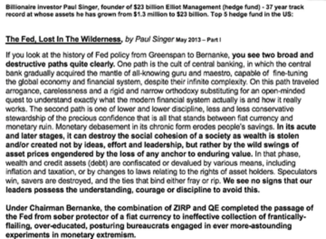
Remember, this was written in 2013, when we were all still “babes in the woods,” relative to debt and Fed manipulation of the present day.
I wish to emphasis the truth of the final emboldened paragraph Mr. Singer wrote.
Undeniably, central banking is more extreme in 2020 than 2013. The question is, are we now “in the acute and later stages” of the central banking experiment or are there more innings to come?
The damage done by these policies has been and wide reaching. The easiest place to clearly see the damage is in currencies purchasing power.
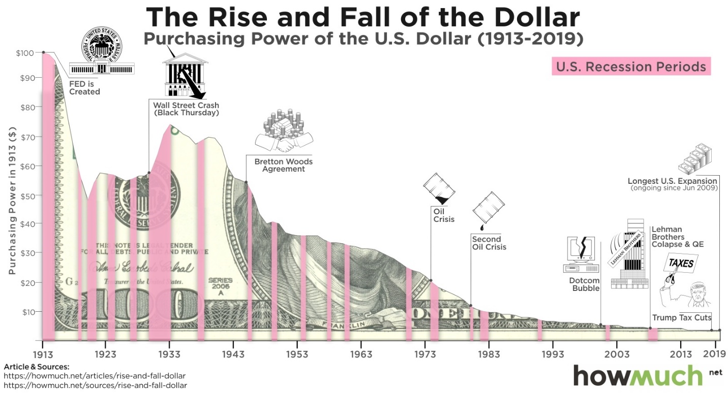
For example, the chart above shows the devaluation of US dollar has been huge.
The devaluation of paper currencies does not speak to relative valuation of asset classes, but are assets really more expensive today than they were 20 years ago, or is it just paper currency devaluation?
I was trying to think of an interesting way to answer this question. The key was to find a constant algorithm used to measure relative valuations over a long period of time.
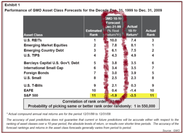
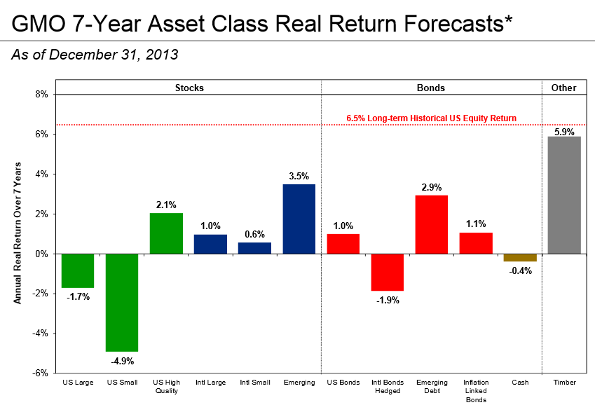
Below are the projected EXPECTED rates of return per year for different major asset classes as calculated GMO Advisors (The 1999 graphic does not use exactly the same categories, Mr. Grantham simplified things in later years. But the process used to arrive at the expected rates of return is consistent).
1999 Forward Expectations (10 years)
2013 Forward Expectations (7 years)
August 2020 Forward Expectations (7 years)
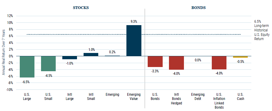
I wish I had thought about using the GMO projections over time like this earlier. It really helps us visualize how far down expected rates of return have come over the past 20 years.
The figures you see are per year rate of return expectations based on relative value. They are not total return over the seven year period. To be clear, U.S. large cap companies would have to lose 6.5% per year for seven years (or 52% total), to get back to a historical normal rate of return expectation.
But even worse from the above chart is the “Bond” matrix of returns.
Please take a close look at the bond side of the matrix. All negative returns now projected over seven years.
Think about (a) the sheer amount of money we are talking about in the total valuation of global bond markets with expected negative seven-year returns and (b) what this means for traditionally balanced portfolios and pension funds.
Now here is the really crazy part of this bizarre investment reality we find ourselves in today.
None of these valuations matter yet. The stimulus programs being employed by central banks are not exhausted yet. The central banks are not finished destroying paper money. In reality their own past actions for their hands to continue to suppress interest rates via monetary assassination.
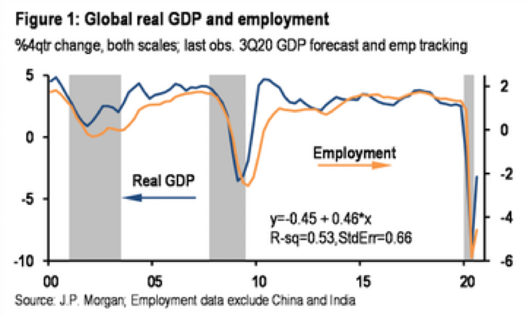
The chart above is GLOBAL unemployment and GDP. The pandemic gave the central banks the cover to move to brave new levels of insanity. After a brief pause in US Federal Reserve central banking activity in September, the global central banks are back in full swing as of the first week of October.
This means the likely direction for stocks is higher yet.
Actually, it means the rate of growth for stocks and real estate may still accelerate.
Could we be setting the stage for the 1999 run higher in stock markets around the world?
Below is a chart of the tracking share (QQQ) for the NASDAQ from April 1999 to the end of 2000.
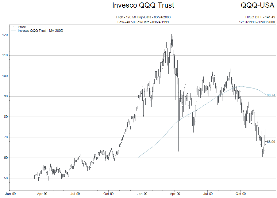
Notice the sharp acceleration higher in October 1999 when the US Fed started prepping the financial markets for the Y2K fear that computer programs would not handle the flip over from the 1900s to the 2000s.
Below is a chart of how the NASDAQ is tracking relative to this time period in 2020. The monetary primer is the same…let’s see what happens.
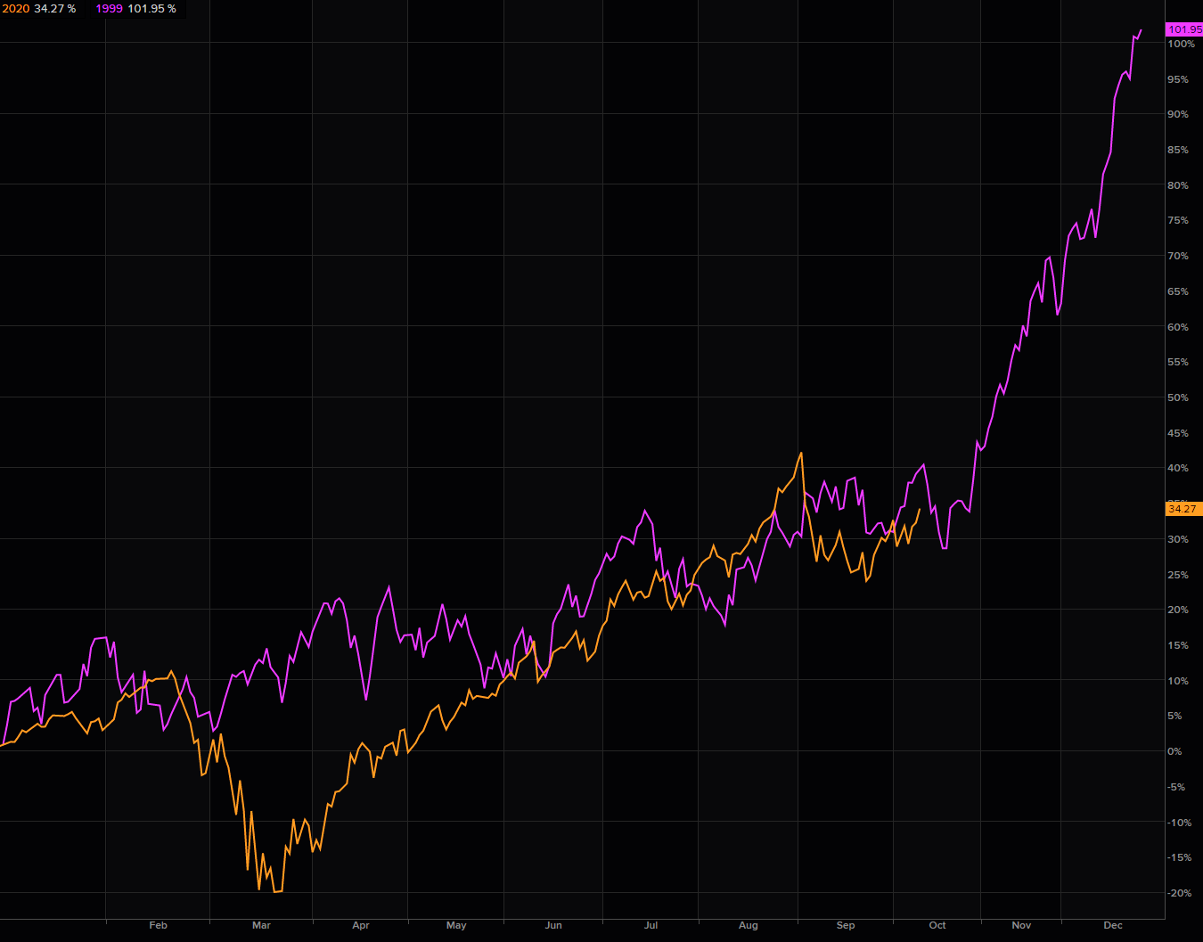
With Donald Trump sliding further in the polls and the likelihood of a contested election fading fast; with China ramping up its money printing in order to try and manipulate its currency, and with the knowledge that the Democrats (if they win as expected) are going to come out of the gate with a huge number of money-spending programs, well…you just might see a 1999 replay.
But investors must have a defensive set of stop losses built into their strategies for investing. Buy and hold is going to be a difficult discipline to adhere to once investors begin to lose money on stocks, bonds and real estate at the same time.
That will happen when central bank omnipotence is seen in the same light as the emperor’s new clothes.
Ok, I have made some bold statements.
But refer back to Paul Singer’s 2013 opening quote…and then think how much crazier 2020 is than 2013, in terms of central bank monetary policy.
Be wise and think for yourselves. Don’t get lulled into complacently by the “buy and hold” crowd unless you really believe in that doctrine.
Remember, my base forecast for 2021 is the forming of the “megaphone” chart pattern.
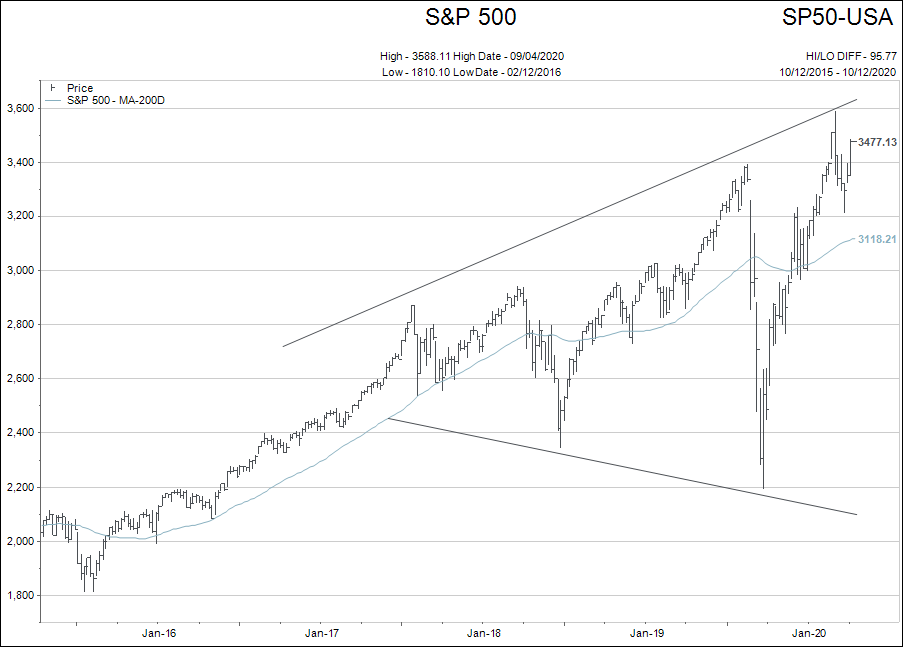
That formation leaves tons of room for Paul Singer’s “wild swings in asset prices engendered by the loss of any anchor to enduring value,” to come to fruition.
Feel free to ask questions and share your feedback.