
“Survival of the Richest”
There were so many titles I toyed with to start this blog. The quick and dirty idea I wanted to look at is “why was the US Federal Reserve so specific in telling the world how it would handle interest rate policy for the coming two years?”
A simple message that would have left the Fed with far more options to change course in the future would have been: “We foresee possibly one interest rate increase in 2019 and will stay data dependent on policy.”
What we got was the following:
- No interest rate increases in 2019
- One interest rate increase in 2020
- Quantitative tightening (QT) of $50 billion per month is reduced to $35 billion per month until September and then it stops completely
- Mortgage Backed Securities owned by the Fed will not be rolled into Treasury bonds rather than retired (quasi QE again!).
That is a lot of detail and huge change in style, not to mention leaving little room to change course as the years’ progress.
Don’t let the irony of such a message escape you.
Three months ago the US Federal Reserve made a 180 degree policy change from three or four interest rate increases in 2019, to zero increases. That was only three months ago…and now they are forecasting the next two years with certainty? Wow…
Again, why such a high level of detail to the Fed message? Especially when stock markets are almost at all-time highs again?
Maybe the Fed still felt some political pressure from the Trump led White House to make sure they continue to enable the survival of the richest people in the US?
Maybe they really are nervous a recession is approaching and want to do everything in their power to investors the confidence that the Fed has the markets back?
I don’t know…but I was very surprised.
Below, the rest of the weekly comment considers how the stock market can continue to go significantly higher from here even though valuations are rich by holding fast to their “money printing mandate.”
Make the Denominator Bigger (AKA “More Cowbell”)
RBC Dominion Securities technical analyst Bob Dickey wrote a report calling for the present BULL market in US stocks to continue. In the report he expects the S&P 500 to continue higher for another 10 years or so.
The graphic below visually shows what Mr. Dickey is looking for.
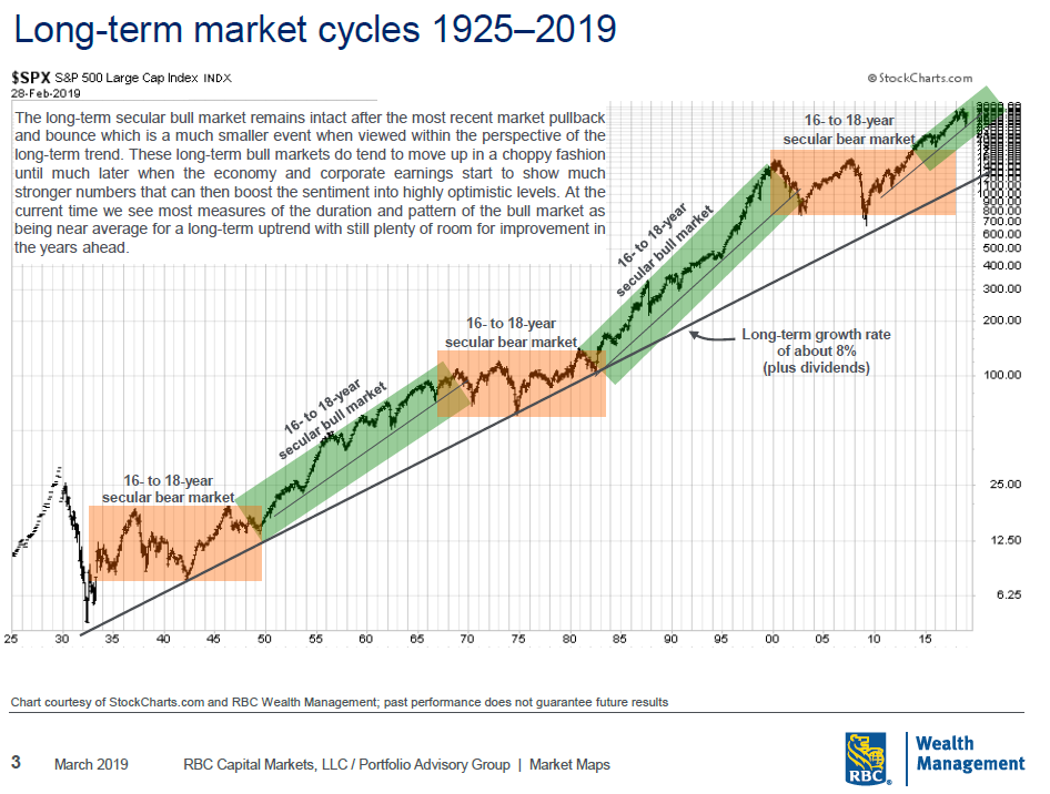
The key comment in the printed section of this chart states “these long term Bull markets tend to move up in a choppy fashion until much later when the economy and corporate earnings start to show much stronger numbers that can boost the sentiment into highly optimistic levels.”
There is no reason to doubt the possibility that corporate earnings could ramp up from here and the case for a further ten year run in this BULL market.
But the reality is, for that to happen, the “global monetary base” needs to get much larger.
Nick, what are you talking about when you say global monetary base?
What I am referring to is the amount of central bank money printed to keep the global ocean of liquidity intact and interest rates low.
If we think of the global monetary base as the “denominator” in a ratio and stock prices as the “numerator” it will help you understand why nominal stock prices can keep rising with an expanding base.
10/20 is the same ratio as 50/100, yet the number 50 is five times larger than 10! Makes sense…right? The ratio hasn’t changed, but the nominal numerator is five times larger than in the first ratio.
With apologies to the old Saturday Night Live skit with Will Farrell and Blue Oyster Cult, the markets are anticipating a much larger denominator being created via lots more central bank printing or lots more “cowbell.”

Ok…that is the theory, but does stock market VALUATION follow the ratio narrative outlined above?
Chart one (by Doug Short from Advisor Perspectives) shows the relative value of the present stock market.
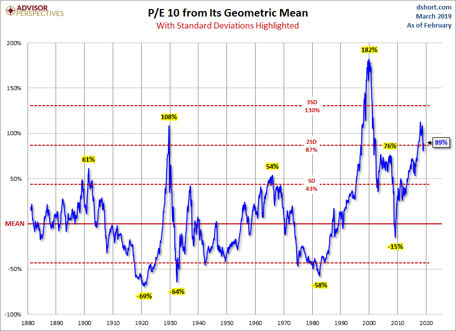
During the past nearly 100 years stocks have only been this expensive three times; 1929, 2000, and 2018.
The next chart is the one I want to focus on closely.
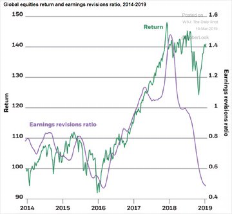
The purple line represents global corporate earnings revisions and the green line shows global stock market returns in US dollars.
Something very strange is happening in this chart. The divergence of stock prices from their underlying earnings is historic.
Why would this happen?
The stock markets are expecting a flood of new money to flow in from the central banks to prop up the slowing global economy, or a lot more “cowbell.”
Let’s look at one more chart to add a final angle to this interesting divergence.
Why would investors continue to buy stocks if they saw the earnings trend deteriorating at the rate shown in the chart above? Who would really do that?
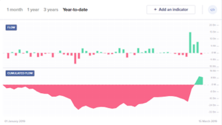
The chart above shows the “net money flows” into US stock exchange traded funds (ETFs) for 2019. If the graphic is red, then there was a net outflow from ETFs. If green, it was a net inflow.
Up until last week US ETFs saw net redemptions in 2019 even when stocks were rising. Wait, what?
You mean the stock market went up nearly 20% and investors were net sellers of index investments in the US?
Yes, Sir!
Who bought all the stock?
The next chart offers a decent clue.
US Cumulative Share Buybacks (Yardeni January 2019)

At the present rate of US corporate stock buybacks, US companies will end up buying back over $1 trillion in stock again in 2019!
That amount of buying has a powerful impact on prices of companies.
So let’s summarize what is being outlined above:
- The long term BULL market in US stocks is intact.
- The underpinnings of the BULL market are quite different from the BULL markets pre 2008. The present BULL market is predicated upon higher amounts of central bank money, lower interest rates, and continued corporate buybacks.
- In other words, “more cowbell!”
It is absolutely fine and correct to be BULLISH on stocks under these conditions as long as one understands what the BULL market is built upon.
The graphic below shows economic expectations (Morgan Stanley) out until 2021. Not exactly data expected to incite a great BULL market from present day valuations!
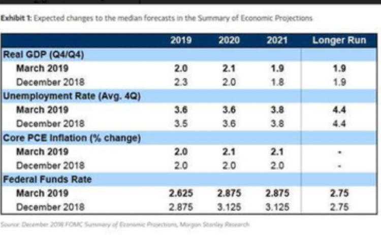
Ah…but more cowbell. Now we’re talking!
All kidding aside, if the expectations for “more cowbell” shift again like they did in 2018, investors should remain vigilant in their tactical approach.