
Pure Canadian Content
There is a lot of banter in the financial press wondering if “we” are going into recession?
The trouble is most of the “we,” refers to US data and not Canadian.
This week we will focus on Canada.
Tweeted by Lakshman Achuthan of ECRI, let’s begin with a look at the Canadian Short Leading Index chart below.
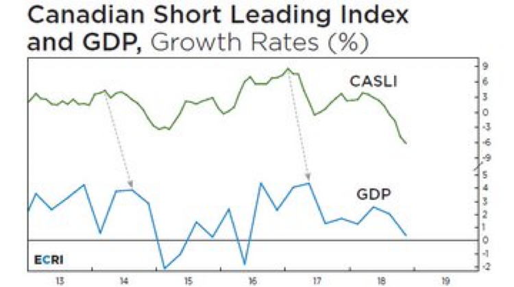
Above, the green line represents the index and the blue line is Canadian Gross Domestic Product. Clearly, both lines are in definitive downtrends, but it is too early to call a recession.
For Canadian investors there is an important historical fact to understand here. By the time the Canadian Short Leading Index and Canadian GDP confirm a recession…the recession will be more than halfway done and stock prices may be 25% cheaper than present.
Because of that reality, we stick to using our Tactical Approach to allocating exposure to stocks.
What are other indicators in Canada saying about the probability of a Canadian recession?
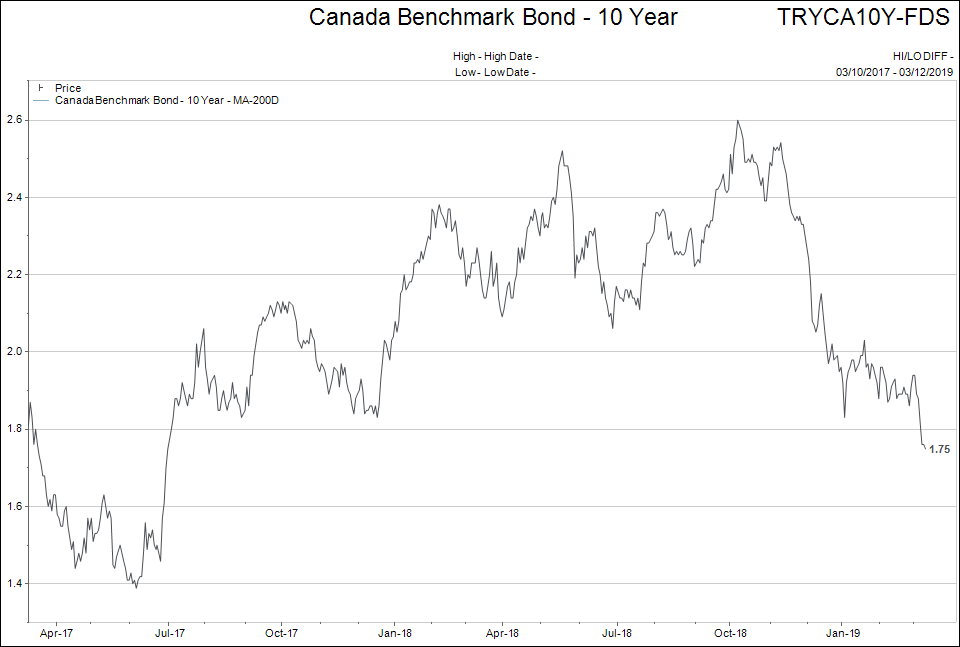
One area that is a good leading indicator to watch is longer term Government of Canada bond yields. The lower the yield the more likely an economic slowdown is in our future.
The ten year bond chart below shows yields going from 2.61% in October 2018 to 1.75% as of last week.
Note that was a period where we were being told that “interest rates are on the rise in Canada.” (It was only on March 6th, that Stephen Poloz stated that interest rate hikes were NOT imminent).
As we have shown before in these comments, I like to watch for “yield curve inversion” as another sign of economic weakness.
The chart below shows the yield ratio of the 10 year bond and the 1 year bond. It shows the difference between the 10 year and the one year bond in the top window, and then the actual yields, and the 10 year and the one year bonds, in the bottom window.
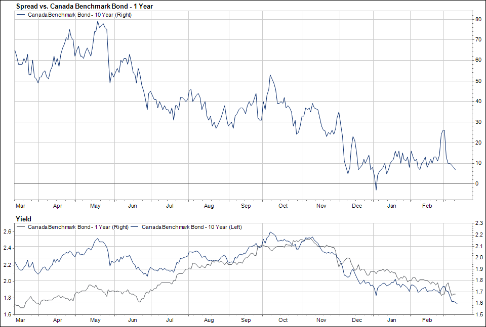
Both yields are heading lower, but the ratio is staying fairly constant. Again, this ratio is “flashing amber” as absolute yields continue to decline, but nothing more serious than that.
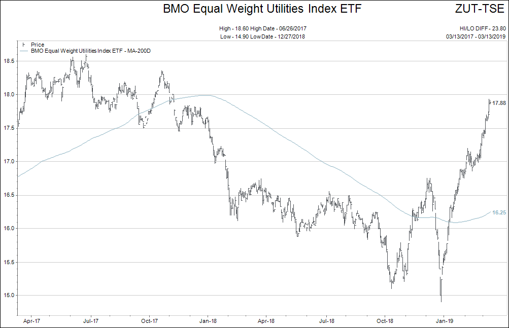
A third investment outcome that tends to portend a possible recession has been the performance of the Canadian Utilities Index.
Why would the rise in the utilities index be a sign of possible recession? Because lower interest rates that accompany a recession make both the dividend yield and the stable earnings stream of utilities attractive to investors.
*The graph is for illustration of performance, not a recommendation to buy.
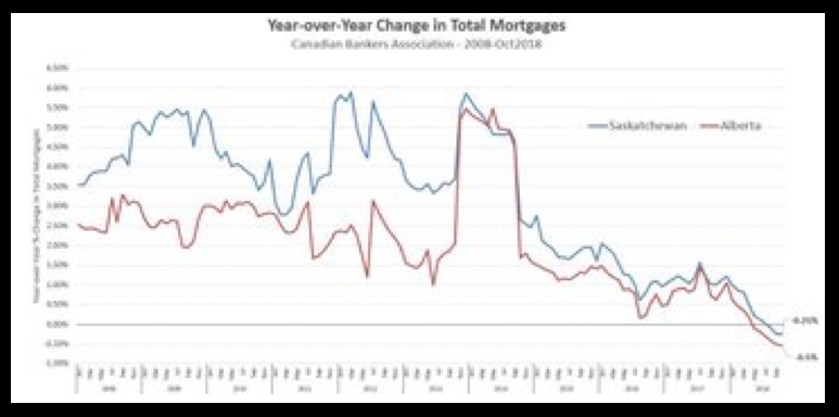
 How about the number of mortgages being taken out as an indicator? Below is a graphic that shows how drastically the mortgage market has shifted in Canada.
Another indicator is the “money supply,” or “liquidity” of the financial markets in Canada.
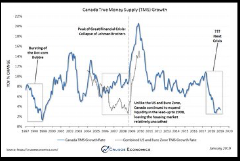
Wow, look at the dates when money supply was dipping in the grey boxes on the chart. Those were challenging times in Canada.
I could continue to add more charts but the message would not change.
In summary, Canada is mired in slow growth that continues to trend lower at a snail’s pace.
Let’s look at a couple of “tipping points” that might move the needle in one direction or the other.
Real estate in Canada is the key to whether our country ends up in a mild recession or avoids such an outcome.
What we know is, in terms a major cities, Montreal is still climbing in price, Toronto is flat after a decline in 2017, Calgary, Edmonton are holding and Vancouver is still declining.
More importantly, real estate sales volumes are quite weak across the country.
If real estate prices decline and, more importantly, sales volumes continue to stay as low as they are now, Canada will likely have a recession.
A recession at present consumer debt levels— a new, all-time high in 2019—would pose a difficult problem for the Canadian central bankers.
The flow to the real estate story is important to watch.
On the positive side, stronger commodity prices would give a significant boost to Canadian growth prospects.
As discussed in the last weekly comment, the prospects for an INFLATIONARY outcome are growing. With inflation comes stronger commodity prices, and this might issue in a better set of prospects for the Canadian stock indexes.
The inflation story is in its infancy. We will continue to post relevant information in these weekly comments.
It is important to understand that, unlike in 2008 where interest rates were nearly twice as high as they are right now, Canadian central bankers and politicians will have significantly less room to maneuver in the next recession. There will be more challenges and likely more financially radical behaviour to have an impact to fight an economic slowdown.
Europe appears to already be in this predicament.
I am watching European data closely to see how the European Central Bank (ECB) handles a scenario with even less maneuverability than Canada.
“Bad” Inflation
What is the difference between “good inflation” and “bad inflation?”
Good inflation is when your house and stocks go up in price, but wages and core items needed for living stay the same or rise at a slower pace.
Bad inflation is when houses and stocks stagnate, but wages and core items needed for living rise at a brisk pace. The text of the editorial mentioned that it is early days for this change, but it is getting more diminutive as we go forward.
What do you get where you have rising wages and stagnant growth? Hmmm?
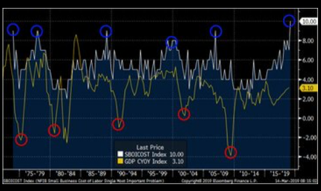
The chart above plots “the percent of small business seeing labour costs as the most challenging problem they face,” in white and GDP growth in yellow.
Peaks in the labour costs problem have been early indicators to recessions, or significant GDP declines.
The next chart shows “wage growth” vs. the US 10 year bond yield. Confirms data in first chart.
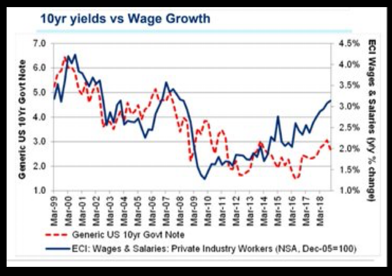
Labour pressure at the present low interest rates is unique to this economic cycle; it makes for difficult analysis and drawing of conclusions.
Is Quantitative Easing a Thing Again?
Sometimes I see charts that go totally against what I hear being reported in the news. The following graphic definitely fit that description.
It is a little blurry but what it shows, is the rate of change for the global central banks combined on the left hand side, and then breaks the US Fed, the Bank of Japan, and the ECB out on their own on the right.
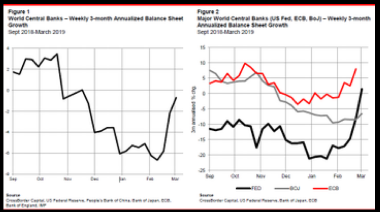
If you added in the money printing going on in China to this graphic, you would easily come out with a positive number again.
I guess we are back in a QE world.
Renting in the US
Below is a chart that shows the “percentage of people who pay more than 50% of their income on rent,” in the different American states.
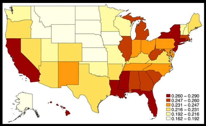
Back in the late 1980s, when I started in this field, the “healthy” cost of either mortgage payments or rent was considered 30% - 35%. Then that figure drifted up to 40% was “reasonable.”
Anyway, I found the graphic interesting….
Back to MMT
I could not resist the following chart to end the weekly comment.
Let me set the stage as to what it is saying.
The graph charts out the responses of economic experts to the question:
Countries that borrow in their own currency should not worry about government deficits because they can always create money to finance their debt?
Agree or Disagree?
The left hand side of the chart plots the responses.
The right hand side of the chart plots the confidence of the expert in being correct in their response!
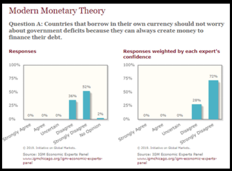
The MMT crowd pushed back at this study saying MMTers do not believe deficits do not matter…only they matter in a different way from traditional thinking.
The Narrative Machine is running full tilt for the MMT crowd.
The story’s just gets better and better…
As always, please share your thoughts and comments with me. Also, Megan has been working on an upcoming seminar series and events calendar, so keep your eyes peeled for updates, and let her know what topics you'd be interested in learning more about.
Have a wonderful week!