
Local Real Estate Statistics
With the publishing of the August 2018 real estate data and considering the number of questions I have been getting from clients about the real estate markets, I felt a real estate feature was in order.
The first chart, Compiled by Saul Hilchey, RBC Dominion Securities, shows the average price of a single family dwelling in Nanaimo.
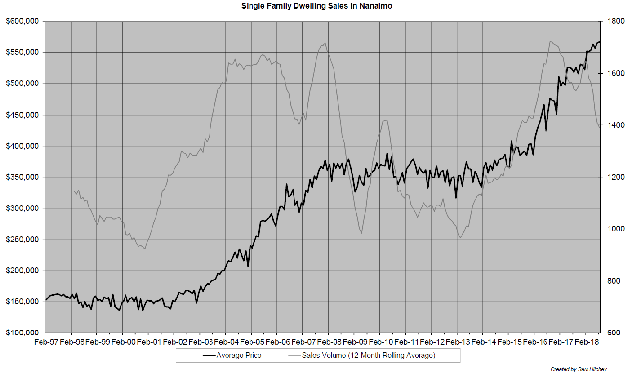
Nanaimo homes are sitting at all time high prices but sales volume is falling. Listings have been rising and taking longer to sell.
The Vancouver Island Real Estate Board made this comment with the August statistics:
“On a local level, BCREA predicts that over the next several months, VIREB’s long-term sellers’ market will begin shifting towards a more balanced one. In fact, an interesting development in the VIREB area is that the market seems to be splitting into two in some communities: one that favours sellers for homes $600,000 and under, and a buyers’ market for more expensive properties.”
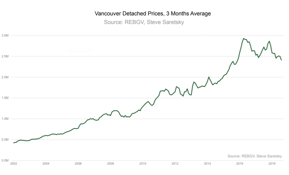
Moving on to the lower mainland (Vancouver) market, Steve Saretsky (The Saretsky Report) had the following charts and comments:
- Vancouver's detached housing market didn't show any signs of a recovery in August. Home sales fell 30% from a year ago, dropping to a record low for the month. (Chart 1) Prices followed volumes lower. (Chart 2)
- Vancouver condos are officially in cooling territory after defying gravity for longer than expected. Condo sales in August slipped to their lowest total in six years. Inventory also jumped by 51%, which put downwards pressure on prices - albeit nothing to write home about just yet.
- Flipping activity appears to have dried up. House flipping across all property types fell to a six-year low. How will liquidity issues impact the market moving forward?
- New home sales now make up 12% of all transactions. With sales slowing and flipping for profits becoming more difficult, how will this impact the speculative pre-sale market?
Chart 1
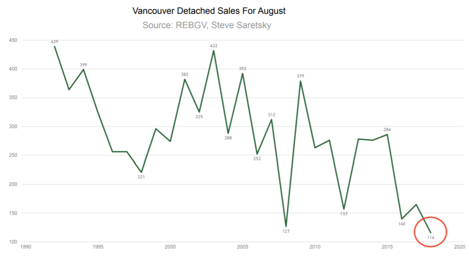
Chart 2
So, overall, the cooling process is well entrenched in local real estate. It would make sense that the pace of interest rate increases in coming months will play a part in how this puzzle comes together.
Let’s take a closer look at why this is true.
Below is a chart of how the Bank of Canada (BOC) has raised interest rates so far and what RBC Capital Markets expects the next year or so to look like.
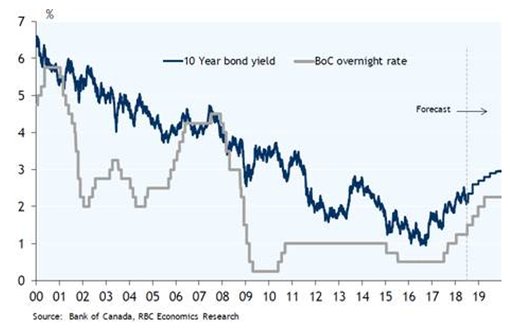
Clearly, interest rates have a long way to go to get back to any type of historical normal level but we have already seen enough economic slowdown to give the BOC pause. (Hence, no September interest rate increase).
I can’t blame them for being cautious, but the BOC also needs to get interest rates high enough to have some ammunition to fight the next recession that comes along.
The next chart shows the percentage of Canadian personal debt needing to be renewed in the next 12 months. The three components shown equal 53% of total debt outstanding.
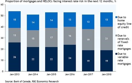
The question is, will the interest rate be higher or lower on these renewals? I just happen to have a handy, dandy chart to show this data too!
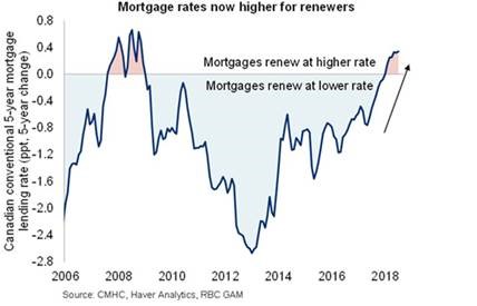
Interest rate increases from here will impact consumers. The chart above is only looking at 5 year conventional mortgages…the increases in Home Equity Loans has been significantly greater as a percentage of the base rate.
Local Real Estate Summary:
Headwinds continue to grow for local real estate price increases. Prices have flattened out on lower sales volumes. Buyers are becoming more patient and selective.
How much higher interest rates might rise is an important variable to consider when deciding what action to take in local real estate.
A Few More Charts
In reference to a comment I received regarding the September to December 2018 publication added to the website last week, I want to show you two more charts.
Before you look at the charts, let me remind you what the theme of the September to December 2018 publication was.
My expectation is:
- Financial markets will continue to ride a wave of liquidity higher until the liquidity dries up.
- The central banks around the world are in the process of switching from Quantitative Easing (QE) to Quantitative Tightening (QT). This change in the liquidity tide, coupled with SLOWLY rising interest rates, will stop the longest BULL market in history and asset prices (real estate and stocks) will fall.
- The central banks will panic when assets fall (maybe 15% - 20%) and return to a QE bias in the global monetary policy. The change from QT back to QE will create another leg higher in asset prices.
- Our goal is to be fully invested in the stock market AFTER a 15% - 20% decline in asset prices takes place AND the US Federal Reserve panics back to QE. This narrative gives our model a clearly defined technical picture to enter and exit investment positions assuming the scenario above.
With these points in mind, please check out the following chart that shows how much of the global performance of stock markets has been tied to the US stock market.
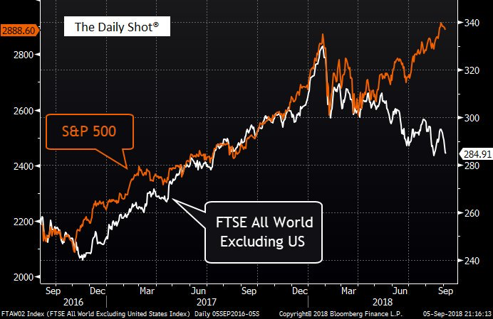
What is important to notice is how up until March of this year, global stock markets were mainly in sync with each other.
But that linkage broke sharply in April 2018.
It is rare for these types of divergences to last for a long time. As technical analysts we refer to them as “alligator jaws.” And alligator jaws usually “close.”
The question remains as to how they close. Do global stocks catch up to the US or do US stocks fall to meet global stocks? Probably a combination of both if I had to guess.
The next two charts need to be considered in conjunction with the chart above.
The first chart shows that Apple, Amazon, and Microsoft now have a higher value than the entire German stock market combined. Important to note here that Germany is the world’s fourth largest economy.
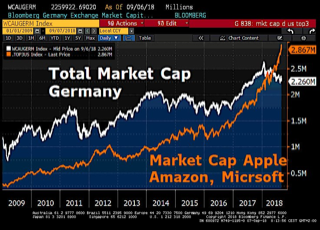
The next chart shows that the entire Chinese stock market is only worth five times more than Apple.
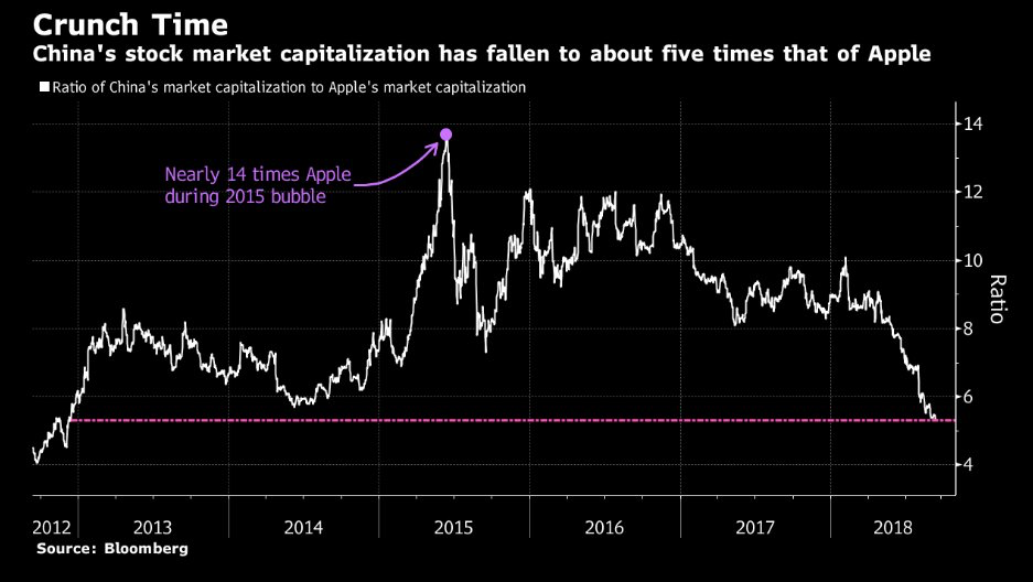
There are two takeaways from the charts above.
- Stock prices around the world have already begun to moderate. It is only the US stock market that has pushed on to new highs since the second quarter of 2018.
- US stocks are very expensive relative to global stock markets.
My final chart for this week shows the historical relative valuation of the US stock markets to itself.
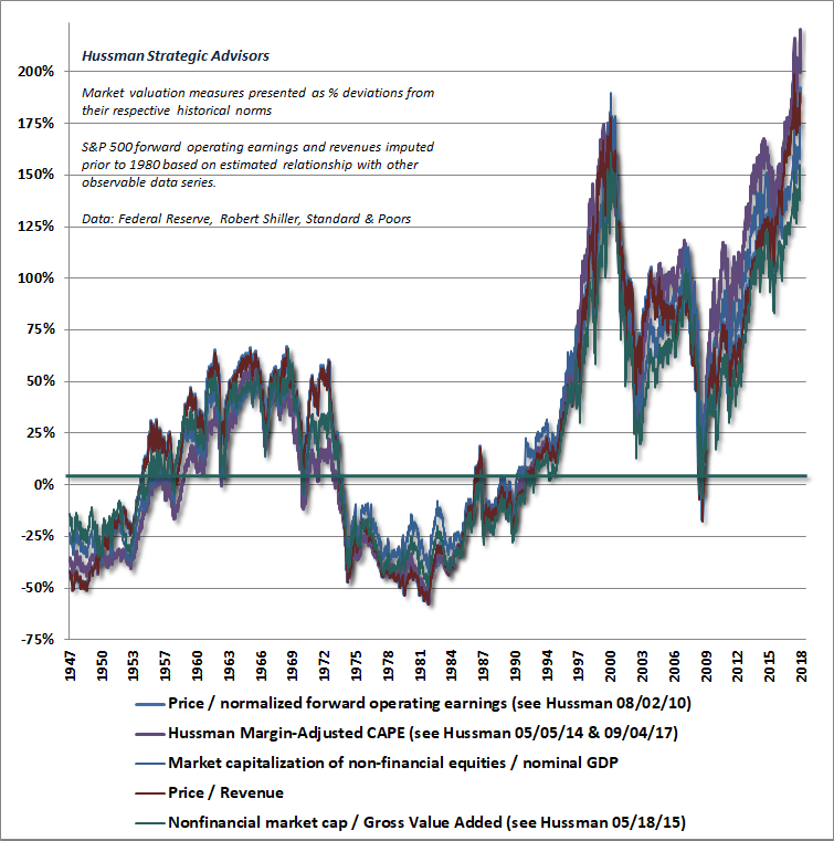
The chart uses five widely accepted methods to value US stocks and it speaks for itself as to the valuation levels of US stocks.
My strategy is to continue to let the financial markets “play themselves out.” We will stick to our knitting and err on the side of caution in light of the headwinds that apply to both real estate and stock markets presently.