
Getting Played Out
Some of the best memories I grew up with were fishing with my dad and brother when I was going through grade school. Our 17 ft., blue Reinell runabout was a fishing machine. During the summer months we would go out and fish the herring balls in the shallow waters around Nanaimo for Chinook and Coho salmon.
In those days it was pretty crazy how many fish there were around here.
Today, some of my favourite time is spend with my wife and kids fishing these same waters.
For whatever reason, this year has seen a fantastic resurgence in Chinook salmon fishing around the same spots we fished when I was a kid. Even though the legal catch limit is only one Chinook per person in our area, it is not uncommon to catch and release five or more fish in a two hour window of time.
I should be a little bit more descriptive about what I mean “to fish.”
Rather than traditional trolling for salmon, we like to jig.
This is done with a light weight rod, mooching reel and a 20 lb. test line; the lures are small metal herring-like units with a hook on the end.
The concept is to try and gently finesse 15 lb. to 25 lb. fish on light line and tackle. When fighting a fish on this gear you have to be very patient. If you try to “horse” the fish in…the line will break. If you give it too much slack, it will probably throw the barbless hook and get away or a seal will steal the fish off your line.
Typically, a 20 lb. fish will take about 20 to 30 minutes to land.
The fight follows approximately the same script each time.
When first hooked, the salmon has lots of strength and will rip up to 200 feet of line off your reel. Then it tires and you skillfully reel the line back in. The key is to sense if the fish is about to run again. If it is…better let the reel go so it can, or it will break the line. If it runs towards you, then you have to reel as fast as you can to keep tension on the line. The fish will “throw” the hook if the line is slack.
The process is repeated three, four, or maybe five times. Each time the fish gets a little more played out and take less line as it runs.
By the end of the battle, the salmon might only run out 10 feet of line before it tires.
Now, it is nearly ready to be netted. The battle is basically over but we are still a little ways away from catching a fish.
You see, you have to be sure the fish is really played out. If it decides to zig or zag when you go to net the fish, quite often the hook will catch in the net and pull out of the fish’s mouth and it will escape the net—I have seen some bitter fisherman when they lose a fish at this stage of the battle!
The tell-tale sign that it is time to net the fish is that it no longer swims upright in the water…it is so tired that it lays on its side.
…And that is the signal of a played out fish ready to be caught.
The stock market is reminding me of a fish that has been on the hook for a long time and looks nearly played out.
- The sheer amount of time passed since the last BEAR market is near record length.
- Debt and leverage are all at or above normal late-cycle levels. (Chart A)
- The upside rips don’t have the same enthusiasm as they had when the days of Quantitative Easing were in full bloom.
- Valuations look stretched and trading depth appears to be getting thin in many markets. (Chart B)
- Market psychology is complacent and passive investing is a panacea. Covenant-lite loans, “this time is different,” “Amazon is a value stock,” etc., are all over the media reports.
- Companies are posting good earnings but the stock prices are already so high that they tend to have little upside impact…and more often trade down after earnings.
- Housing markets look late cycle
- Auto sales look late cycle
- And the really big one…Fed policy looks very late cycle, and it’s starting from a very low base.
The stock market is not done yet. But, sticking with the analogy above, it feels like it is somewhere between “its fourth or fifth attempt to run line off the reel and laying off the side of the boat waiting to be netted.”
As I was writing the analogy above I had two thoughts:
- I really want to go fishing right now!
- Didn’t I read a similar themed timing article by Ray Dalio, the billionaire hedge fund manager at Bridgewater and Associates?
Below are the events and time comparisons between today and the 1929 recover process:
- Debt Limits Reached at Bubble Top, Causing the Economy and Markets to Peak (1929 & 2007)
- Interest Rates Hit Zero amid Depression (1932 & 2008)
- Money Printing Starts, Kicking off a Beautiful Deleveraging (1933 & 2009)
- The Stock Market and “Risky Assets” Rally (1933-1936 & 2009-2017)
- The Economy Improves during a Cyclical Recovery (1933-1936 & 2009-2017)
- The Central Bank Tightens a Bit, Resulting in a Self-Reinforcing Downturn (1937)
No question…the narrative I am outlining carries the same theme as the Ray Dalio editorial.
In summary, there are going to be BULLS and BEARS forever. That never changes. What you need to do is to be sure you have a strategy that is robust in its investment process and be sure it matches your risk tolerance.
Please be sure you understand this clearly.
Nobody knows what is going to happen or when it might happen. This editorial is only looking at the signs.
The Canadian TEAM models are 50% cash and 50% invested in Canadian stocks. The US TEAM model is still 100% invested but will go to 50/50 if the S&P500 closes the end of the month below 2,825; it presently sits at 2,846.
Remember, stock market tops are a “distribution process.”
They tend to see larger holders and insiders sell stock on market rallies and more retail investors pour into stock investments. Exchange Traded Funds (ETFs) have somewhat changed this dynamic from prior distribution top charts, but the underlying technical pattern is still there.
We will watch and wait.
Chart A
Even though interest rates (red line) are near historic lows, the amount of interest payments being made by people is at an all-time high. What if rates go higher?
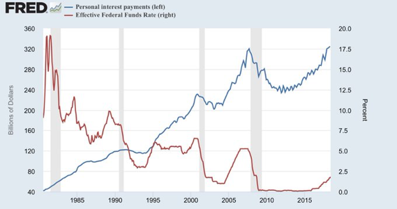
Chart B
I have used this Doug Short chart many times before. It shows the value of stocks relative to Gross Domestic Product. Often it is referred to as “The Buffett Indicator” as it is said to be one of his favourite views of stock market under/over valuation. Worth another look at again. Updated to July 3rd 2018.

As always, we welcome your thoughts, observations and comments.
Have a wonderful week.