
Charts That Caught My Eye
No question the summer is here and people’s thoughts are not exactly on reading longish editorials about financial markets that are pretty quiet anyway.
Today I am presenting a number of charts I saw over the past week that made me think. Many of these are a little off the beaten course…hopefully they give you some food for thought as well.
Before we start, I wanted to present Bob Farrell’s 10 rules for investing.
Bob was the founder of Farrell’s Ice Cream Parlour and Restaurant. He and his family had an interesting relationship with financial markets, and his rules for investing stem from that relationship. Personally, I think rules 7 and 9 are most timely today.
1. Markets tend to return to the mean over time
2. Excesses in one direction will lead to an opposite excess in the other direction
3. There are no new eras — excesses are never permanent
4. Exponential rapidly rising or falling markets usually go further than you think, but they do not correct by going sideways
5. The public buys the most at the top and the least at the bottom
6. Fear and greed are stronger than long-term resolve
7. Markets are strongest when they are broad and weakest when they narrow to a handful of blue-chip names
8. Bear markets have three stages — sharp down, reflexive rebound and a drawn-out fundamental downtrend
9. When all the experts and forecasts agree — something else is going to happen
10. Bull markets are more fun than bear markets
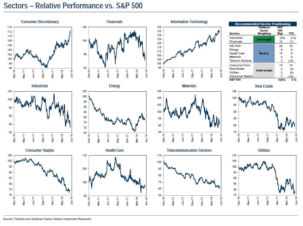
The graphic below relates to Farrell’s rule number 7, and shows the different sectors of the S&P500. Notice how only two sectors are actually in “uptrends” since the beginning of the calendar year.
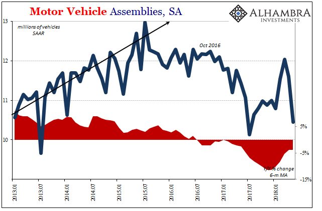
Next we take a peek at the pace of new car production in the US.
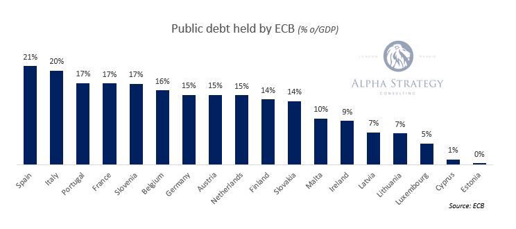
The next chart jumps over to Europe and looks at just how much debt the European Central Bank (ECB) has purchased to suppress interest rates during its Quantitative Easing initiative. The question one must ask “if the ECB is ever going to try and lower its balance sheet by selling these bonds back into the market, what interest rate is a true investor going to demand?”
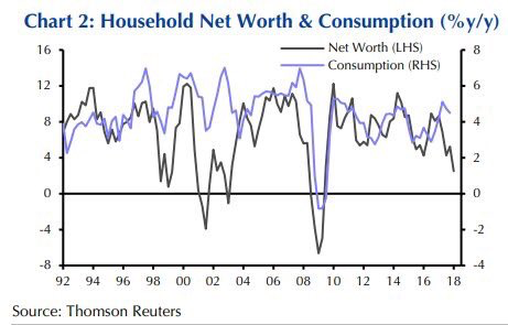
The next chart graphs the rate of growth in American net worth vs the American consumption growth. This is a graphic representation of the “wealth effect” that says if you raise the net worth of a person they will spend more. The chart shows this to be an actual correlation. Notice how the black, net worth rate of growth line has headed down since early 2017, and now the purple consumption line has started to follow.
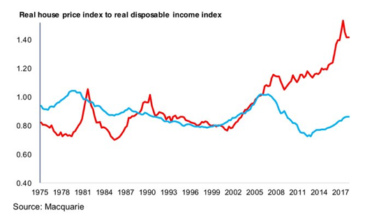
Jumping back to Canada, I love showing this chart. It really makes the point just how crazy our Canadian housing bubble got compared to the US housing bubble in 2008. It is interesting to see how the Canadian ratio has finally started to come back to earth.
Dove-tailing with the chart above, I have included a picture of “mortgage liabilities” in Canada below. It is absolutely amazing to see how Genworth financial has become such a major force in the market place!

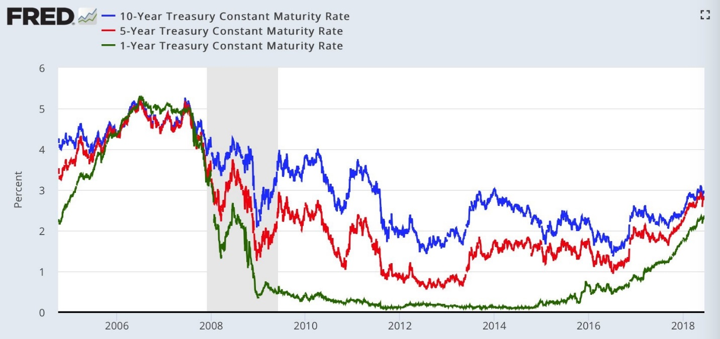
The next chart touches on how the US yield curve continues to “flatten.” This means that short term interest rate yields are getting closer to the same as the yield on 5 and 10 year bonds. A flattening yield curve is a precursor to an economic slowdown. As the person who Tweeted this chart stated: “Someone is catching up.”
The last chart I will leave you with today is kind of a bonus chart. It is meant to make you put on your thinking cap. The chart shows the rate of return index on the US 10 year Treasury bond index from 1926 to 2013. Please look at the chart and let some of the information sink in for a few moments before reading below.
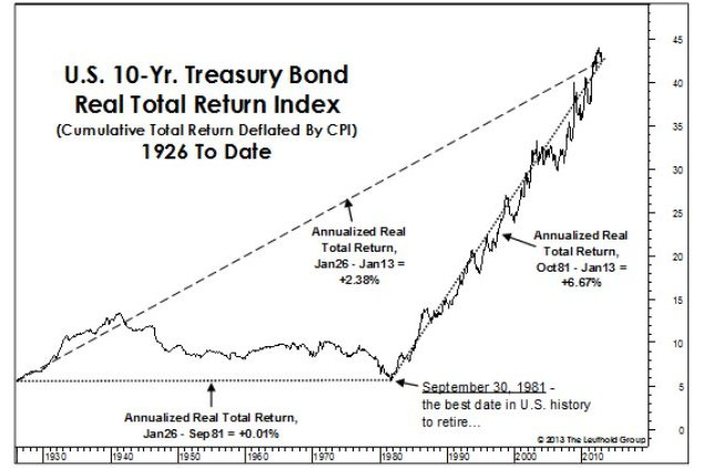
OK, now I will break down how I looked at this chart.
- Notice the annual rate of return for the total time frame of the chart. 2.38%
- Notice the rate of return from 1926 to Sept 1981 when interest rates peaked. 0.01%
- Notice the rate of return from 1981 to 2013. 6.67%
Think about what interest rates were doing during each of those time periods…
Clearly the biggest moves came in the 1965 to 1981 period when interest rates went up from 4.5% to 16% on the 10 year US Treasury bond.
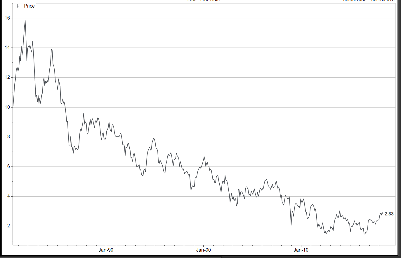
The next big move was from 1981 to present when they rates fell from 16% to 1.5%. Shown below.
The question is “will interest rates ever go back up again?”
Maybe said another way, “can interest rates ever go back up again?”
Who knows? But if they do, it will create a long period of under performance for long term bonds. It is tough to imagine the central banks ever allowing a significant rise in interests again.
Enough for today. Have a great week!