
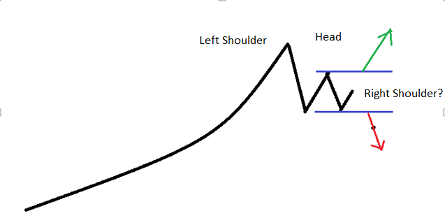
“Right Shoulder?”
We find ourselves in the heart of Q1-2018 earnings season. This week is the busiest week for earnings announcements in the quarter, and the news is filled with companies announcing excellent earnings numbers…so what is wrong with the stock markets?
- Earnings expectations were very high going into the quarter due to the Trump tax cuts so companies had a high bar to clear to succeed in having a “great quarter.”
- Interest rates and inflation continue to push higher making the relative advantage of earnings over interest rates smaller and smaller.
Let me show the chart backing up point number 1 once again.
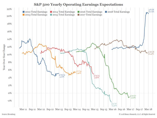
The expectation for the first quarter 2018 was nearly 7% higher than any of the other first quarter since 2012. That is important to keep in mind.
The second issues are rising inflation and rising interest rates.
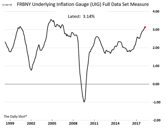
Look at how rapidly the underlying inflation gauge has been rising since the announcement of the Trump Tax cuts.
Check out the US interest rate on the 10 year and 1 year bonds.
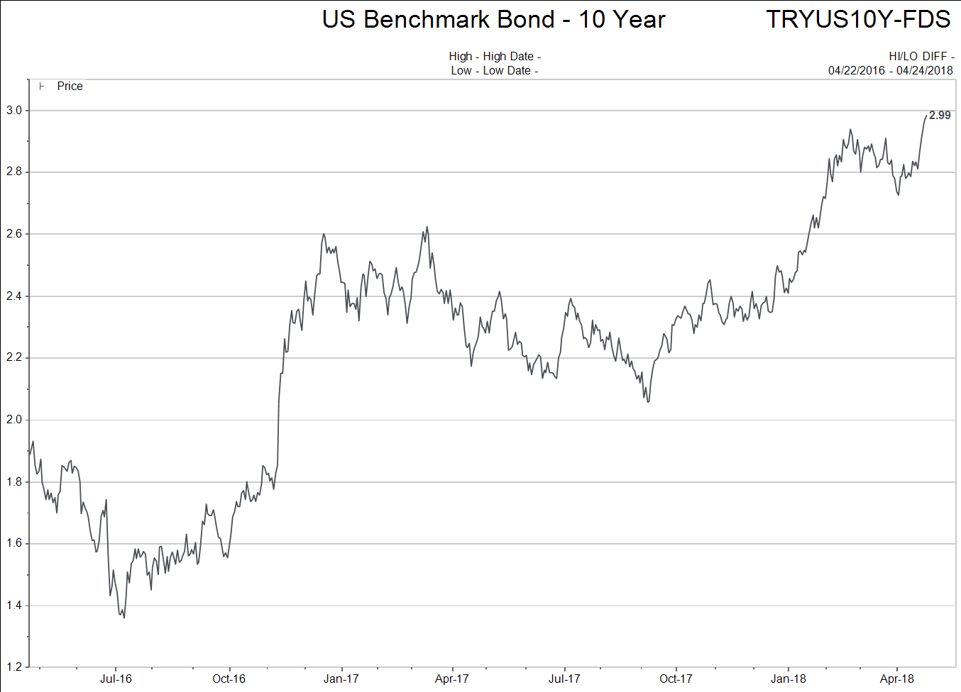
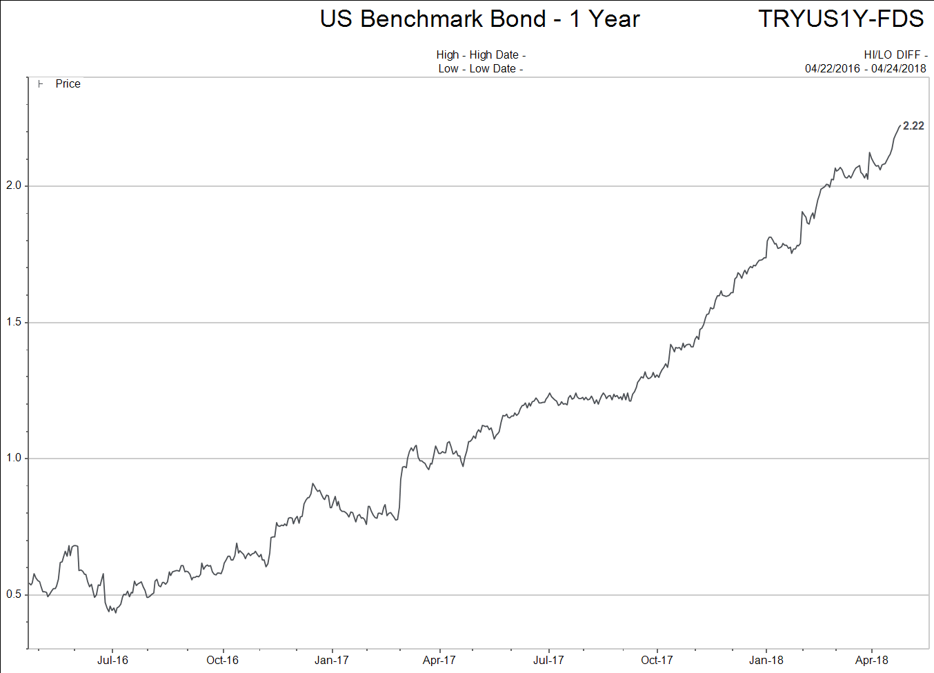
Wow, those are some pretty steep rises in especially the short term interest rate charts. But why does this have anything to do with my stock portfolio?
Here is the key: Rising interest rates compete for capital with stocks AND make the cost of doing business higher when companies borrow money. Check out the chart below.
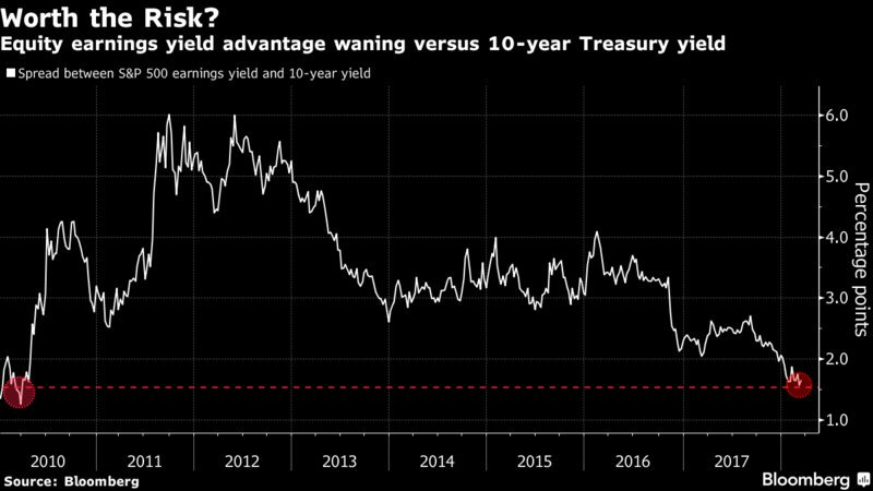
Here we are measuring the percentage advantage stocks have over 10 year bond yields. Look at how the “percent advantage” has plunged in the last run up in US stocks after the Trump election AND the violent rise in interest rates.
I don’t want to over-complicate things. Please realize assets cannot be viewed only priced relative to themselves. All assets co-exist and are priced in competition to each other.
People always want the best deal, right? If all other variables are equal, what is the cheapest thing to buy right now? Good questions…
So back to this idea of a “right shoulder” being built in the US stock market.
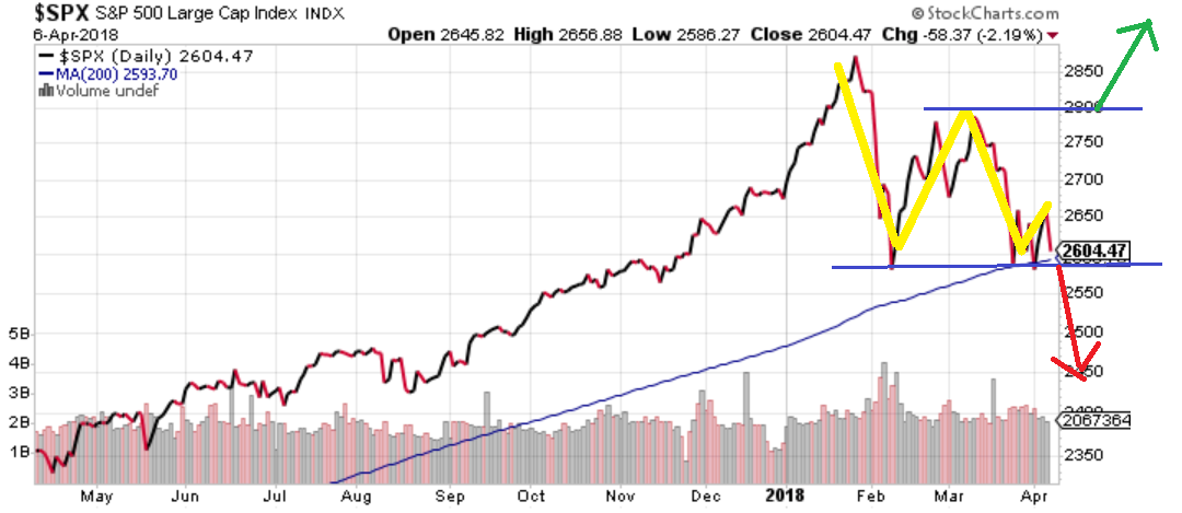
Back on April 6th, I wrote the following words followed by a diagram and chart below:
“The reality of the two charts is that both Canadian and US stock markets are sitting in neutral positions.
The double-bottom pattern can continue to play out with a continuously rising market. If the result ends up being head and shoulders BULL market top, I would expect the right shoulder in this process to take about two months to complete. If the stock markets are breaking down as I write, then the next level for support comes about 6% to 9% lower where the technical analysis would begin again.”
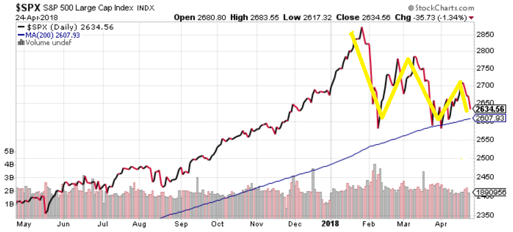
When I look at this chart it tells me that nothing has been decided definitively BUT the likelihood of the right shoulder being put in place is growing. Any move below the blue 200 day moving average line should be considered a strong cautionary sign for US stock holders.
As Tom Petty so bravely predicted when it comes to technical analysis…The waiting is the hardest part. Therefore, I will conclude with the idea we should be on the lookout for a possible breakdown out of the “head and shoulders” top profile that the US broad stock market is exhibiting at this time.
I will keep you up to date with such matters.
A Few More Things to Think About
I truly am the collector of charts and data. It fascinates me and, therefore, probably share more of it that you actually care about.
The feedback some of you send tells me you enjoy the stuff I send so here comes some more.
The first graphic shows the relative performance of a number of the world’s largest equity indices. Each index is referenced to the 800 level prior to the “great recession.” Then the chart shows the decline suffered by the index in the “great recession” and the subsequent recovery out until the present.
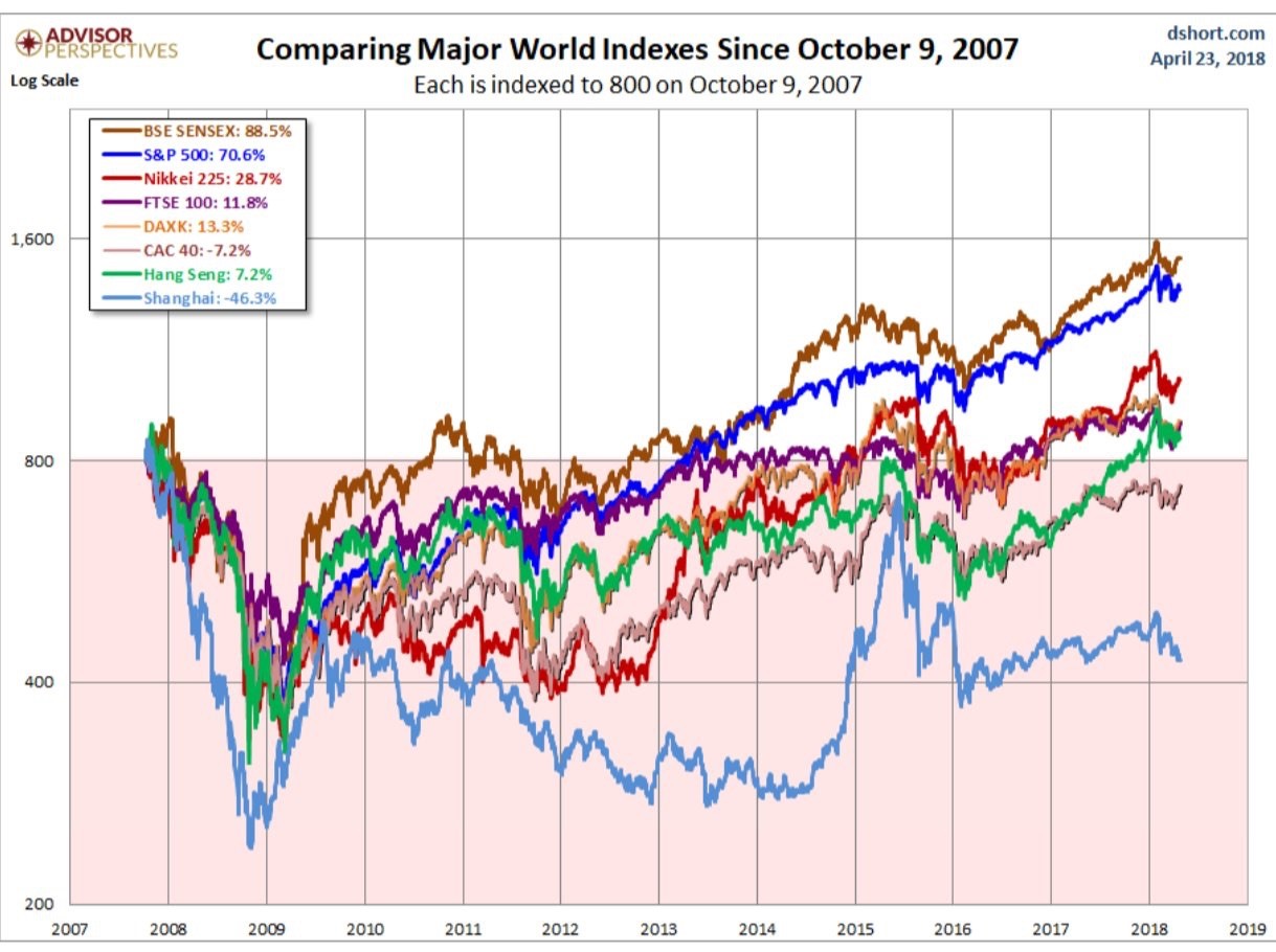
Notice how few markets have actually seen great rates of return when referencing their old high before the great recession. Canada would be fairly close to the green line showing the Hang Seng index, just so you know.
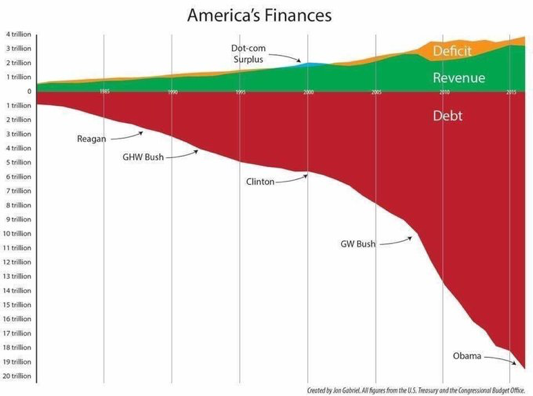
The next chart shows just how much debt has been accumulated in the US and why higher interest rates are such a big deal.
I am going to show you this situation another way. The next graphic shows how much interest is being paid.
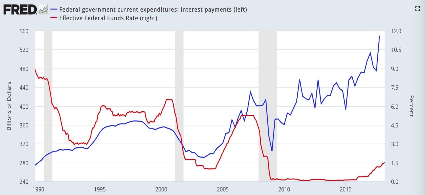
Even with record low interest rates just starting to turn up, interest payments are ripping higher. It really takes your breath away.
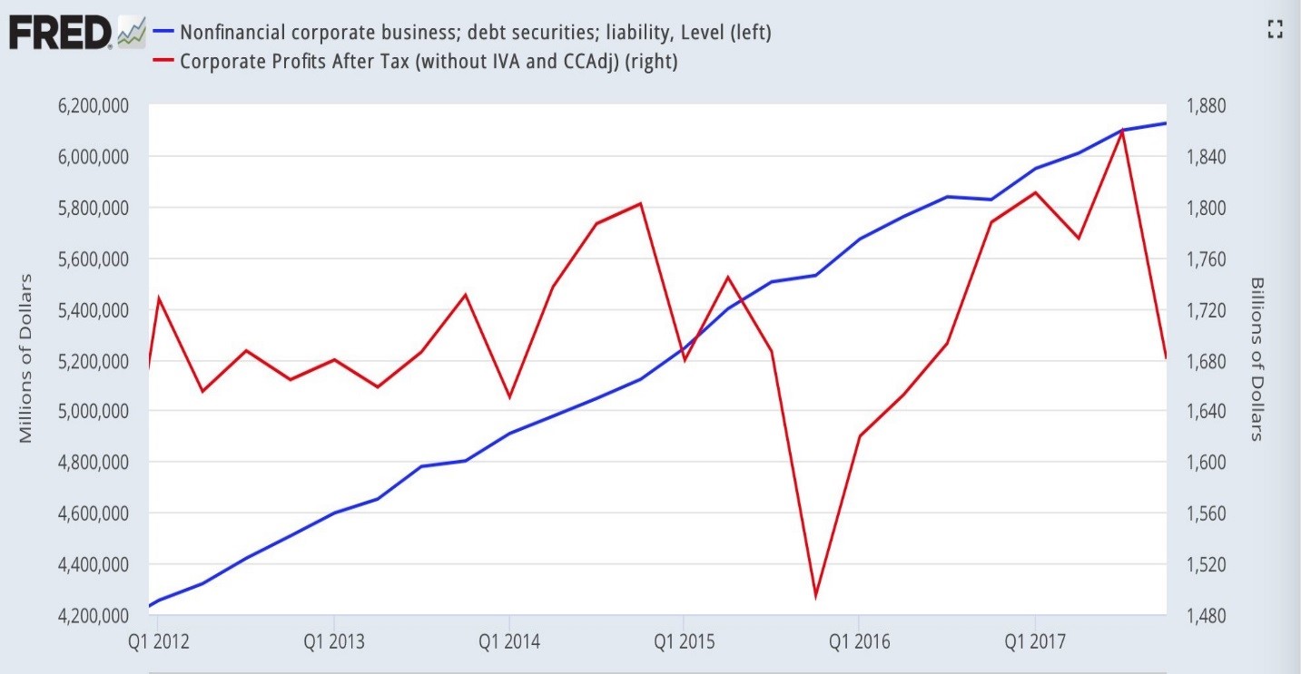
Let’s not forget how much debt businesses and individuals have added. The higher interest rates are clearly having a bite on margins in both homes and C-suites.
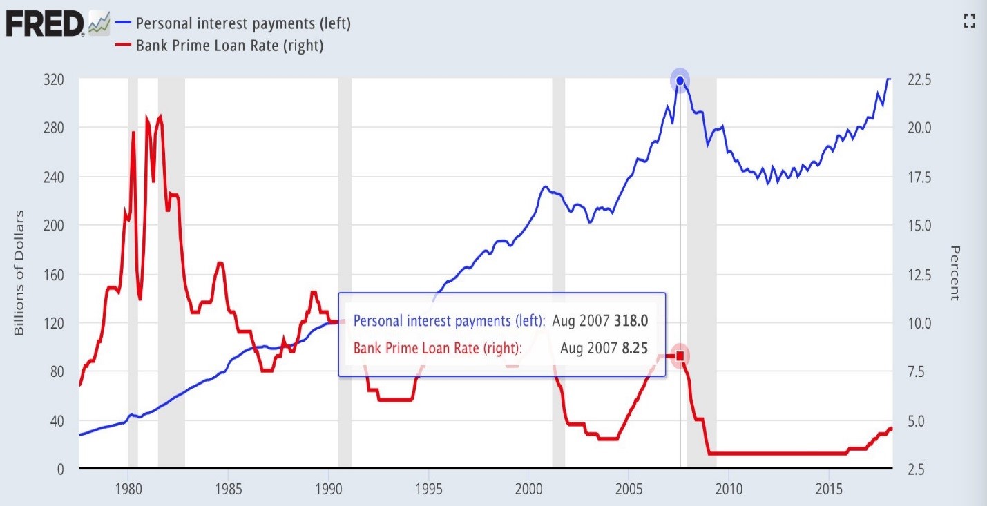
For individuals, what if interest rates just get back to where they were prior to the last recession?
Ok, I’m on a roll. What about the entire planet?
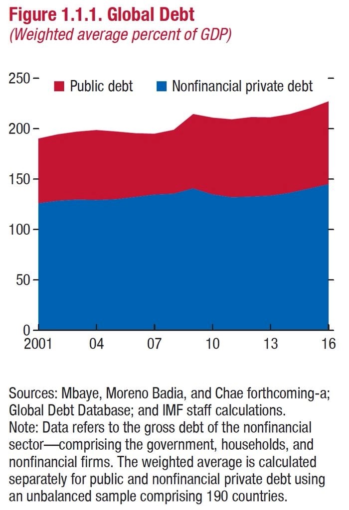
What is stunning about the graphic above is it shows how, even with synchronized economic boom that low interest rates and tax cuts created around the world the percent of debt relative to GDP just kept on rising.
That’s it. I’m done. But it really is an amazing world we live in today.
The common denominator is the dependency upon low interest rates. That is the start, middle and end of story.
Keep an eye on interest rates.