
TSX Clears 200 Day Moving Average
It has taken a while, but the February correction has given “tactical” investors a little breathing room again.
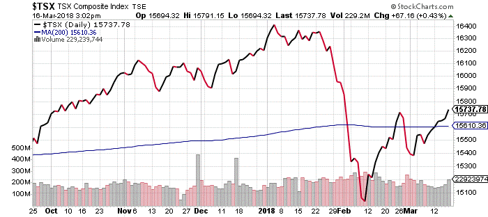
As you can see in the chart above, the thick line representing the TSX Comp index daily close has moved above the thin, blue 200 day moving average line.
This means the Dividend Tactical Model is back to full exposure.
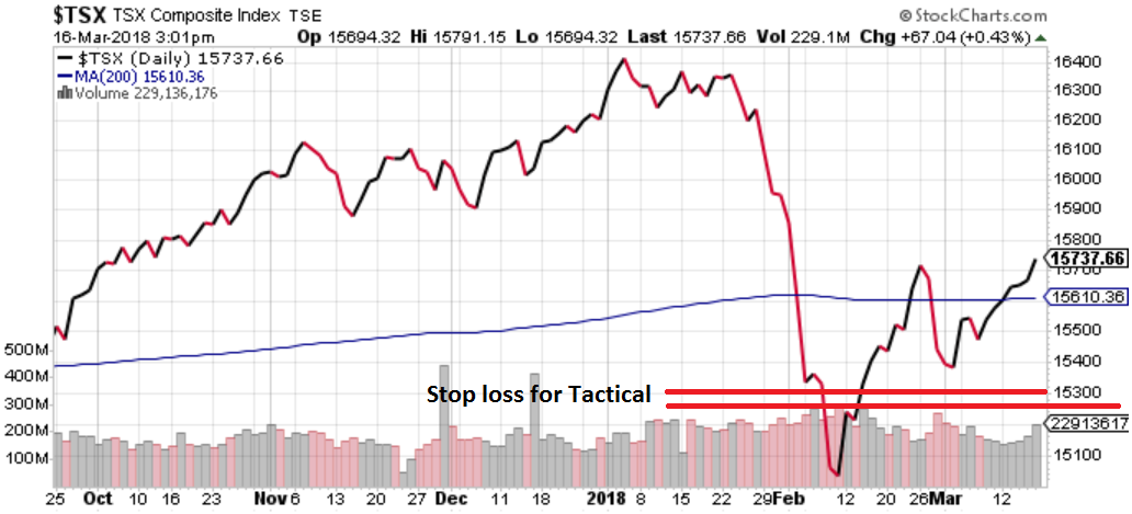
Since this portfolio yields 4.80% when fully invested I am hoping to stay fully exposed in the tactical portion of the portfolio. To help facilitate this result, I am going to use a stop loss below the 200 day moving average. The hope is the TSX will grind sideways and in a “rising range.”
The chart below outlines the approach I am taking with the tactical portion of the Dividend portfolio. The TSX would have to trade below 15,300 to trigger a tactical sell signal.
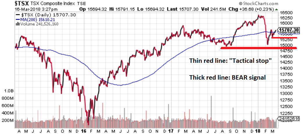
Let’s expand this idea to a longer time frame.
The chart below is the TSX over 3 years. The thin red line on the chart is same tactical stop loss level as shown above. The thick red line at 14,800 would be confirmation of a possible change in longer term trend from “sideways” to “lower.”
If you have any questions about the Dividend Tactical model or what is written above please feel free to give me a call.
A Couple More Canadian Real Estate Charts
I have included short updates on real estate the past few weekly comments, and the reason I continue to watch this market so closely is because:
- Canadian real estate is very expensive.
- Interest rates are going higher.
- The government has taken dead-aim trying to slow down the pace of increase of Canadian real estate.
What I am really looking for are clues that the government policy changes have actually had an impact on pricing.
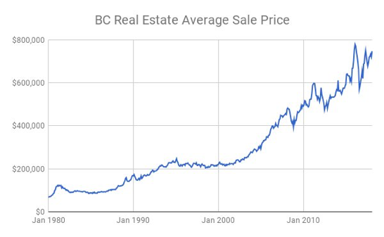
Chart 1 above shows the average sale price in British Columbia out to the end of February. Nothing appears to have changed in this trend.
The second chart below shows the average sale price for all of Canada.
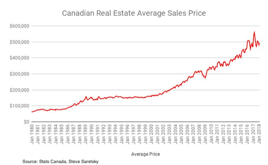
Again not much has changed in the trend for Canadian real estate prices either. Maybe a little bit more of a “top” appears to be forming here, but nothing conclusive.
Anecdotally, I have heard from a number of realtors in Vancouver, Victoria and Nanaimo that the February 20th budget changes have significantly slowed the local real estate markets.
At the end of March we will look to see if the anecdotes translate into actual data of a slowing market.
China Continues to Print Money
A couple more charts to close the weekly comment.
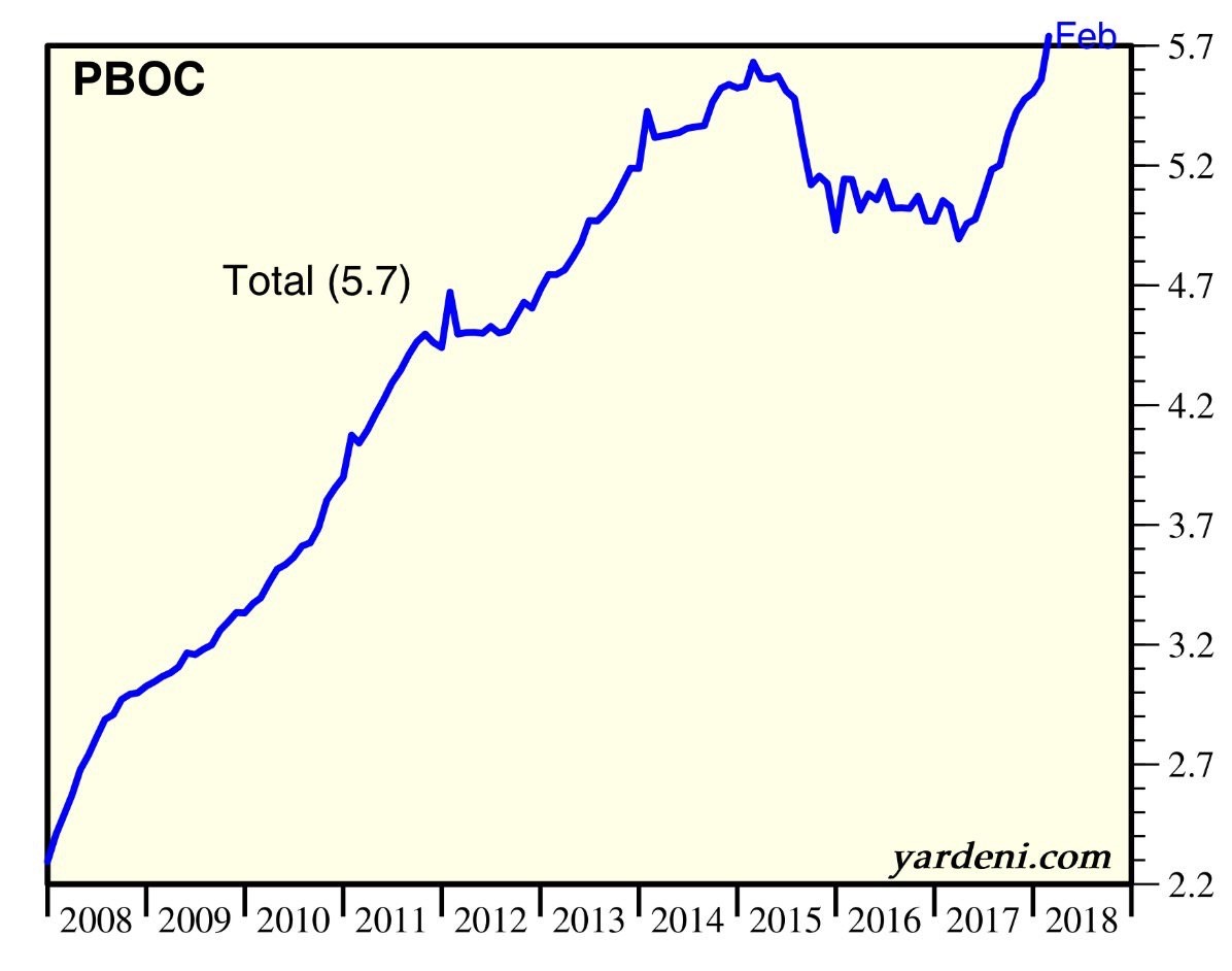
The first looks at the “Peoples Bank of China,” which is the equivalent of the Bank of Canada or the US Federal Reserve, to see how they have opened up the monetary spigots again in 2017-2018.
It is hard to imagine a significant pull back in global asset prices as long as China is printing money at a rapid rate. (Priced in Trillions of US dollars.)
The second chart graphs out the US debt accumulation. On Thursday, March 15th the US national debt jumped by $72.8 billion to push through the $21 trillion level.
All I can say is the trend has to end at some point. When it does, it will be a big deal but until it matters, asset prices will likely stay buoyant.
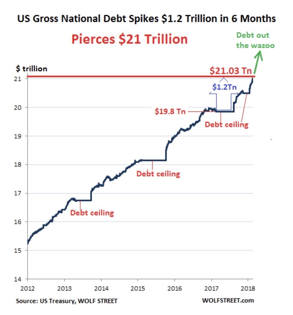
Remember, this chart only includes the most recognized and quantified pools of US debt accumulation. Also note, that “debt ceilings” no longer exist as of 2018.
For those who want to browse around the numbers of US finance please check out the usdebtclock.org website to see the broader picture.
Have a great week and please feel free to comment back on anything in the weekly comment.