
Looking for a Tipping Point
My record for having down stock markets while I am away on vacation remains unblemished! (I’m kidding, but it does seem to happen quite often).
The take away from last week was not the poor stock market performance, but the poor bond market performance.
Interest rates moved higher last week.
To make things more challenging…interest rates moved higher even when the US stock market finally decided to correct by more than 2%.
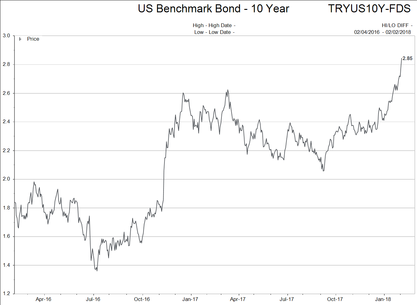
Below is a chart of the yield on the US 10 year Treasury bond.
So let me cut right to the summary statement as to what I am watching for in coming days:
- Interest rates need to take notice of weaker stock prices and stop going up. The chart of the US 10 year Treasury yield above should find support around the 2.5% - 2.65% levels.
- Stock markets need to take notice that interest rates have stopped going higher and find their footing. They don’t need to rocket higher again, but they need to catch a bid and flatten out into a range
The key expectation I have for financial markets is that the weaker stock prices of last week will give way to a reversal in the sharp move higher in interest rates. If interest rates do not stop rising, it would be a strong signal that the BULL market of the central bank manipulated, Quantitative Easing (QE) era is over.
I highly doubt the central bank manipulated era is over! It is a “senior citizen”…but it is not over…yet!
It will be interesting to watch both financial markets and investor sentiment over coming weeks. Will the euphoric attitude of investors begin to fade? We will see.
A Few Charts
Chart 1 is of the TSX Comp index. The reason I chose this 3 year chart is you can see that Canadian stocks are at the same level again that they were in March of 2015. The chart also shows a relative strength index, where the blue circle depicts the TSX being the most “oversold” since 2015 too.
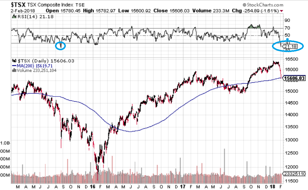
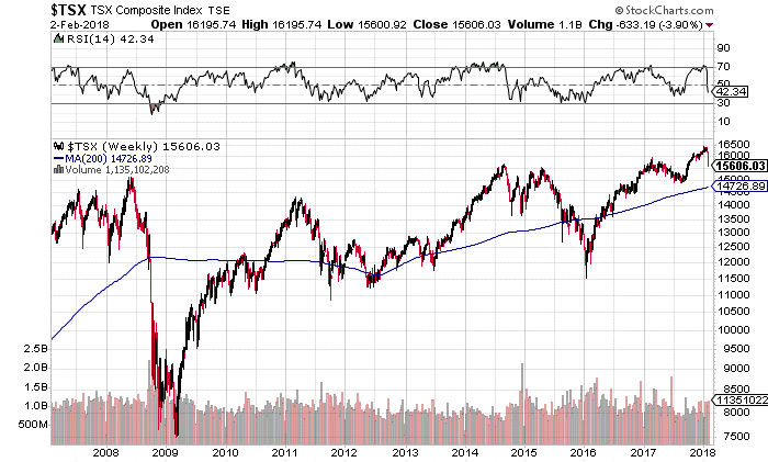
Chart 2 is an 11 year chart of the TSX Comp index. This chart uses weekly closes and shows how the TSX is only 250 points above its peak price level in 2008.
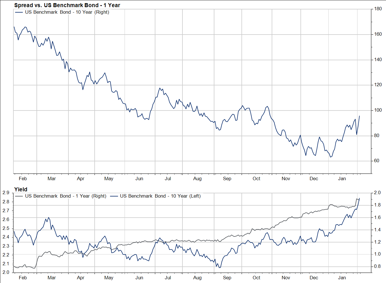
Let’s take a look at short and long term interest rates in both the U.S. and Canada. Looking at the U.S. first, you can see the actual charts of the 1 year and 10 year bonds on the bottom of the graphic. The large plot at the top shows the difference or “spread” between the yields on the two bonds.
Now, let’s look at the Canadian yields.
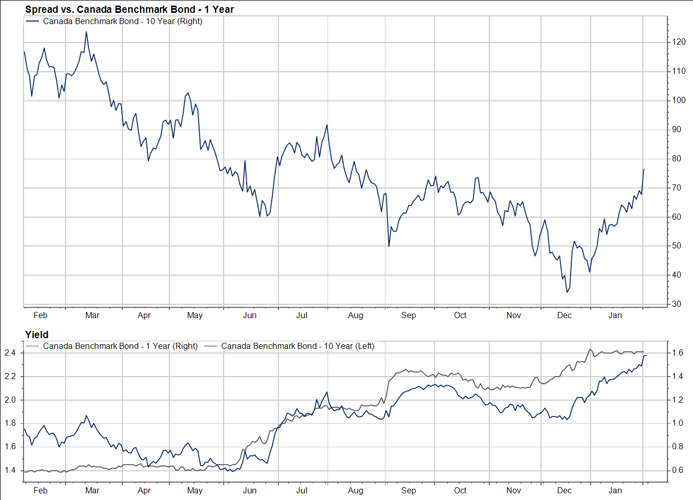
Just one comment on why these bond markets have become so unruly the past few months.
If you are holding a security that is only going to pay 2% per year for the next 10 years you need to be quite sure that inflation is not going to run hotter than it has in the recent past.
I believe the central bank actions of the past decade created a potentially strong environment for inflation, but since inflation never really took hold except in stock and real estate prices, bond yields were comfortable at low levels.
But two things have changed in the past six months:
- Central banks are trying to end their money printing ways. The U.S. Fed and People’s bank of China are already net “Quantitative Tightening”. Europe’s central bank may be forced to stop QE due to political pressures…and that would only leave Japan which is an absolute mess!
- The Trump tax cuts and pending military budgets have given the message that the U.S. could care less if it ever balances a budget again. Those types of messages have always been associated with run-away inflationary periods in history.
If bond markets sense their central bank best friends forever are maybe not as friendly as they once were, markets will be quite different going forward. We just have to keep watching.
Check out the 3 month chart of Bitcoin below.
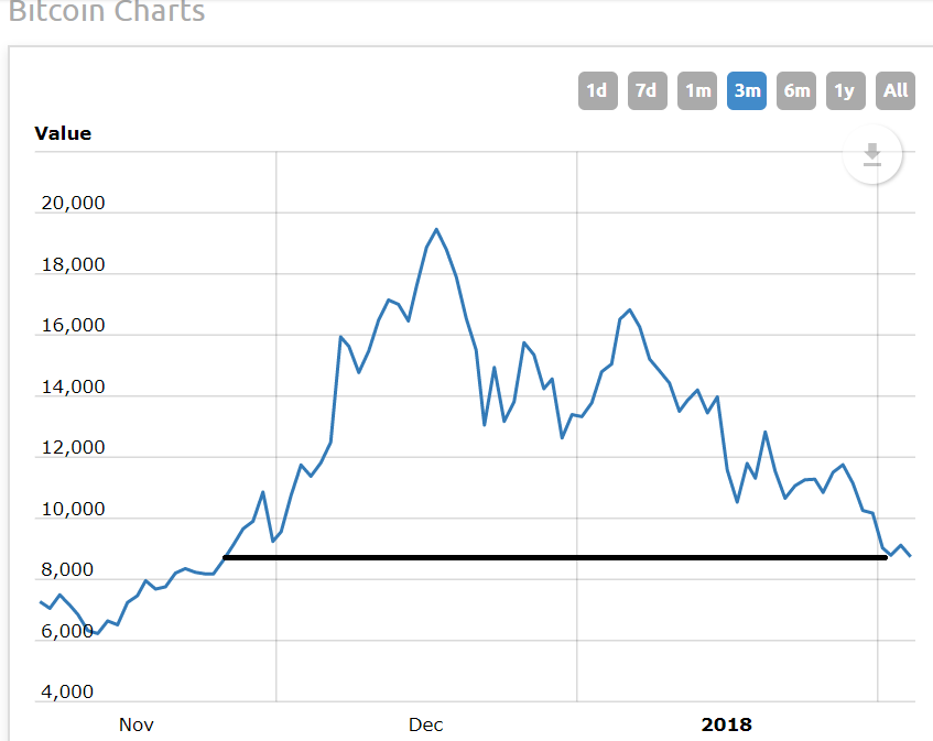
Everybody who bought Bitcoin after November 22nd, is now down on their speculation. Many are down by more than 50%.
I stand by what I said in December, Bitcoin and cryptocurrencies are a bubble.
The chart now has all the tell-tale signs of a broken bubble. I still believe Blockchain technology will change the future and that some version of cryptocurrency may eventually evolve to a point where it is useful but the existing crypto markets do not interest me in the least!
To finish this abbreviated, back from vacation comment, we will look at the exchange traded fund (ETF) for the cannabis stocks. Please note, this is not a perfect proxy for cannabis companies because it does own a number of non-cannabis names but since the “pot stocks” have jumped up in price so much it has become, for all intents and purposes, a proxy for the pot stocks.
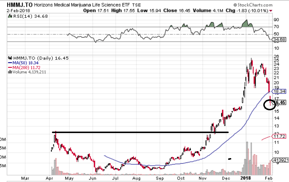
This chart is not quite the “broken bubble” chart that Bitcoin represents. If I was guessing, it will bounce back nicely when the stock market bounces, but I would be a seller of a significant amount of my holdings on the next bounce!
Notice how the cannabis ETF went into a down/sideways move from April to November. Then the speculative spirits of investors took off late in the year and the cannabis stocks were a significant benefactor of this behaviour.
If we are coming to the end of a speculative period for investor sentiment, then I would guess pot stocks will find something closer to their true values. It is up to you to decide what you think their true values really are.
Megan's Editorial
When I was getting ready to go on vacation last week, Megan asked me if I was going to publish a weekly comment. I said I didn’t plan to…
So Megan asked if she could write one. I said sure.
Wow, she did a great job! I really appreciate her message and her skills as a writer.
Thanks again Megan!
And with that, let’s see what the new week brings.