
Lost in ll the Forecasts
Last week, I titled my opening editorial for 2017, The un-Forecast, in a tongue-in-cheek reference to the 7UP advertising campaign used to target Coca-Cola and Pepsi in the late-1960s.

For those of you who are interested, click the ad above to see the pictures of the late-1960s/early-1970s ad campaign. They are really cool…
My reason for using the title is my belief that we are living through a monetary policy experiment unfolding in real time before our eyes. A set of policies that had never been tried before and have been allowed to run far beyond their “best before dates” have created a future impossible to forecast.
What sort of made me laugh is just how many analysts decided to make forecasts for 2018 that were based upon fundamental assumptions they purport to be on solid economic foundations, but actually only exist because of a massive sea of monetary liquidity that was created out of thin air by central banks.
Ten-years later we live in a truly imbalanced world where the creators of these problems remind me of arsonists at the scene of a fire they started pretending to ponder how they might put the fire out when they know full and well what the solution is.
The solution is simple.
Raise interest rates.
The asset price results of raising interest rates: Not so simple!
It is hard to decide whether to laugh or cry when one considers how the central bankers of the world feel they need to debate if the global economy can handle significantly higher interest rates. If asset prices, unemployment data, or global inequality are the yardsticks for deciding how high interests should be, then the answer is totally obvious.
Let me be blunt: There will be no correct time for the central banks to raise interest rates significantly to solve the global financial imbalances that exist. That ship sailed at least three years ago.
The present strategy is one that sees the central banks making painfully spread out minor interest rate increases and microscopic scaling back of Quantitative Easing (QE) liquidity hoping to only stop the rampage of asset prices higher, not cause a major financial disruption.
I have only two charts for this week.
First is a 100-year duration chart of the S&P 500 stock average. To begin, just look at the line on the chart. Forget about the years or what you know to have happened in those years past.
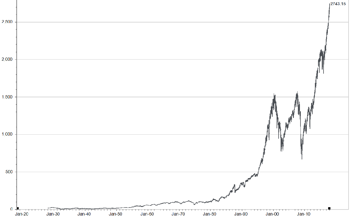
What does your eye see? In context of the rest of the chart, do you see a line that looks closer to the beginning of a move in direction or the end? Let me state that question another way. Do you see a chart that is likely to offer 8% compound rates of return for the next 10 years as it keeps going higher?
Now, I will add the details as to dates and percent declines.
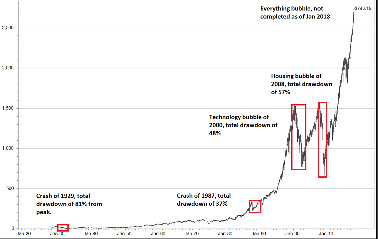
Sometimes is it just easier to shut out all the insanity that is spewed out of the news and social media and simply use common sense. Again, this does not say the present move higher is finished. It just says we are closer to an end than a beginning in the move.
The second chart is one that I believe holds the keys to the timing of the end of the move higher in asset prices. Timing is always the challenge in a bubble. When is the move higher in asset prices going to end?
Well, if I believe the global central bank policies created and nourished the bubble in asset prices, then it is logical to believe the ending of the central bank policies would establish the end of the asset bubble.
The chart below shows the global central banks net monetary creation out of thin air via QE during the past decade.
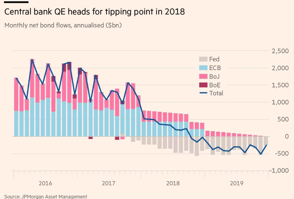
It appears that 2018 is the year where the net amount of global monetary printing goes to zero and then begins to unwind in subsequent years. (The blue line on the graphic goes below the net zero in late 2018). This is an important fact to keep in mind as we invest through 2018.
Let me leave you with one more question that I wrestle with as I weigh these simple thoughts. How far will the central banks let asset prices correct down once a real correction begins?
My opinion (and only my opinion) is not very far down.
Before the market cycle is over I believe the central banks will stop removing the QE stimulation being shown in the chart above and go “all in” once again with their monetary manipulation. There is too much debt outstanding to let asset prices correct too far down.
This question is one step ahead of where we need to be thinking right now.
Let’s watch the financial bubble that is greater than all bubbles that preceded it run its course. Let’s take more defensive action once it begins to correct, but let’s stay open to all possibilities when it comes to our investment choices in the future.
What Action Needs to be Taken?
You just finished reading a summary stating the world is in an “Everything Bubble”. Stock prices are high, bond prices are high, and real estate prices are high.
You agree with that synopsis, but you still don’t know what to do?
The first suggestion I offer is to make sure you know yourself as an investor.
Are you the type of person who can take risks that become greater every day the markets march higher and not worry about your money? If you don’t mind investing in momentum these can be profitable times.
Are you the type of person who worries about being invested in a bubble but can’t stand to watch the markets go higher without you being along for the ride? If this is you, then pick an amount of money that you can risk and not lose sleep over to invest with. In this case pick investments that have lots of momentum behind them…but also carry lots of risk.
Are you the person who believes you are in for the long term and ride out the ups and downs that surely we face in our future? Good for you, that mentality is noble and common to successful investors. But even Warren Buffett raises cash when markets get too crazy to create investable dollars for after the markets decline.
Do you ever think about what type of investor you are? Funny, more and more people I talk to have no idea what their plan is. They just figure it will all work out and forget about their investments. I highly doubt that is going to be a great strategy in the coming decade!
If you would like to meet and talk about what type of investor you are and how well your plan lines up with your personality, then please give me a call and we can set a time to meet.
I Lied…Here are a Few More Charts to Think About
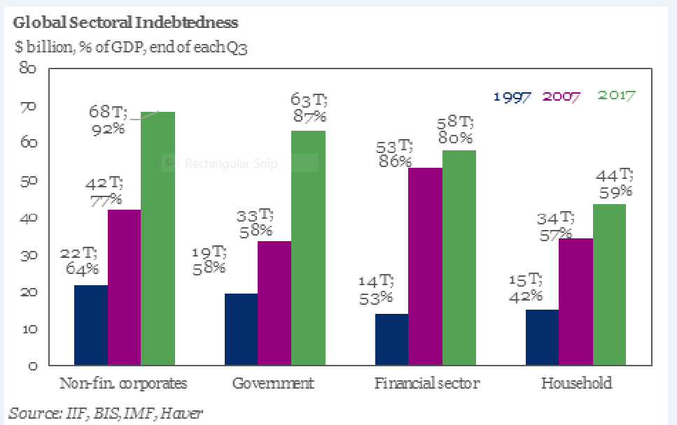
The first chart below shows the growth in total debt outstanding over the last 20 years in the different sectors of the economy.
As of Q3 2017, total debt has risen to $230 trillion. This is an increase of $16 trillion or 7.5% over January 2017. That is a pretty fast rate of increase in debt!
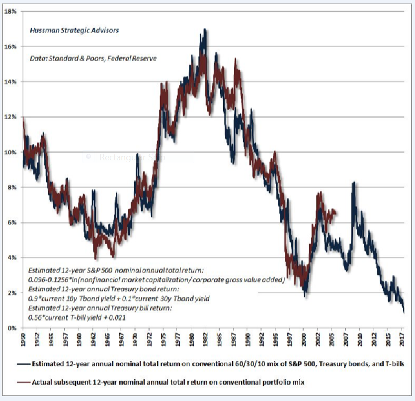
The next chart shows the estimated annual rate of return expectation per year for the next 12 years for a portfolio made up of 60% US stocks, 30% US Treasury Bills and 10% cash on the blue line.
The red line shows the actual 12 year rates of return for the same structured portfolio.
With a projected rate of return of just over 1% it would appear a lot of investors and pension funds are going to try and “trade around” the market to come anywhere near their 6%-8% goals.
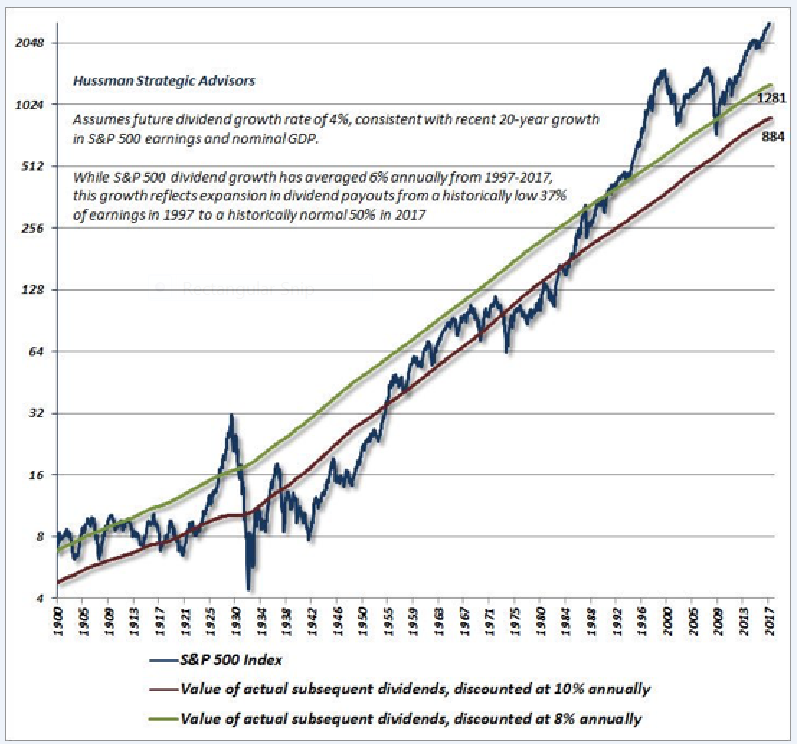
The final graphic shows how far the S&P 500 would have to decline to project an 8% compounded rate of return for the next 12 years.
What this means is that the S&P 500 would need to decline to the green line (S&P 500 level of 1281) with everything else staying the same for it to yield an 8% rate of return per year including dividends.
As always, please feel free to offer comments or questions.