
The Gap
Can we be frank with each other for a few moments? Does anyone reading this letter really believe the government calculated inflation rates that are published? More directly, do you believe the inflation your family budget has been subjected to the past 15 years is only 1.8%?
If you believe 1.8% inflation to be true, please stop reading this email right now and send me a short note on why you see inflation this way. If not…keep reading!
The following chart is “food for thought” in a world that seems to struggle with agreeing upon how to measure inflation.
Dynamic Price Index (DPI) is a measurement of inflation to be considered instead of using the more popular Consumer Price Index (CPI) because it measures price changes in consumer goods, assets and durables, where CPI mainly measures consumer goods alone.
Ok, now that we have that straight, look at the chart below and understand what it is telling us.
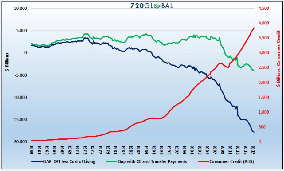
Let me explain what you are looking at. The blue and green lines show the surplus or deficit between wages and DPI. If the blue or green line is above the zero line on the left margin, then wages are keeping up to DPI, but once the blue or green line falls below zero level then consumers must “borrow” to balance their budgets so to speak. Hence, we have the rapidly accelerating red consumer credit line in red.
Now we will take the lines in the chart one by one.
The first blue line is showing the “gap” or “spread” between DPI and wages growth. When asset prices are included in the calculation of inflation…wages really get left in the dust. Notice it was right around 1990 that DPI started to negative meaning consumers were required to borrow to balance their budgets.
The green line adds in the transfer payments from the government and they kept the green line above the zero bound for an extra 20 years. Of course, government deficits were exploding at this time so, in reality, the debt was being created but it was accumulating on the government balance sheet.
Now focus on the most important part of the chart. Right around 2008 things got pretty screwed up. The “great recession” hit in the US and two things happened simultaneously:
Consumers were not able to borrow and even went bankrupt, so consumer credit declined. (Red line on chart)
Jobs were lost and wages got crushed. (Blue/green lines steeper descent)
I think we can all understand the story up to this point. But here is the real question I have for you today.
Why have the blue/green DPI lines both kept crashing lower and the red consumer credit line exponentially pushing higher? If we have had this wonderful recovery…why did these lines not start to flatten out?
The answer to the questions above come from viewing the national economy, not as a single economy, but as two separate economies.
Ray Dalio, Chairman and Chief Investment Officer at Bridgewater, wrote an editorial entitled “The Two Economies: The Top 40% and the Bottom 60%. (I included a link to the entire editorial at the bottom of the email you received to get this editorial).
Ray believes it is a mistake to use average statistics when measuring economies at this time. Let me provide you with two GLOBAL statistics that will make it clear how correct Ray Dalio is and how much of a global problem wealth disparity has become.
The top 10% of wealthy people around the world own 84% of all assets.
The top 1% own 51% of all assets.
By including the data from even the top 1% in the national averages, we get an upside distorted picture to how the median person is really doing.
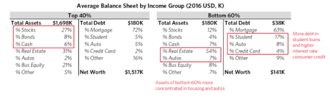
Below are two sets of charts comparing the top 40% to the bottom 60%. Hopefully these will paint a good picture at how large the disparity between the two groups is. Again, read the linked report if you find this data interesting.
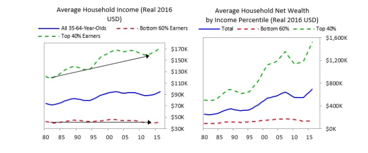
Look at the huge disparity between the average blue lines in the charts above vs. the green line showing the top 40% and the bottom 60%. How can anyone argue that the blue line represents the experience of either of the two groups?
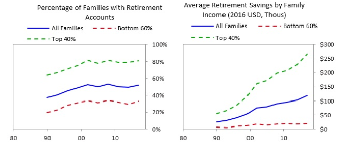
The charts above looking at same statistics from a different angle. Clearly, the same issues are present. The top 40% are twice as likely to have a retirement oriented account AND it has 10x more value!
Conclusion: This story started out looking at inflation data and how most of us would argue that real life inflation people experience in their budgets is much higher than the inflation statistics that the governments produce. I used a chart of Dynamic Price Indexing (DPI) to include asset prices in the inflation calculation and we saw an entirely different picture of inflation. This inflation has been extremely biased in the economy in that it benefits the wealthy who own the inflating assets as compared with the middle class and poor who mainly have few assets and little savings.
 Solutions to the issues above are difficult to find. Raising wages would obviously help the poor and the middle class, but business finds that solution intolerable. Cutting taxes sounds great…but the majority of the lower middle class and poor pay little in tax so it is not a big help to them. The governments are already in large deficit positions so lower taxes exacerbates their financial woes.
The best solution is an upgraded job market where better paying jobs that have true economic value are created, but I would argue globalization and technology are making that solution an uphill battle too.
Therefore, it is easy to conclude there are no simple solutions to financially balancing society again. It took over 30 years to create the problem and it will require a significant amount of time to rebalance the equation in a healthy, peaceful way.
Clients continue to ask questions and my about my opinion of Bitcoin. I have avoided writing about Bitcoin because it is such a hot topic and I am not an expert in the area but I will give it my best shot in the next few paragraphs.
To be clear, this is only my personal opinion from my own due diligence and research.
In simple terms, I am a huge believer in the blockchain[i] technology but I am not convinced that any of the existing cryptocurrencies (including Bitcoin) will be the ultimate vehicle chosen that the blockchain financial future is going to be built upon. (If there even is a blockchain financial future!)
If I had to guess, I believe that the global banks and central banks will come together to create some blockchain based vehicle that may have a chance at becoming the longer term global transaction basis that many are assuming Bitcoin is going to become.
I am not asking you to believe in my thesis. And I am not an expert in Bitcoin, cryptocurrencies, or blockchain. But if you are BULLISH on Bitcoin please explain to me how the next two charts make any sense in reference to the original characteristics of Bitcoin. I will put in italics the ones I believe are no longer true…
Scarcity, durable, portable, divisible, safe storage, fungible, difficult to counterfeit, widespread use.
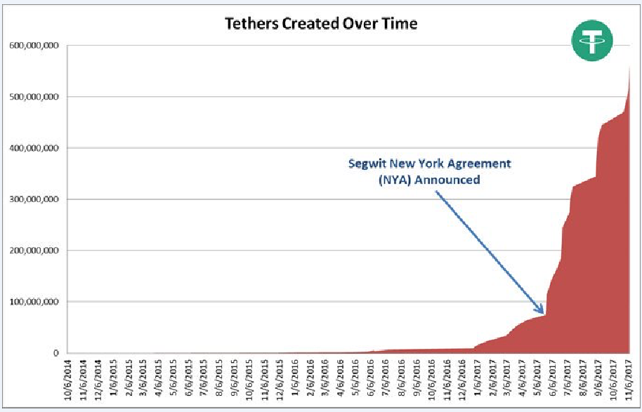
Chart 1 shows how “tethers” are created over time in Bitcoin trading. To start with I cannot explain to you exactly what a tether is and how it applies to Bitcoin. For that reason alone I am not attracted to investing in Bitcoin. If you are a Bitcoin investor and you understand tethers, please touch base with me and help me understand. If you are a Bitcoin investor and you don’t know what a tether is you should do some homework here. The correlation is huge and it could matter in the future.
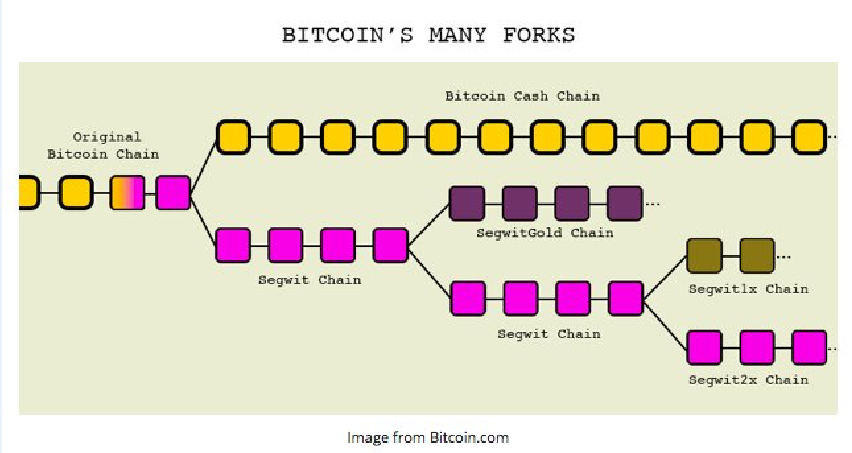
The second chart is the “forking” of Bitcoin. Forks are like splits. So for an asset that was supposed to “limited” in supply, how does this make sense?
There are now over 1200 different types of “coins” in existence. The vast majority of these names are trading with valuations in the $10,000,000 plus78 range and have absolutely no value at all other than speculative trading instruments in the middle of a frenzy.
Also, many of the exchanges where people are trading these coins are unregulated and unaudited. The coinbase market is truly the “wild west” of investing at this point.
As with all financial frenzies and bubbles this in no way implies the frenzy is complete. But, as an investor, my interest lies in the area of the blockchain technology and the distribution base for blockchain far more than the coins themselves.
Hopefully, that gives you an overview of my PERSONAL opinion. It is based upon a decent amount of research, but not an extensive amount of research.
[i] Blockchain – is a continuously growing list of records, called blocks, which are linked and secured using cryptography. Each block contains a pointer (hash) to link a previous block and a timestamp.