
“Chart-fest”
Seriously, the news stories are beyond spin doctoring on all sides of the political and financial framework these days.
Likely, we as consumers of the news, can expect this trend to intensify up until the US election in November.
Let’s cue up a few charts and let “the trends do the talking.”
The first chart shows COVID-19 trend. This has become a completely politicized issue with people’s health at stake. Unfortunately, the data allows that to happen because it tells two stories.
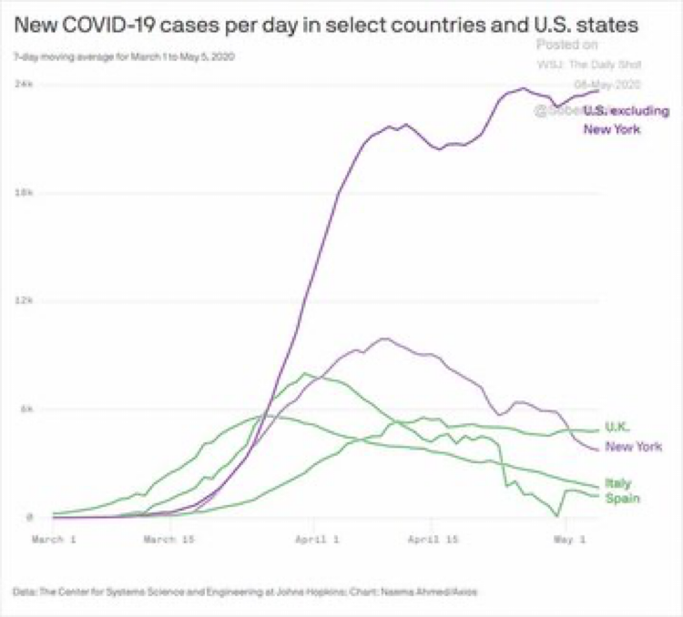
The reality: Cases of COVID-19 are flattening out in the US and declining in many other countries that were badly impacted. But, excluding New York and New Jersey in the US, the virus is still spreading into the reopening of the economy.
Also, many other COVID-19 hotspots are showing up again in countries well past their peak infection rates.
It is time to still be careful and take care of yourself.
The stock market has been flat after a normal BEAR market bounce in April. Below is a year to date chart of the S&P500. As of time of writing the S&P500 is still trading below its April 17th level.
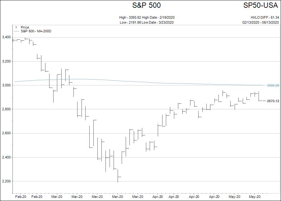
What is really interesting is what the “internal squiggles” of the stock market are telling me.
Technology has really saved the day for the stock indexes. Facebook, Apple, Amazon, Netflix, Google, Microsoft, Tesla and a host of other “usual tech suspects” are the index support.
Industrials, retailers, financials and non-precious commodities have bounced but are nowhere near all time high levels like the tech names.
If you own the overall S&P500 index I guess you don’t really care. But as a person living and working in the real world…you really do care.
Canada tells a similar story when looking at the internal squiggles.
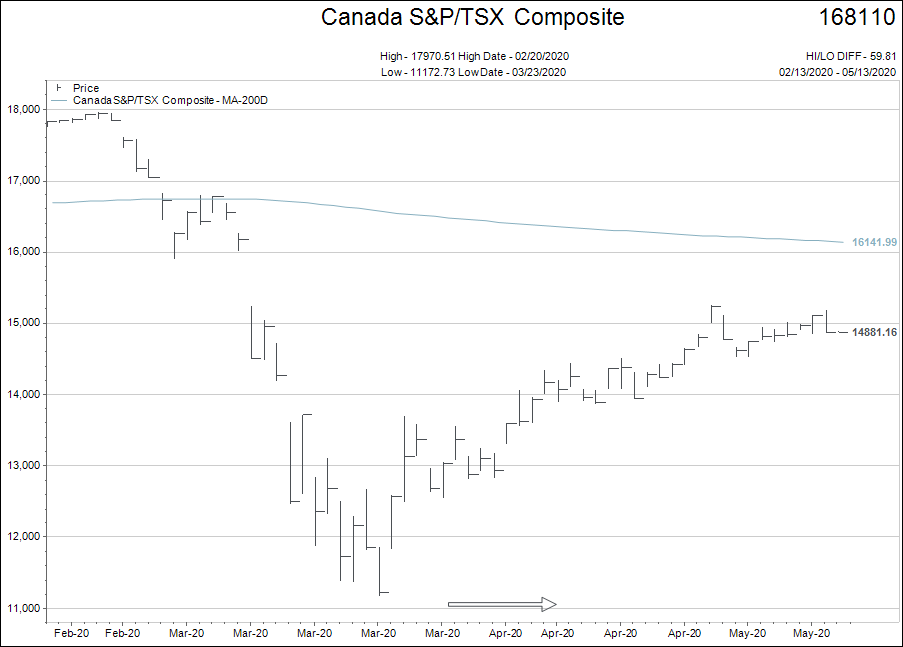
The recovery rally shows a similar flattening trend, with a little more upwards slope due to the oil names being a larger percentage of the TSX Comp than the S&P500 index.
I want to deep dive into our bank and utility names right here because they are such an important part of both our Canadian stock index and our retirement dividend producing portfolios. The names selected are not recommendations, but examples of the bank and utility sectors, and for informational purposes only.
The first two charts are Royal Bank and BMO.
Other than bouncing out of their absolute worst levels traded at in late March, the banks have done very little in terms of price recovery.
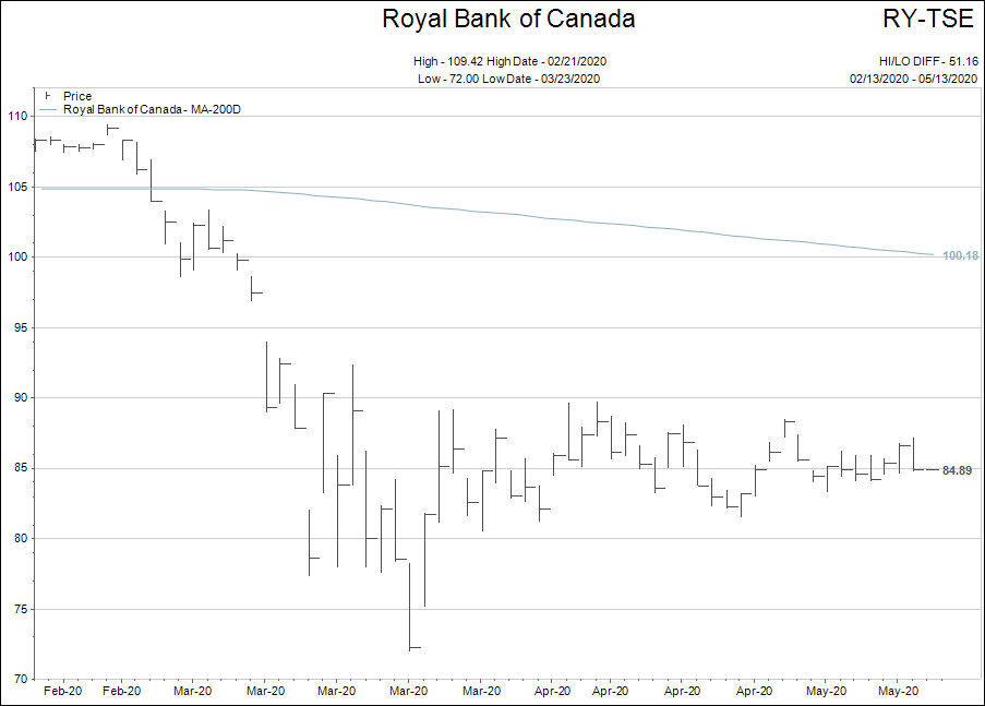

My study of history suggests that any long lasting recovery in the economy and stock market ALWAYS includes the banks.
Next, we look at a public utility and a telecom utility.
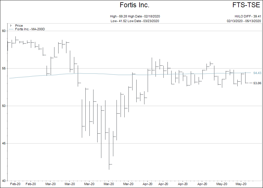
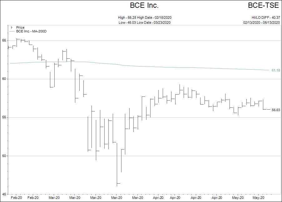
Significantly better bounces out of their lows from March, but still no momentum since the middle of February.
So what am I trying to tell you?
The torrent rally in the stock market is a figment of the imagination of the BULLS.
But the raging BEAR market that the nay-sayers dwell upon is an equal figment of their imagination.
Governments just keep printing money and people keep believing what they want to believe when it comes to COVID-19, stock markets and the economy.
Why? Because the world is in a relatively “flat” spot for both the disease and the markets so everybody can justify their belief.
What I want us to be ready for is what trend takes hold next!
Let’s continue to let the trends do the talking, and when there really is no trend, let’s not pretend to create one.
Finally, I do believe there is something interesting still swirling about the gold markets.
As you know from past writing, my thesis on gold is that it will not really be a BULL market until it rallies higher when the stock market is flat or weaker.
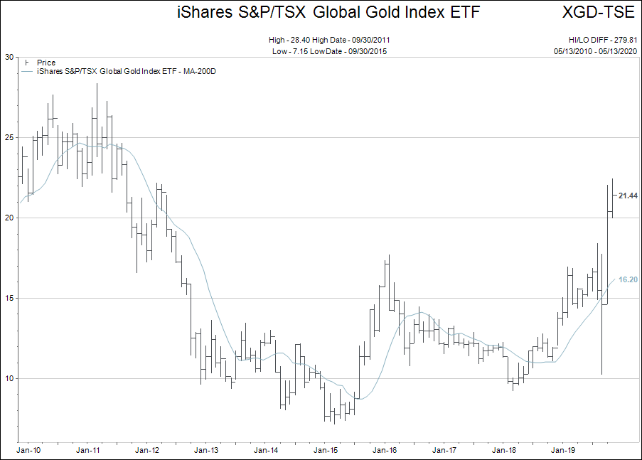
The chart above is the large capitalized Canadian Gold mining exchange traded fund (again, not a recommendation, but an example). Each bar on the chart represents a week of time.
When you see a chart pop out of a long term range like the gold company index has, it means that investors have taken notice of the sector.
These are higher risk companies with tons of volatility. They are however, under-owned by mainstream investors, and the entire index of gold companies doesn’t equal the size of Microsoft or Apple.
Gold companies don’t make money like a Microsoft or an Apple, but if gold prices continue higher via the insane money printing schemes of central bankers and politicians…well, then things get interesting for this sector.
Please feel free to email me your questions and observations anytime.
Enjoy your week.