
“Cart Before the Horse”
Before 2009, in what I like to call the financial dark ages, the stock market was seen as a reflection of what was going on in the world.
Economics, geopolitics, politics and many other shifting criteria in the world could impact how the stock market was being valued. It made sense, therefore, that investors looked at the stock market as a gauge as to how things were going in the rest of the world.
This is an important thing to keep in mind, because today I want to make the argument that the exact opposite is true.
Financial markets, specifically stock markets, are besieged in no uncertain terms, by central bankers and politicians to convince investors that as long as stock prices keep going higher, the rest of the world must be doing just fine.
The irony is that the longer this “cart before the horse” process of manipulating the stock markets as a method to deny the underlying changes in the world remains in place, the less likely the real economy will get a chance to truly heal itself.
There are plenty of examples taking place in real-time, but I will only show three.
The first chart below shows the GLOBAL rate of change for vehicle sales, and is pretty self-explanatory.

The next chart broadens the theme from just “vehicle sales” to “total retail sales.” It also shows broadly measured industrial production.
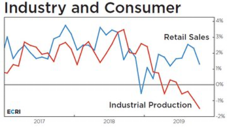
Notice industrial production never regained any traction while retail sales actually recovered nicely out of the late-2018 stock market decline of more than 20%. Once again, however, it has started to trend lower (Oct 2019 data).
In the pre-2008 world, the stock market would have more closely followed the trends shown in the above charts, but when central bankers and politicians take it upon themselves to try to keep stock prices higher, the normal economic signals get drowned out in the process.
The final chart is a little trickier to understand, but it is actually the one that interests me the most.
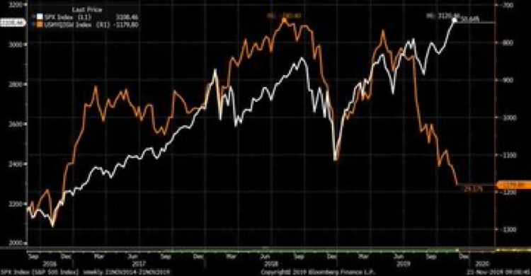
The white line shows the past three years for the S&P 500 index. Obviously, it is still pressing on to new high price levels.
The tan-coloured line represents the market value of a basket of CCC credit rated bonds; the rating scale for bonds is AAA, AA, A, BBB, BB, B, CCC, CC, C, D or default.
Bonds with a CCC rating are not considered investment grade and investors without specific goals and skills should not be trading in CCC paper.
Yet, the valuations for CCC bonds has been a pretty good historical indicator for the state of the economy and the direction of the stock market.
As you will see in the section below where we will review the “Crisis Portfolio” investors need to remain BULLISH towards stock prices.
That said, BULLISH investors need to realize the big picture situation when it comes to what is holding stock prices up near their all-time high levels.
“Crisis Portfolio”
Status: 100% Equity
Since: October 28th
S&P 500 level at entry: 3032
Every couple of weeks I will include the update data for the “crisis portfolio” component of our portfolios. For those who have chosen to add or use the “crisis portfolio,” it represents a tactical exposure to growth oriented investments.
As interest rates have gone lower, more investors are opting for a tactical exposure to exchange some of the GIC and fixed income exposure for.
The idea behind a tactical approach is to remain exposed to stocks when they are trending higher, and to reign in exposure when stocks are trend less or declining.
Feel free to ask any questions about this type of exposure or if you would like to find out if having some “crisis portfolio” exposure is right for you please give us a call or email.