
Two Ideas to Consider
The comment this week briefly highlights two investment themes that appear to be building a positive profile from a base.
The public comment will only show the charts of the two assets; I have a specific report for clients only about the investment ideas with the technical details of how I recommend exposure. For clients, if you are interested in more detail please email me and I will forward you the detailed report.
Before we look at these two ideas let’s look at one chart.
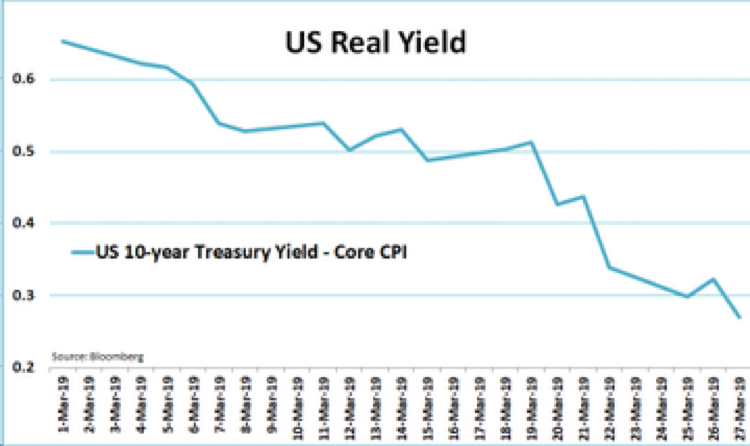
This is a ONE MONTH look at how fast the real yield (Nominal yield – inflation = REAL yield) has dropped on the US 10 Year Treasury Bond.
Real yield is an indicator of the confidence in future economic growth. If investors feel like growth is accelerating the investment choices they would make would push the real yield higher on the 10 year bond. The opposite is true if investors are worried about economic growth prospects.
If investors are growing less confident about future growth in both the economy and earnings, it would be logical to expect the central banks to go back to their old tools to support asset prices (stocks and real estate).
This is the challenge for investors to try and gauge in 2019. If central banks do go back to their old bag of tricks will asset markets respond positively as they did in 2000 and 2009 or not?
The top of the head answer to that question would be “Yes, they will take a positive view of Quantitative Easing (QE).” Therefore, staying long the stock market and real estate market still makes sense as I have been saying in these weekly comments.
But the central banks are also starting from a vastly different point in the cycle for this easing phase. Interest rates are much lower than the past two QE cycle starting points and debt levels are much higher.
Let’s consider two ideas that might work well to “hedge” the risk of the central bank cycle failing to behave the same way as the last two easing cycles.
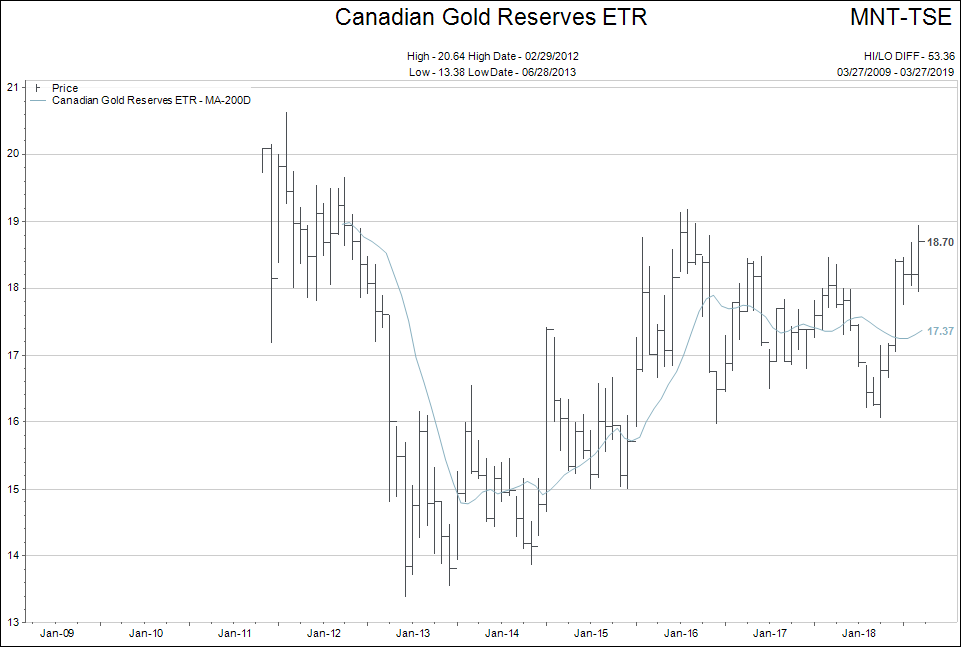
The chart shows Gold Bullion priced in Canadian dollars. My recommendation in the client edition uses a combination of Gold and Silver bullion and stocks.
Oil

The chart above is US dollar West Texas Oil price. My client recommendation includes only oil stocks.
Conclusion:
The objective of diversifying in these types of investments is to find “something” that will perform while the general market prices do NOT perform.
Therefore, until the stock markets give clear SELL signals, these are either speculations or early “opening bid” type investments.
For more details…please email me.
The Great Job Market
There is so much in the American media about the great jobs market. No question the unemployment rate is low and companies are hiring.
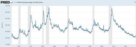
Canada seems to have similar strong data too. The chart below shows 4-week average jobless claims.
I wonder what would happen if there was a way to sort the jobs data using two additional screens:
-
Jobs available that pay a “living wage” for the surrounding area where the job is available. Meaning if the job is below the living wage it doesn’t get counted.
-
Skill requirements for jobs relative to skill level of Canadian public.
Most of you know my wife and I work with the homeless and the hungry in our community. The people using our food banks are not growing in numbers at the present time…that is the good news.
What is changing is that the “homeless” have been supported in our community after the “tent city” escapade and have dropped to a smaller percentage of our client base.
The group that is growing in size accessing our local food bank is the “working poor.”
This is part of what gets me asking the question: What good is it to have lots of job openings in a community if the jobs don’t pay enough for someone to survive?
The skill level screen also fits into the question above. If most of the engineering jobs are in downtown Vancouver where the average cost of living is 20% to 45% higher than Vancouver Island city locations, then the job vacancies there must pay appropriately to the location.
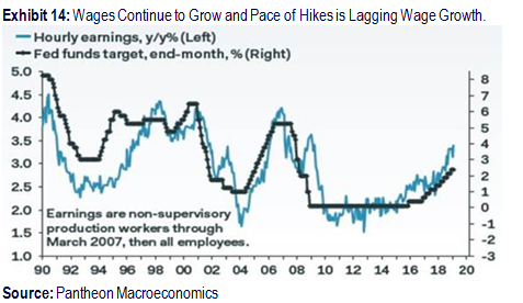
The chart above proxies to this problem.
Wages fell hard from 2008-2010, but cost of living kept rising. It has only been since 2017 that real wage growth has progressed. A lot of that increase comes from rapid rises in Minimum Wage, which is still woefully behind a Living Wage level.
Bottom line is the wages never came close to keeping up with the cost of living.
This is where I try to marry two ideas we have been discussing in the weekly editorials.
What if we have a global economic slowdown at the same time that “living cost inflation” keeps rising?
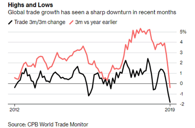
We know the global economic slowdown continues to engulf more economies around the world.
The number of countries that have bond markets yielding negative interest rates is expanding.
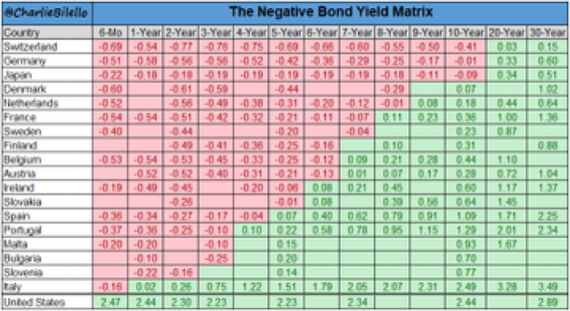
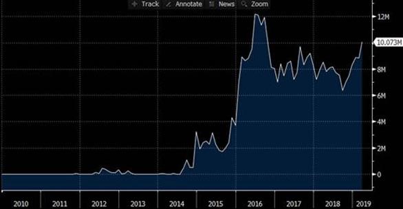
The total volume of bonds with negative rates in the world keeps growing.
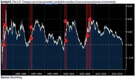
…And we know that inverted yield curves are excellent predictors of future recessions.
So what happens if we have an “inflationary recession” where asset prices drop and wage pressure and living costs still grow?
Answer: I’m not sure, but that is why I am writing about ways to invest in Gold and Oil with large margins of safety built into the plans.
Outside of those ideas I continue to look for things that small amounts of exposure to might help cushion the lack of performance that may be expected if an inflationary recession were to start to appear more likely.
For a final bonus chart this week let’s look at the level of Canadian indebtedness relative to other G7 countries. Long gone are the days of those conservative Canadian savers…eh?
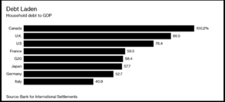
Apparently…we win!